
The Russia-Ukraine Monitor Map “is a crowdsourced effort to map, document and verify information in order to provide reliable information for policymakers and journalists of the on-the-ground and online situation in and around Ukraine. […] The pins on this map represents open source material such as videos, photos and imagery that have been cross-referenced with satellite imagery to determine precise locations of military activity.” It’s produced by the Centre for Information Resilience. [Boing Boing]
Lego’s New Globe
 If Lego’s 11,695-piece world map was not enough for you—and believe me, I understand—then they have something else for you: a 2,585-piece globe that’s 40 cm (16 inches) tall, comes with glow-in-the-dark labels, and costs US$200/
William Clark Implicated in Land Grab by Map Re-Attributed to Him
 A new historical study reattributes a rough sketch of treaty lines in what is now Missouri to William Clark (of “Lewis and” fame), implicating the legendary explorer in the dispossession of some 10.5 million acres of land assigned by treaty to indigenous peoples. The article by Cambridge historian Robert Lee, who studies Indigenous dispossession in the 19th century and discovered the map misfiled in another fonds, appears in the latest issue of William and Mary Quarterly. The DOI doesn’t appear to work yet, nor is the article available online at this point, but here’s the abstract and the press release.
The Map Books of 2022 page is now live. At the moment only a few books are listed—it’s only February, after all—but this is where my worldly and erudite readers come in. If you know of a book coming out this year that ought to be on this page—basically, any and all books about cartography, maps and related subjects—please let me know. It’s best if the book has a publisher listing and publication date (though I’m well aware that dates can move around a lot); I’ll work with what I can get, though.
The Rise and Fall of Hunga Tonga-Hunga Ha‘apai
A storymap from Esri’s Robert Waterman, based on Maxar satellite imagery, shows the rise and fall of Hunga Tonga and Hunga Ha‘apai from being two separate islands before a 2015 eruption combined them, through its time as an apparently stable but awkwardly compound-named single island until it got blown apart last month.
Previously: Hunga Tonga-Hunga Ha‘apai, Before and After.
Looking for Lightning, Finding Meteors

It turns out that the Geostationary Lightning Mapper (GLM) aboard the GOES-16 and GOES-17 earth observing satellites can do more than just detect lightning—it can also detect bolides, or very bright meteors, thanks to a new automatic detection algorithm. NASA Earth Observatory: “The map above shows the distribution of more than 3,000 bolides detected by the GLMs aboard GOES-16 and GOES-17 between July 2017 and January 2022. Blue points are bolides detected by GOES-16; pink points were detected by GOES-17. The lone pink point over the Atlantic Ocean was detected by GOES-17 during its commissioning phase before it was moved into its operational orbit over the West Coast.” (Bolides in the middle of the map are detected by both, and as you can see there’s a bit of parallax.)
xkcd: The Goode Homolosine to the Rescue!
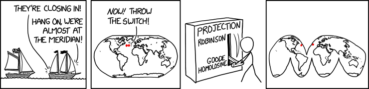
Randall Munroe’s map projection humour is increasingly on point, as last Friday’s xkcd demonstrates. (The mouseover text is even better: “There are two rules on this ship: Never gaze back into the projection abyss, and never touch the red button labeled DYMAXION.”)
Previously: xkcd: The Greenland Special; xkcd: All South Americas; Blame the Mercator Projection; xkcd’s Time Zone Map; xkcd’s Liquid Resize Map Projection.
David Rumsey Map Collection: More Than Just Digitization

The David Rumsey Map Collection has a blog post that explains that they do more than just scan old maps.
When we digitize historical maps we create copies that can be shared and used by all. But we also create the potential to repurpose these copies to advance understanding of the original maps. To do this, we create composite maps, georeferenced maps, composite views, interactive globes, composite texts and other types of digital versions that expand map interpretation and enhance use. Below are some examples of these interpretive maps that we have created over the past 20 years. To date we have created 1,674 interpretive composite maps, views, and texts as well as over 56,000 georeferenced maps.
Examples at the blog post—some of which we’ve already seen, including the digital assembly of Urbano Monte’s 1587 world map (above).
Online Exhibition: Multiple Middles

An online exhibition from the University of Delaware Library, Museums and Press, Multiple Middles: Maps from Early Modern Times features a selection of early modern maps and travel narratives from their special collections. “The exhibition takes narratives from the maps’ edges and repositions them as possible middles. As a result, previously unfamiliar histories and visual elements come to the fore. These objects highlight specific innovations, scientific theories, and geographical middles that their makers intentionally framed. The exhibition provides an alternate view of maps and early modern cartography.” Features many familiar cartographers (e.g. Blaeu, Ortelius). [WMS]
The Atlantic on the Board of Geographic Names
The Atlantic’s David A. Graham looks at the history and painstaking deliberation of the Board of Geographic Names. “Usually, the public eye is far from the BGN, a member of the class of government bodies whose work you could go a lifetime without thinking about, even though it’s all around you. But the board now finds itself in the middle of the fiery national debate over racism and language. In recent years, the BGN has spent more of its time reconsidering offensive names than doing anything else, but the process typically takes months and is reactive by design, with names considered case by case upon request.” [MAPS-L]
Previously: Secretary Haaland Takes Action Against Derogatory Place Names.
Hunga Tonga-Hunga Ha‘apai, Before and After

NASA Earth Observatory has released digital elevation maps of Hunga Tonga-Hunga Ha‘apai both before and after the volcanic eruption earlier this month.
The digital elevation maps above and below show the dramatic changes at Hunga Tonga-Hunga Ha‘apai, the uppermost part of a large underwater volcano. It rises 1.8 kilometers (1.1 miles) from the seafloor, stretches 20 kilometers (12 miles) across, and is topped by a submarine caldera 5 kilometers in diameter. The island is part of the rim of the Hunga Caldera and was the only part of the edifice that stood above water.
Now all of the new land is gone, along with large chunks of the two older islands.
The Lighthouse Map

A map showing the lighthouses of Europe has gone viral on social media. It’s a Geodienst project that actually dates back to 2017 or so. The map is generated using lighthouse data extracted from OpenStreetMap. “More specifically, it asks the Overpass API for all elements with an seamark:light:sequence attribute, decodes these, and displays them as coloured circles on the map using Leaflet. It also tries to take the seamark:light:range and seamark:light:colour into account.” (The above animation, taken from the project’s GitHub page, doesn’t show colours, but maps can be built that do, and the example going viral does.)
TomTom Says Its Algorithms Avoid Potentially Dangerous Routes
It probably has nothing to do with Google redirecting traffic up poorly maintained mountain roads during a blizzard in California last month (previously), but TomTom has posted a piece explaining how its algorithms avoid sending drivers down potentially dangerous routes in Finland even though, on paper, they’re shorter.
TomTom’s routing and location technology recognizes that the shorter route to Koli National Park is on winding unpaved roads, made up of sand and gravel, and it takes that into consideration when computing a route for a driver. It places significant importance on this information. […] Even though the unpaved route is shorter, it’s still not considered “better” than the longer paved route when all things are considered. If map data didn’t include this contextual data about the specific road, the unpaved road would most likely be the default route suggestion.
Mapping Methane Emissions

Funded by NASA’s Carbon Monitoring System, scientists recently built a new series of maps detailing the geography of methane emissions from fossil fuel production. Using publicly available data reported in 2016, the research team plotted fuel exploitation emissions—or “fugitive emissions” as the UNFCCC calls them—that arise before the fuels are ever consumed. The maps delineate where these emissions occur based on the locations of coal mines, oil and gas wells, pipelines, refineries, and fuel storage and transportation infrastructure. The maps were recently published at NASA’s Goddard Earth Sciences Data and Information Services Center (GES DISC). (Note that 2016 was the most recent year with complete UN emissions data available at the time of this study.)
The Challenger Map Re-Emerges; Fundraising Campaign Under Way
The iconic Challenger map—a 26×24-metre exaggerated relief map of British Columbia made of nearly a million pieces of jigsaw-cut plywood, is now on display at the B.C. Sports Hall of Fame as part of an exhibition on the early days of the Pacific National Exhibition, where the map was on display between 1954 and 1997. This is only for a few months; its appearance part of a fundraising campaign to restore the map.
Previously: Challenger Map Gets Reprieve; Challenger Map Update; Another Challenger Map Update; Challenger Map Back on Display, Sort Of.