
On The Conversation, James Cheshire looks at the Cold War-era maps that news magazines commissioned to explain the geopolitical situation to their readers. “Their maps were large, dramatic and designed to be spread across kitchen tables and classroom desks. And they also offered a very different perspective to the mainstream maps we have become accustomed to today.” Which is to say: polar projections were front and centre.
Tag: map projections
Greenland, the Mercator, and You-Know-Who
Somebody’s been talking about Greenland again, and we’re getting another flurry of articles about how Greenland’s apparent size on maps may be to blame for the obsession. Last year it was suggested that Trump wanted Greenland simply because it looked really big on the Mercator projection: Slate and Newsweek were a lot less circumspect about it than Foreign Policy was, but then they would be. The latest round of press appears to be equally circumspect. The Financial Times and Geographical magazine turn evidence of executive ignorance into some kind of teachable moment about map projections instead of saying outright: he thinks it’s bigger than it actually is, and that’s nuts. Providing some context is always good, but let’s try not to bury the lede.
Most people know the poles are exaggerated on the Mercator projection. They’ve seen other projections. In Rhumb Lines and Map Wars, Mark Monmonier pushed back against the argument that map projections distort our understanding of geography: “Do they never look at a globe, or at other maps? Are map users complete idiots?”1 It was a rhetorical question: of course they aren’t, he was saying. Apparently there’s an exception. But when the emperor has no clothes, you have to proceed as though most people run around naked.
Previously: Trump’s ‘Cartographic Compulsion’.
‘The Correct Map Does Not Exist’
Miguel García Álvarez weighs in on the Correct the Map campaign to replace the Mercator projection with Equal Earth:
I think the Equal Earth projection is an excellent compromise. But as a cartography enthusiast, it pains me deeply every time someone talks about the “true” map, the “correct” map, or that the Mercator projection is “wrong.”
I will never stop loving this scene from the West Wing of the White House, but please don’t say that any map is right or wrong simply because of the projection it uses. We should just focus on saying that some projections are more or less suitable for different purposes, but we have to avoid sensationalism.
(This is the English version; it was first posted in Spanish.)
Previously: In Case You Thought the War Against the Mercator Projection Was Over Long Ago.
In Case You Thought the War Against the Mercator Projection Was Over Long Ago
A new front has been opened in the never-ending war against the Mercator projection. The African Union endorses Correct the Map’s campaign to replace the Mercator projection (which diminishes the relative size of Africa) with the Equal Earth projection. I think it’s awfully interesting that they’re proposing Equal Earth instead of the Peters map: Equal Earth is a better choice for maps of the world than the Peters or the Mercator, but then so are dozens of other projections. That the campaign against the Mercator is no longer necessarily a campaign for the Peters is something to take note of. [Andrew Middleton]
Though I’m still wrapping my head around the idea that campaigning against the Mercator is still a thing. Really, still? After all, it’s been decades since the Mercator was the dominant projection on wall maps. A quick look at the catalogues of Stanfords and World of Maps suggests maybe one in ten wall maps of the world use the Mercator, and the ones that do seem to be second-tier publications at best (because it’s been known for a long time that the Mercator is shit at being a world map). I guess the Mercator is too good a metaphor for colonialism and foreign domination to let go of it.
But then I have no idea which maps are used in classrooms, in Africa or anywhere else. And I’m often surprised at how much Mercator I see in online maps and infographics, because the tools they use default to Web Mercator. Web Mercator is perfectly fine—at large scales. Most online map providers use Web Mercator at all zoom levels (Apple Maps zooms out to a globe on Apple Silicon but not on older Intel Macs, Google offers globe view as an option on desktop). Web Mercator shows up a lot where an alternative would’ve been better. So it’s not like there isn’t a point here.
Previously: The Peters Map Is Fighting the Last War.
Daniel Huffman’s Asymmetric Monstrosity

Foreshadowed on Mastodon in January, the horror that Daniel Huffman has created is now upon us. Behold the Asymmetric Monstrosity projection, an equal-area—yes! every part of it—projection that grafts together pieces of the Equal Earth, cylindrical equal-area, three pieces of Mollweide and five sinusoidals (each on different central meridians) into a patchwork atrocity with an uneven graticule and interrupted labels. Stop twitching long enough to read Daniel’s explanation as to why this was perpetrated:
First off, it was fun and interesting for me to think about how projections can be glued together. This map is a Frankenstein’s Monster–like creation, but it doesn’t leave anything out, nor does it have mismatches at the joints. Landmasses fit together seamlessly at the boundaries of any given transition zone between projections, because with a little math and the right tools, you can make two projections (of the right variety) match each other at a given location.
The other goal is to educate, through entertainment. It looks funny, thus drawing attention; and in doing so I hope it will jar people into realizing how distorted all projections are. This projection is just as valid as any other, in terms of how faithfully it represents the earth. It’s equal-area, showing everything in proper size proportion. It has interruptions, sure, but so do many others. It is a composite, yes, but so are other projections.
I think it’s in the same vein as those “south-up” world maps that you can buy, or ones centered on the Pacific. Many audiences would find them unfamiliar, but the maps use their uniqueness to make people realize that there’s really no right way to portray the world, and that our conventions are frequently arbitrary.
It’s available for free download at pretty high resolution, or you can buy it as a print, and while Daniel doesn’t actually expect anyone to do it, honestly, why not?
xkcd on Greenland’s Size
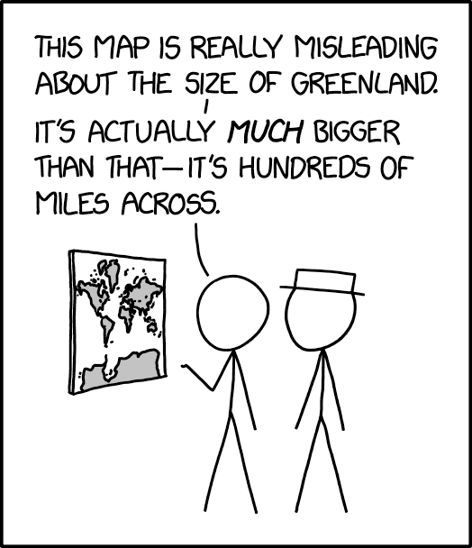
The 25 March 2024 xkcd honours Greenland’s place as a measure of cartographic distortion. It’s also, unexpectedly, a riff on the idea of the 1:1 scale map (cf. Borges), especially if you consult the comic’s alt text: “The Mercator projection drastically distorts the size of almost every area of land except a small ring around the North and South Poles.”
Previously: xkcd: The Greenland Special.
Heart-Shaped Maps
 Today might be a good day to look at cordiform map projections—maps in the shape of a heart. This Geography Realm post (and related video) looks at the history of such projections, such as the Werner and Bonne, which first saw use in the 16th and 17th centuries. This Library of Congress blog post explores two maps that use the projection: a 1795 Ottoman Turkish map attributed to a Tunisian cartographer, and the 1534 map by Oronce Finé (pictured) that apparently inspired it.
Edney on Arno Peters
Matthew Edney has written a long blog post on Arno Peters and his map.
I’ve been struggling for months now on how to deal with Arno Peters and his world map. Every time I turn to the subject, I just get bogged down by the complexity of the scattered and multifaceted literature, by the insanity of much of Peters’ map work, and by the different responses to his work. […] After at least three tries to say something new, and floundering each time, I am presenting this blog entry simply as an attempt to organize the information about Peters in a way that makes sense to me, which is to say historically. Think of it as a long bibliographical essay based on what I have to hand (so not comprehensive, especially in the German-language literature). I’m not sure that it says anything necessarily new or significant. So please join me as I go through a series of cuts at Peters and his map work.
The Return of the Map Projection Trading Cards

Daniel Huffman’s map projection trading cards are making a comeback. “While my colleagues and I did our best to let everyone know about these cards, some people inevitably missed out during the first print run. I’ve had many people contact me asking and hoping to get their hands on a pack or two. So, I am bringing them back for one final print run via Kickstarter,” writes Huffman. “I hope you’ll share this widely, so that we don’t miss anyone this time around, as this is almost certainly the last time these cards will be printed.”
Previously: Map Projection Trading Cards.
‘Whoops, Made All Longitudes Positive’
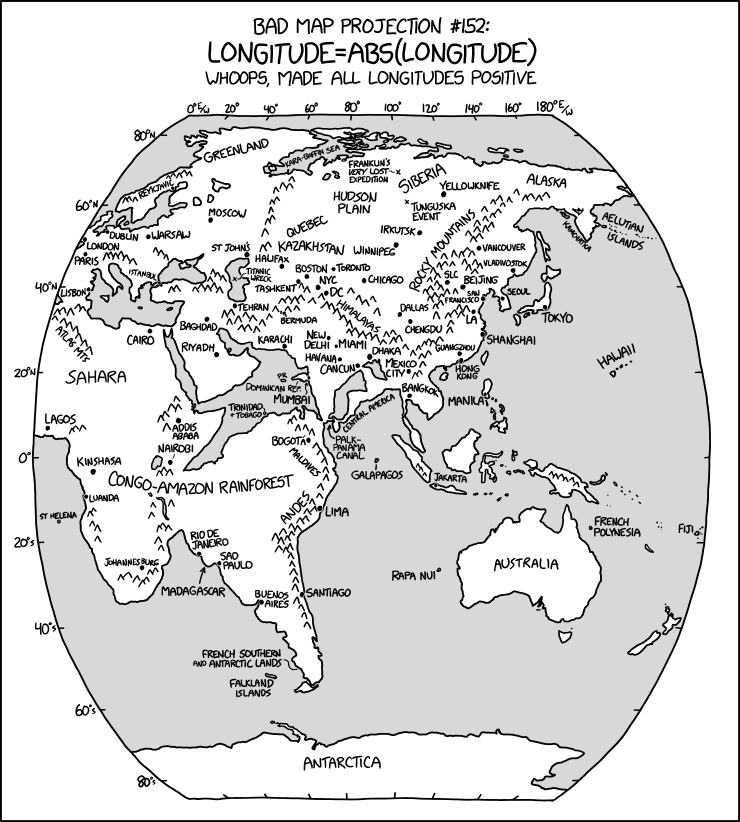
The latest in Randall Munroe’s Bad Map Projection series on xkcd is perhaps his most evil yet: it turns all longitudes positive—i.e., it turns west longitude into east longitude, putting Quebec somewhere in Kazakhstan and the Panama Canal off Sri Lanka.
Projection Connections: A Genealogy of Map Projections

Fresh off of producing a (now sold-out) line of map projection trading cards, Daniel Huffman has produced a 16×24-inch poster showing the surprisingly close and entangled relationships between the various map projections.
I first learned about a couple of these connections several years ago. I don’t quite remember how or where, but I found out that the Mercator projection was equivalent to a Lambert Conformal Conic with the standard parallels set opposite each other across the Equator. And that if you moved both those parallels up to a pole, you got a Stereographic. My mind was suitably blown, and I saved it as a fun fact to share with people. This year, while working on The Projection Collection, I spent a lot of time on daan Strebe’s site looking up details, and I often saw his notes (usually derived from Snyder/Voxland) about how projections were related to each other. I started to realize there were a lot of these connections out there, and I thought it might be fun to diagram them in some way.
The diagram is digital-only (PDF) and donationware.
Map Projection Trading Cards
Daniel Huffman’s map projection trading cards are now a thing you can order. Daniel, earlier this month:
A couple months back, I floated an idea for making some fun trading cards based on map projections. I’m very happy to report that several dozen of you responded and contributed designs to help make the set happen. I’ve been spending several weeks on managing everyone and working through logistics, and I’m pleased to now be able to offer a pre-order of The Projection Collection.
The cards can be pre-ordered here, with delivery later this year (or pickup at NACIS). Each pack has 16 cards, with complete sets not available by design—these are meant to be trading cards in the classic sense. Pre-orders will close on July 6, so you have until then.
Mercator: Extreme
To follow-up on xkcd’s Madagascator cartoon (previously), I missed the fact that clicking on the cartoon at the xkcd website actually did something, but Keir caught it: it links to Drew Roos’s Mercator: Extreme, an online tool that allows you to have some fun with the Mercator projection’s excessive polar distortion by making any point on the planet the North Pole and which clearly served as Randall’s inspiration.
xkcd’s Madagascator Projection
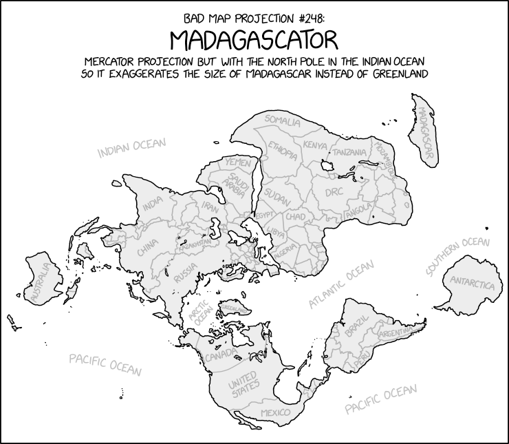
Uncharacteristically for xkcd’s Bad Map Projection series, the Madagascator is actually totally legitimate as a projection. Not that it’s any less mischievous, mind.
Update, 3 May: Turns out there was more to this xkcd cartoon. See Mercator: Extreme.
xkcd: The Goode Homolosine to the Rescue!
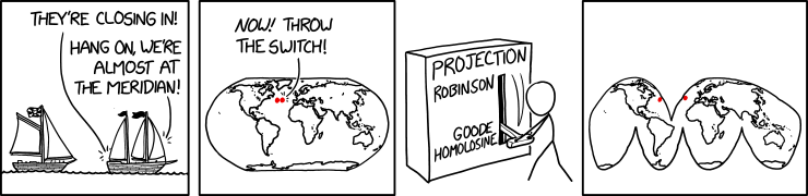
Randall Munroe’s map projection humour is increasingly on point, as last Friday’s xkcd demonstrates. (The mouseover text is even better: “There are two rules on this ship: Never gaze back into the projection abyss, and never touch the red button labeled DYMAXION.”)
Previously: xkcd: The Greenland Special; xkcd: All South Americas; Blame the Mercator Projection; xkcd’s Time Zone Map; xkcd’s Liquid Resize Map Projection.