To follow-up on xkcd’s Madagascator cartoon (previously), I missed the fact that clicking on the cartoon at the xkcd website actually did something, but Keir caught it: it links to Drew Roos’s Mercator: Extreme, an online tool that allows you to have some fun with the Mercator projection’s excessive polar distortion by making any point on the planet the North Pole and which clearly served as Randall’s inspiration.
Tag: Mercator
xkcd: The Greenland Special

At some point, xkcd cartoonist Randall Munroe is going to put out a book focusing on his map-related cartoons, isn’t he. The latest in his “Bad Map Projection” series (previously: All South Americas, Time Zones, Liquid Resize) is The Greenland Special, an equal-area projection except for Greenland, which uses Mercator. And I thought he was messing with us before.
A Virtual 16th-Century Globe
The National Maritime Museum is closed right now, obviously, but in the meantime they’ve given us a virtual version of one of their treasures: a 1541 table globe by Gerardus Mercator.
Previously: Antique Globes, Virtual and Real.
SMBC Takes the Mercator Projection into Its Own Hands

Saturday Morning Breakfast Cereal’s take on the Mercator projection is … not what you’d expect. The punch line is similar to Christopher Rowe’s short story, “Another Word for Map Is Faith”: if you can’t make the map conform to the territory, make the territory conform to the map. Since we’re dealing with the Mercator projection, this requires some … escalation.
Mapping the Canadian Election Results: Technical Details
Bothered by the widespread use of Web Mercator by Canadian news outlets to show last week’s election results, Kenneth Field has posted an article that aims to address the problem. Static maps of Canada tend to use a conic projection like the Albers or the Lambert, and that’s the case for print election maps as well. Online interactive maps, on the other hand, use off-the-shelf tools that use Web Mercator, which results in the sparsely populated territories looking even more enormous. But that doesn’t have to be the case, says Ken, who shows us, with a few examples, how use ArcGIS Pro to create interactive maps using a conical projection.
Meanwhile, Mark Gargul writes in response to Ken’s critique of his cartogram of the election results. Mark describes himself as an amateur and readily admits that other cartograms are “clearly more aesthetically pleasing. On the other hand, I was going for something different with my cartogram—specifically, to try to preserve riding-adjacency as much as possible.”
@kennethfield
… On the other hand, what I was going for was preserving, to the extent possible, riding adjacency. If Markham-Stouffville shared a border with Markham-Unionville on a real map, I wanted that border on the cartogram. Hence, the ugliness.— Mark Gargul (@GargulMark) October 26, 2019
The other thing Mark was going for in his cartogram was to indicate the urban-rural split: metropolitan areas are given a black border: it’s easy to see which ridings are in Montreal or Toronto; seats that are partially urban and partially rural straddle those borders.
I'll summarize for you guys what I let Ken know in more detail: I wasn't going for pretty, but I was going for illustrating the rural-urban split, which doesn't come across well in the other cartograms or maps I have seen
— Mark Gargul (@GargulMark) October 26, 2019
So it’s doing several things at once that may not be immediately apparent.
Previously: A Cartogram of Canada’s Election Results; More Canadian Election Maps.
A Map Projections Roundup
Three things make a roundup. Here we go:
Here’s a gallery of all 68 map projections supported in Arc

Chris Whong uses a clementine as a substitute for Tissot’s indicatrix: “I found myself eating a clementine this morning, and thought it would be interesting to slice up the orange peel on an 8×8 grid to visualize how much of the earth’s surface is represented in WebMercator tiles at zoom level 3. This is kind of an inverse of the Tissot’s Indicatrix above, showing chunks of the spheroid’s surface over the projected tiles that represent them in web maps.”
Alberto Cairo’s short piece arguing that the Mercator projection isn’t a monstrosity doesn’t cover particularly new ground: the Mercator was created for a specific purpose (bearing-based navigation) and is a good choice for small-scale maps, but it has no business on a world map. But it’s probably worth reiterating, since I still see over-the-top condemnations of the projection on colonialist grounds, channeling Arno Peters (which, you know: not new).
Blame the Mercator Projection
Last Friday’s xkcd suggests that the Mercator projection’s reputation can be used to convince anyone of any false geographical fact.
Not that I’d suggest you do that, mind. No.
Mercator Globes at the University of Lausanne
The University of Lausanne has come across a pair of globes—one celestial, one terrestrial—made by Mercator in the 16th century. Mercator apparently had a reputation as a globemaker, and a number of his globes are still in existence today. But “not particularly rare” is not the same as “not particularly interesting,” and the globes, which first turned up on campus in 2004, are now the subject of an exhibition at the Espace Arlaud in Lausanne, which runs until 15 July, and an extensive and detailed website that talks about the globes and how they were discovered and authenticated. Digital versions of each globe have also been produced: here’s the terrestrial globe; here’s the celestial globe.
All of this, by the way, is in French. If reading French is not your thing, the Harvard Map Collection also has a pair of Mercator globes, which you can view via their (rather dated) website.
The 74 on Boston Schools and the Peters Map
Education news website The 74 has its own coverage of the Boston schools/Peters map controversy (is it safe to call it a controversy?), with extensive quotes from Matthew Edney, who does not mince words. (Comparing both projections to Comic Sans? Ouch.) [Caitlin Dempsey]
Previously: More on Boston Schools and the Peters Map; The Peters Map Is Fighting the Last War; The Peters Projection Comes to Boston’s Public Schools; In Defence of the Mercator Projection; How the Mercator Projection Won the Internet.
More on Boston Schools and the Peters Map
Atlas Obscura’s Cara Giaimo has an in-depth look at the reaction to the decision by Boston public schools to adopt the Peters projection in teaching materials. It’s well worth taking the time to read; the general gist from several cartographers and commentators is that swapping the Mercator for the Peters isn’t that much of an improvement. Though it includes comments from yours truly (I was in touch for this article), Giaimo talks to people who actually do know what they’re talking about, including Mark Monmonier (who, again, literally wrote the book on the Mercator projection) and Matthew Edney (who spoke to WZON 3 about this topic earlier).
Joshua Stevens, NASA’s data visualization and cartography lead:
(2/2) Are kids being taught that? If so, adopting any *1* projection is counter to learning why *many map projections exist & have purpose*
— Joshua Stevens (@jscarto) March 23, 2017
Also on Twitter, and to emphasize how long this has been going on, Jeremy Crampton notes his 1994 paper, “Cartography’s Defining Moment: The Peters Projection Controversy, 1974–1990.” A sequel may be required.
Previously: The Peters Map Is Fighting the Last War; The Peters Projection Comes to Boston’s Public Schools; In Defence of the Mercator Projection; How the Mercator Projection Won the Internet.
The Peters Map Is Fighting the Last War
News of Boston public schools’ decision to go with the Peters projection has gone viral over the past week, and my teeth have not stopped itching. Largely because this is very much old news: Arno Peters began promoting “his” projection 44 years ago, and the Peters map has been making the rounds in certain circles ever since then. This is not new, and the media is showing its feckless streak in its lack of awareness of that fact. After all, the West Wing episode with the Peters map in it was broadcast 16 years ago.
The Gall-Peters projection is just one of several rectilinear equal-area projections; that Peters promoted it as a tool of social justice and anti-colonialism made it awfully appealing to people who are concerned with such issues. (They are not wrong to be concerned with such issues.) But cartographers have generally always been appalled by the projection, by Peters’s rhetoric and by his general ignorance of what had gone before. (Peters’s map had already been described by James Gall in 1885; the Mercator projection‘s insufficiencies as a wall map had long been known; and there were many other projections, from the Van der Grinten to the Mollweide to the Goode homolosine, that were already being used in the Mercator’s stead.)
(The Mercator projection, for its part, makes a crap wall map: its virtue is that rhumb lines—compass headings—are straight lines, making the Mercator ideal for navigation. It’s worth emphasizing that Mercator himself died in 1594. Again, see Monmonier’s book on the subject.)
Cartographers’ response to the Peters projection is essentially, usually (and correctly) that every map projection is a compromise, because every map projection is an attempt to represent a round planet on a flat surface. All maps, in other words, lie; or at least no map is exempt from lying; or at least the Mercator is no more a liar than any other projection. It’s essentially an effort in debunking—the tedious repetition of “well, actually” to a credulous audience that doesn’t care enough to listen all the way through. (And besides: the company selling the Peters map thoroughly agrees with them!)
For the latest examples of this, see Caitlin Dempsey’s piece on teaching context, and Andy Woodruff’s response to the latest round of this. They’re good pieces, worth reading—but I can’t help wonder whether something different needs to be tried. But then again: what problem are we trying to solve? Media and public credulity? The fact that the Peters projection, bluntly, sucks? The campaign—and it is a campaign—behind it?
But the campaign for the Peters map is increasingly irrelevant. In late 2015 I argued that the debate over the right projection for wall maps was the cartographic equivalent of fighting the last war. The Peters map was a 20th-century response to a 19th-century problem (the Mercator on wall maps) that had already largely been solved earlier in the century. Sure, there are still wall maps out there that use the projection (I’m looking in your direction, IKEA), but by and large it’s not used nearly as much as the Peters defenders would have you think.
But 21st-century mapmaking is not about wall maps: it’s about web maps. As I said in 2015:
Every online map service uses a variant of the Mercator projection called Web Mercator. Whatever its shortcomings—and there are many, owing to the fact that its calculations use a spherical Mercator model to save computational cycles—Web Mercator has become the de facto standard. And the size distortions at small scales that have made the Mercator projection the target of so much ire over the decades are simply moot for most use cases.
In many ways the past debates over the Mercator are moot: arguing over the right projection for wall-sized world maps—Mercator vs. Peters vs. Robinson—is fighting the last war. Mercator has become the default option for online mapmaking, simply because so many data visualization maps rely on Google Maps or OpenStreetMap for their base map layer. Other projections will be reserved for the professionals, people with access to more sophisticated mapmaking tools and the skill to use them, but for the most part, when data is mapped on the Internet, it’ll be mapped according to Mercator.
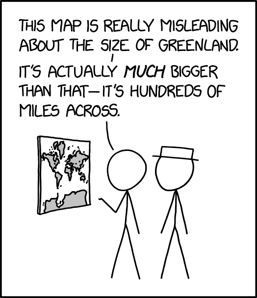
Zoom out in Google Maps or OpenStreetMap, and what do you see? The Mercator projection, with Greenland in all its inappropriately giant glory. (Apple Maps turns into a globe when you zoom out far enough, but Apple Maps are app-only.) The reason why this isn’t generally seen as a problem is that hardly anyone uses Google Maps as a world map: like topographic maps that use UTM, at close range Mercator works just fine.
While there are efforts under way to use other projections in web maps, it’s unlikely that the Mercator-vs.-Peters battle—a false dichotomy if there ever was one—will migrate to the digital arena.
Previously: The Peters Projection Comes to Boston’s Public Schools; In Defence of the Mercator Projection; How the Mercator Projection Won the Internet.
In Defence of the Mercator Projection
In a June 2015 piece for Al Jazeera America, history Ph.D. candidate Nick Danforth offered a contrarian opinion piece in defence of the Mercator projection. The usual (i.e. Peters) critique of the Mercator is that it emphasizes northern countries at the expense of equatorial countries. Danforth questions the premise behind that critique:
I first sided with the Mercator against its critics when, on one of the rare occasions I thought about Greenland, I realized just how rarely I thought about Greenland. Despite seeing it hanging there like a giant icy sword of Damocles atop every wall map, we just don’t seem to care about it. Antarctica, too, is massively inflated on the Mercator, to the point that it’s as big around as the entire earth. But few would argue that mapmakers intended to depict it as a superpower. Meanwhile, if maps lead us to ignore Africa, they should also lead us to treat cartographically bloated Canada as one of the most important countries in the world. We don’t.
He goes on to argue that if the Mercator projection was a reflection of European power, Africa would have been emphasized, not minimized.
Of all the problems with criticizing the way our maps depict Africa, the most ironic is that it ignores the continent’s history of colonialism. Consider the motives of a colonial-era British cartographer—perhaps the kind of guy who made this bold, colorful propaganda map […] showing off the queen’s dominions.
His incentive, if anything, would have been to make Africa appear as large as possible, since Britain then ruled a large share of it. With India along the same latitude, expanding the size of the earth’s equatorial region would have been a perfect way to color more of the map imperial pink.
Danforth studies Turkish history. His map blog is Mid Afternoon Map. [WMS]
Previously: How the Mercator Projection Won the Internet.
Further reading: Rhumb Lines and Map Wars: A Social History of the Mercator Projection by Mark Monmonier (my review).
How the Mercator Projection Won the Internet

I’ve said it before: if you want to start a fight among cartographers, ask them what their favourite map projection is. Earlier this week I did just that: I felt mischievous and wanted to try out Twitter’s polling feature, so I ran a poll asking my Map Room followers what the best projection for world maps was. And because I was feeling particularly mischievous, I made sure to include both the often-reviled Mercator projection and its antithesis, the Peters projection, rounding out the list with two less controversial choices: the Winkel tripel projection used by National Geographic, and the brand-new Patterson projection announced late last year.
The results of the poll were utterly unexpected: 42 percent chose the Mercator projection.
Continue reading “How the Mercator Projection Won the Internet”
Mercator Puzzle
The Mercator Puzzle is an excellent way to visualize the distortions inherent in the Mercator projection, which conserves angles (useful for navigation) by exaggerating size at the poles (problematic in virtually every other use). Click and drag the countries in this in-browser app to see just how dramatically larger or smaller they become as you move them closer to and further away from the poles. [Boing Boing]
Previously: Review: Rhumb Lines and Map Wars; Reversing the Mercator Effect.
You must be logged in to post a comment.