
 Published late last month, Mark Monmonier’s new book, Patents and Cartographic Inventions: A New Perspective for Map History (Palgrave Macmillan) is on a somewhat more arcane and non-obvious subject than his usual fare. It’s an exploration of the U.S. patent system that focuses on map- and navigation-related inventions. The publisher’s description: “In probing evolving notions of novelty, non-obviousness, and cumulative innovation, Mark Monmonier examines rural address guides, folding schemes, world map projections, diverse improvements of the terrestrial globe, mechanical route-following machines that anticipated the GPS navigator, and the early electrical you-are-here mall map, which opened the way for digital cartography and provided fodder for patent trolls, who treat the patent largely as a license to litigate.” Actually sounds interesting as hell; the book is quite expensive, though. Amazon, iBooks.
Mapping Global Landslide Susceptibility

NASA Earth Observatory notes the release of a new map of global landslide susceptibility that models the risks of landslides that are triggered by heavy rain. “The map is part of a broader effort to establish a hazards monitoring system that combines satellite observations of rainfall from the Global Precipitation Measurement (GPM) mission with an assessment of the underlying susceptibility of terrain.” [Geographical]
Amtrak Before and After
Following up on this post about maps of cuts to Amtrak, here’s a visualization from Will Geary showing a week of Amtrak trips before and after the proposed budget cuts. [CityLab]
Early French Maps of the Great Lakes
 On Tuesday, Jean-François Palomino of the Bibliothèque et Archives nationales du Québec gave a talk on early French mapmaking efforts in the Great Lakes region at the University of Michigan. I missed being able to tell you about it in advance, but student newspaper The Michigan Daily has a writeup. [WMS]
(Palomino is one of the co-authors of Mapping a Continent: Historical Atlas of North America, 1492-1814, the French edition of which is La Mesure d’un continent.)
‘Please Return to the Map Center’

April 19th: The day the Leventhal Map Center finally snapped.
Burmese Maps at Cambridge

Natasha Pairaudeau: “Imagine maps as big as bedsheets, and then imagine the sheets big enough for beds made wide enough to sleep extended families. Only such a double stretch of the imagination can provide the scale of the three Burmese maps in the University Library’s collection, which have recently been made available online in digital format.” [Cartophilia]
Tube Maps of the Thames
Transport for London also operates river buses along the Thames; their maps of the London River Services are very much in the Tube map vein, in both tourist and non-tourist versions:
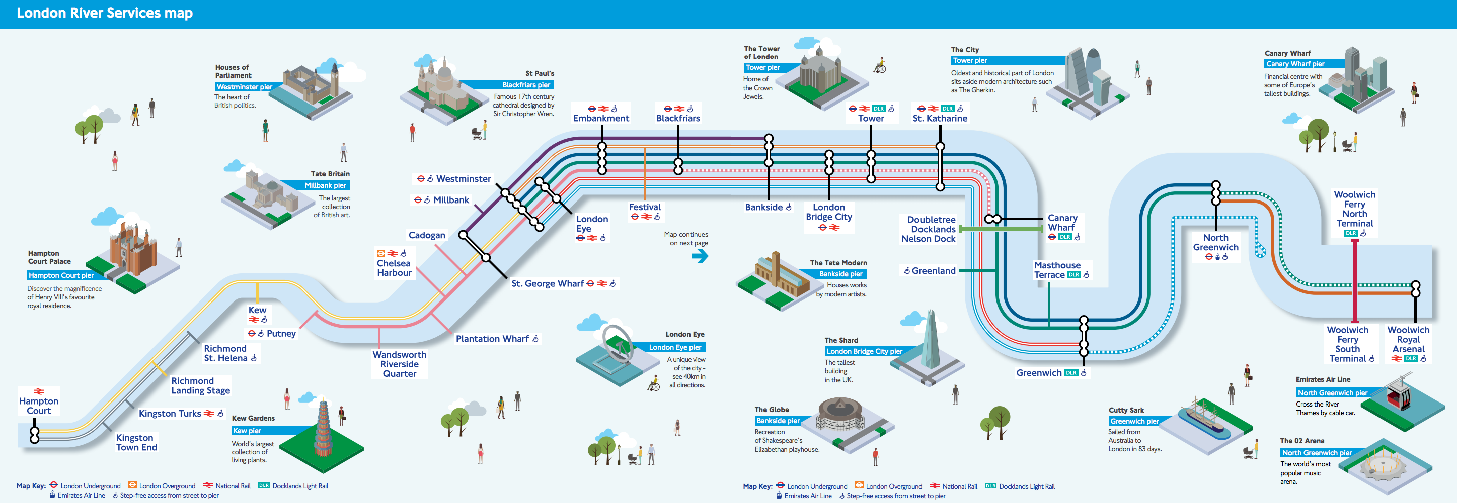

Of the tourist version Ollie O’Brien of Mapping London says this: “We like the pseudo-tube-map styling, although it could of course be simplified even further, with the Thames just being shown as a straight line. The inclusion of isometric squares showing the major landmarks near each pier is a nice touch. TfL has never really decided whether its river services are for tourists or commuters, but this map should satisfy both.”
The Only Star Chart You’ll Ever Need

The successor to the Only Fantasy Map You’ll Ever Need is the Only Star Map You’ll Need, a riff on maps of galactic empires and space-opera tropes that emerged from the discussion in this thread. It’s a few years old, but Boing Boing spotted it yesterday.
Previously: Mapping Star Trek.
The Earth at Night, Updated

NASA has released updated global maps of the Earth at night. The so-called “black marble” maps show where human activity lights up the darkness. NASA’s page highlights some of the differences between the 2016 and 2012 versions of the map with before/after interactive sliders. John Nelson has tried something different: overlaying the 2016 map on the 2012 map with a clipping mask shows newly illuminated parts of the globe as dark patches.

New Google Earth Launches
A new version of Google Earth launched today. Unlike previous versions, the desktop version runs in a web browser rather than a standalone app. Also unlike previous versions, it’s no longer cross-platform: for now at least, the desktop version only runs in Chrome, and the mobile app is Android-only.
Frank Taylor has been covering the new release at the venerable Google Earth Blog and has a first review.
For my part, I’ve poked around in it in Chrome a bit and I found it fairly responsive and easy to use. If it runs this well in the browser I can see how a standalone app would be redundant; this is a better delivery method. I would much prefer it, though, if it also ran on platforms that didn’t belong to Google.
Update, 21 April: Coverage from AFP and Geoawesomeness focuses on the features, which I gave short shrift to above.
When Users Don’t Interact with Interactive Maps
Brian Timoney responds to the argument that few users actually interact with interactive infographics with some thoughts on how that might apply to online maps, with their sometimes-complicated, GIS-derived user interfaces. His suggestions? Static maps, small multiples, animated GIFs, text-based search—simpler, more user-friendly, more familiar UIs and ways to present mapped data.
Mapping Amtrak Cuts
President Trump’s proposed budget would end funding for Amtrak’s long-distance passenger routes, leaving only the Northeast Corridor and state-funded lines. Maps of the lines that would be closed share the problems of Amtrak network maps in general. Take USA Today’s map from its 12 April article on the subject:

Like electoral maps that make large, less-populated areas look more important than densely populated areas, this map is somewhat deceptive: it distorts the extent of the cutbacks because it shows lines rather than trains. There are, for example, a lot more trains in the Northeast Corridor than run between Chicago and the Pacific Northwest (the daily Empire Builder). State-run services tend to have lots of lines and trains over short distances that are too small to see clearly on this map. Adding connecting services (which are usually bus routes) adds even more detail, and clutter, to a small map.
Cameron Booth, for his part, visualizes the proposed cuts by starting with his Amtrak Subway Map and greying out the lines that would be cut. This doesn’t solve the number-of-trains problem, but it does provide a clearer sense of what’s happening to the network.
Proposed budget could eliminate 15 long-distance Amtrak trains, which would leave the notionally "national" rail network looking like this: pic.twitter.com/OkBTsz8hCg
— Transit Maps (@transitmap) April 15, 2017
Previously: Cameron Booth’s Amtrak Subway Map.
Drawing in Windows Maps
“Windows 10’s stock Maps app has a drawing tool that’s quite useful, especially if you have a Windows 10 touchscreen PC,” writes Matt Elliott at CNet. In addition to scribbling notes, you can draw a line between two points to get directions and measure the distance of a drawn route. My household is all-Apple so I miss out on things like this on other platforms. [Gretchen Peterson]
The 74 on Boston Schools and the Peters Map
Education news website The 74 has its own coverage of the Boston schools/Peters map controversy (is it safe to call it a controversy?), with extensive quotes from Matthew Edney, who does not mince words. (Comparing both projections to Comic Sans? Ouch.) [Caitlin Dempsey]
Previously: More on Boston Schools and the Peters Map; The Peters Map Is Fighting the Last War; The Peters Projection Comes to Boston’s Public Schools; In Defence of the Mercator Projection; How the Mercator Projection Won the Internet.
How Many Fake Business Listings Are There on Google Maps?
Bogus business listings on Google Maps have been a thing for a while; a new research paper, authored by researchers at Google and the University of San Diego, tries to quantify the scale and scope of the problem. The New Scientist reports:
To analyse the scope of this abuse, the group looked at over 100,000 listings that the Google Maps team had identified as abusive between June 2014 and September 2015. The fraudulent listings most often belonged to services like locksmiths, plumbers and electricians.
Overall, less than one per cent of Google Maps listings were fraudulent, but pockets of fake listings emerged. In West Harrison, New York, for example, more than 80 per cent of locksmiths listed were scams. The U.S. was home to over half of the fraudulent listings, followed by India with 17.5 per cent.