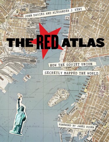
The Future Mapping Company looks at the unrecognized women of cartography. They point out that there are only two women (Marie Tharp and Jessamine Shumate) among the 200-plus names on Wikipedia’s list of cartographers, and come up with 10 names, some of which you might have heard of (Tharp, Phyllis Pearsall), others maybe you haven’t, but should have—and now you have. [NLS]
Atlas Obscura Wants a Map of Your Dream Island
Atlas Obscura is asking readers to draw a map of their perfect dream island and send it in to them. That’s something I can absolutely get behind.
If you could make an island to your exact specifications, what would it look like? What would make it unique—the true island of your individual dreams?
Maybe your island is made entirely of recycled bottles, or only accepts currency featuring Darth Vader. Perhaps your island is set up as a villains’ lair, or populated with magical creatures that don’t exist anywhere else in the world. Is your island an expansive paradise that will take years to explore, or a simple spot of sand surrounded by boundless ocean? Does it have a treehouse? A mansion? Is there a skull-shaped cave? A water park? A hidden base in a volcano? Mischievous monkeys? Pirate ghosts? A lost society of evolved super-beings?
You’ve got until, uh, tomorrow afternoon. Atlas Obscura will publish their favourites on Friday.
Indigenous Place Names in Canada
The University of Maine’s Canadian-American Center has published a map of indigenous place names in Canada:
Commissioned by Dr. Stephen J. Hornsby, Director of the Canadian-American Center, Coming Home to Indigenous Place Names in Canada was researched and designed by Dr. Margaret Wickens Pearce. The map depicts Indigenous place names across Canada, shared by permission of First Nations, Métis, and Inuit communities and people. The names express territorial rights and describe the shapes, sounds, and stories of sovereign lands. The names mark the locations of the gathering places, the communities, the places of danger and beauty, and the places where treaties were signed. The names are ancient and recent, both in and outside of time, and they express and assert the Indigenous presence across the Canadian landscape in Indigenous languages.
The map is available for purchase; a PDF is available for download for personal or educational use. [MAPS-L]
Previously: Mi’kmaw Place Names Digital Atlas.
Two Different Ways to Make Maps for Self-Driving Cars
Another piece on the various attempts to create detailed, high-definition maps for self-driving cars, this time from Bloomberg’s Mark Bergen, who views it through the prism of Google’s efforts in that space, and whether its competitors will be able to stop Google from dominating the high-definition mapping space the way it has come to dominate consumer maps.
There are, Bergen reports, two ways to make high-definition maps for self-driving cars:
The companies working on maps for autonomous vehicles are taking two different approaches. One aims to create complete high-definition maps that will let the driverless cars of the future navigate all on their own; another creates maps piece-by-piece, using sensors in today’s vehicles that will allow cars to gradually automate more and more parts of driving.
Alphabet is trying both approaches. A team inside Google is working on a 3-D mapping project that it may license to automakers, according to four people familiar with its plans, which have not previously been reported. This mapping service is different than the high-definition maps that Waymo, another Alphabet unit, is creating for its autonomous vehicles.
Waldo R. Tobler, 1930-2018
The influential geographer Waldo R. Tobler died last month at the age of 88. Tobler, who taught at the University of Michigan and UC Santa Barbara, was best known for his First Law of Geography, which he coined in 1970: “Everything is related to everything else, but near things are more related than distant things.” See obituaries from the AAG and UC Santa Barbara.
Update, 8 March: Obituary in the Santa Barbara Noozhawk.
Update, 27 July: Obituary in Cartography and Geographic Information Science.
Dot Density Maps of Belgium

Maarten Lambrechts discusses how to make a dot density population map, in technical detail. He uses QGIS to process data for his home country of Belgium. The map above is one result (he also zoomed in on Brussels).
The Chiswick Timeline

The Chiswick Timeline, a public mural of historic maps of Chiswick, London, situated along the walls of the underpass next to the Turnham Green tube station, opened earlier this month. A project of Abundance London, the mural is a series of panels reproducing maps of Chiswick from as early as the late 16th century, and traces its development into the London suburb it is today. An accompanying fold-out book is also available. [Londonist]
Apple, Google and Waze: Which Is Most Accurate?
Artur Grabowski spent most of 2017 testing three mapping apps—Apple Maps, Google Maps and Waze—to see which app was the most accurate in terms of travel time to destination. His questions: which app estimated the shortest travel times, which app actually got him to his destination in the least amount of time, and how much did each app over- or underestimate travel times? In the end, based on 120 trips in the Bay Area, roughly 40 using each service, Artur found that Apple’s estimates were the most reliable (indeed, Apple underpromised and overdelivered), but while Waze promised the shortest travel times, those promises were usually overly optimistic; it was Google Maps that provided the shortest travel times.
Why does Apple underpromise and overdeliver, while Waze does the opposite? Artur suspects it’s because Waze needs to monetize its app with ads, and Apple doesn’t:
For Apple, Maps is a basic solution for its average user who wants a maps solution out of the box. Apple Maps does not directly drive ad or subscription revenue for Apple so there is less reason for Apple to incentivize iOS users to use Apple Maps over other solutions. However, Apple does care about user experience, and sandbagging trip time estimates so that users arrive at their destination on time results in a great user experience. Hence, I believe that Apple is intentionally conservative with estimated arrival times.
At the other extreme, Waze (Alphabet) makes money through ads when you use their app. What better way to get people to use your navigation app than by over-promising short trip times when no one takes the time to record data and realize that you under-deliver? If an unsuspecting user opens Apple Maps and sees a 34-minute route and compares that to 30 minutes in Waze, the deed is done. Now Waze has a life-long customer who doesn’t realize they’ve been hoodwinked and Waze can throw at them stupidly annoying ads.
A Fantasy TTC Subway Map
There have been plenty of fantasy transit network maps—maps that imagine the subway, rail or bus system they think their city should have. BlogTO points to a good one: a map that reimagines the Toronto Transit Commission’s subway network posted to Reddit by architecture student Henry Lin. BlogTO calls it “one of the most ambitious and beautiful (like, if you’re into that stuff) yet. It’s the subway map Toronto deserves to have—though we probably never will. I mean, if a one stop subway extension costs $3.35 billion, this system would cost a few trilly to build, at least.” Lin’s done a few maps like this one that seem be modified from the original maps (see, for example, Ottawa’s or Montreal’s); the point of exercises like his, though, isn’t the originality of the design, but imagining the expanded network.
Territory, a Literary Project
Territory is an online literary magazine (or what they call “a literary project”) whose subject is “territories and the maps that will always fail to capture them. It’s about the naive dream of objectivity, and how we use the act of representation to both hide and broadcast our subjectivities.” Seven issues so far; they’re organized into what they call an atlas, and comprise various fictions, illustrations and other works of art. It will take me some time to go through it all. [Leventhal]
Mapping Global Sea Level Rise
Global sea level rise has been accelerating in recent decades, according to a new study based on 25 years of NASA and European satellite data. This acceleration has been driven mainly by increased ice melting in Greenland and Antarctica, and it has the potential to double the total sea level rise projected by 2100[. …]
The rate of sea level rise has risen from about 2.5 millimeters (0.1 inch) per year in the 1990s to about 3.4 millimeters (0.13 inches) per year today. These increases have been measured by satellite altimeters since 1992, including the TOPEX/Poseidon, Jason-1, Jason-2, and Jason-3 missions, which have been jointly managed by NASA, France’s Centre national d’etudes spatiales (CNES), the European Organisation for the Exploitation of Meteorological Satellites (EUMETSAT), and the U.S. National Oceanic and Atmospheric Administration (NOAA). The maps on this page depict the changes in sea level observed by those satellites between 1992 and 2014.
Connecting Texas: Map Exhibition in San Antonio
Connecting Texas: 300 Years of Trails, Rails, and Roads, an exhibition of 300 years’ worth of maps and documents from the Texas General Land Office and several private map collectors, is on now at the Witte Museum in San Antonio, and runs until 17 September 2018. More from the Texas General Land Office.
Some of the maps presented in this exhibit include Stephen F. Austin’s landmark 1830 map of Texas, unique plat maps that show Native American trails, one-of-a-kind manuscript military maps of the Republic and State of Texas, German immigration maps of the Texas Hill Country, hand-drawn railroad maps created to illustrate the progress of construction of railways across the state, cattle and trail maps from the 1880s, and interesting maps of Hemisfair ’68 in San Antonio, and much more.
Previously: And Now Some Map News from Texas.
Some Gun Maps
Reddit user academiaadvice maps the rate of gun homicides per 100,000 residents by state from 2007 to 2016 (above).
From 2015: Business Insider’s map showing, by state, the rate of gun ownership. Note that the two maps do not precisely correlate. [both via Boing Boing]
The Washington Post has maps of Marjory Stoneman Douglas High School in Parkland, Florida—where last week’s shooting took place—and its surrounding area.
Mapping ‘River of Teeth’

Sarah Gailey is the author of two novellas, River of Teeth and Taste of Marrow, about an alternate America that domesticated hippos, which promptly ran swam feral in the Mississippi. In this Tor.com post, she describes how there wasn’t supposed to be an accompanying map, but one got made anyway.
It had never occurred to me to draw a map. I had written a story that wasn’t an epic, high-fantasy journey across nations. Why would I draw a map? Maps are for bigger stories, right? How does one go about drawing a map? I stayed up that night googling cartography. My search was not fruitful. I tucked that particular insecurity into the part of my brain where I catalogue all my shortcomings as a writer, and I did my best to forget about it.
Imagine, then, my abject horror when my River of Teeth editor, Justin Landon, sent me the following message: “oh hey, btw, do you have a rough map you’ve done for RoT?”
I said no, and he asked me to put something together. I hedged heavily, hoping that if I said “I will probably do a bad job” enough times, my editor might say “oh, ha ha, just kidding, I would never make you do something this hard! Please, go enjoy a cocktail.”
Reader, he made me do a map. I gritted my teeth, grabbed a piece of paper and an existing map of Louisiana, and braced myself for despair. You’ll never believe what happened next.
I had so much fun.
Pennsylvania Supreme Court Imposes New Congressional Map

A major development yesterday in the case of Pennsylvania’s gerrymandered congressional electoral district map, which was thrown out as unconstitutional last month by the state’s supreme court. The legislature and governor having failed to submit a new electoral district map by the court’s deadline, the court has imposed what it calls a remedial plan, drawing a new congressional electoral district boundaries for the state of Pennsylvania (court documents). These boundaries will take effect in the primary vote next May, but not next month’s special election.
The general consensus is that the map is more favourable to Democrats than the Democrats’ own proposals: under this map, for example, Clinton would have won the vote in eight seats to Trump’s ten; under the old map, she won the vote in six to Trump’s twelve. Republicans are already planning an appeal. The New York Times does a map-heavy deep dive into the new district boundaries: which areas they include and exclude, and their electoral implications.
Suddenly rendered moot, but still worth pointing to: Philly.com’s interactive comparison of congressional map proposals. There were a lot of them, before the court put its foot down yesterday, and this website is a similarly deep dive, analyzing each rigorously.