
 Belatedly noted, thanks to a story in Penn State News last month: Cynthia Brewer was awarded the American Geographical Society’s O. M. Miller Cartographic Medal at the AGS’s symposium last fall. Brewer, a geography professor at Penn State since 1994, is the author of Designing Better Maps: A Guide for GIS Users (previously) and the creator of the ColorBrewer colour design tool for cartographers. The Miller medal is no minor award: this is only the eighth time it’s been awarded since it was created in 1968; past recipients have included Waldo Tobler, Arthur Robinson, Mark Monmonier and, in 2017, John Hanke and Brian McClendon (basically, the team behind Google Maps). Brewer is the first woman to receive the award.
Kenneth Nebenzahl, 1927-2020
 Antiquarian map and rare book dealer Kenneth Nebenzahl died last month at the age of 92, the Chicago Sun-Times reports. The author of numerous book about antique maps and map history, most recently (as far as I can tell) Mapping the Silk Road and Beyond: 2,000 Years of Exploring the East (Phaidon, 2011), Nebenzahl also founded the Kenneth Nebenzahl, Jr., Lectures in the History of Cartography, in memory of his son; several of said lecture series have been published by the University of Chicago Press. His obituary. [Tony Campbell]
James Niehues Creates an Amtrak Network Map Full of Ski Hills

James Niehues is legendary for his pictorial maps of ski resorts—a collection of them was published last year—so it’s no surprise that when Amtrak approached him to create a route map for their on-train magazine, The National, he remained true to his particular idiom, “taking a few liberties to highlight the country’s major ski regions—the Great Plains are shrunken, while the Rockies loom large. ‘I hope nobody takes it too seriously,’ he cautions.”
Previously: Book of Niehues Ski Resort Art Now Available; Crowdfunding a Book of James Niehues’s Ski Resort Art; A Video Profile of James Niehues, Ski Resort Map Artist; James Niehues Passes the Torch; James Niehues’s Ski Resort Maps; James Niehues Profile.
Google Maps Turns 15
 Google is marking Google Maps’s 15th birthday with updated iOS and Android apps that reorganize everything into five tabs, new crowdsourced travel data, and a new app icon. (The update hasn’t turned up for me yet, but that’s not unusual.) Also with a fair number of reminiscences and corporate
 navel-gazing self-reflection. CNBC, Engadget, The Verge.
The Map Books of 2020 page is now live. It lists all the books scheduled to come out this year—at least the ones I’m aware of. I’ll do my best to keep this page as up to date as possible. If there’s a book coming out in 2020 that should be on this page, let me know: I’m keen to find out about any and all books on cartography, maps and related subjects that are in the works.

Inō Tadataka, Surveyor of Japan

 Britain had the Ordnance Survey, France the Cassini family. Japan had Inō Tadataka (伊能 忠敬, 1745-1818), who over a series of expeditions in the early 19th century conducted a systematic survey of Japan using modern techniques. Writing for Nippon.com, Inō’s biographer, Hoshino Yoshihisa, writes a long introduction to Inō’s life and work that is well worth the read. [Tony Campbell]
For more on the history of Japanese cartography, see Cartographic Japan, a collection of academic essays edited by Kären Wigen, Sugimoto Fumiko and Cary Karacas that was published by the University of Chicago Press in 2016.
Primers on Google Earth and Google’s Imagery
A nice, accessible (if overboosterish) history and overview of Google Earth—which despite its deprecation on the desktop is still a thing—from Sarvish Mathi at OneZero. [GIS Lounge] Related: this Google blog post on their imagery, how they get it and how it’s processed.
99 Smartphones Create Virtual Traffic Jam
Simon Weckert created a virtual traffic jam in Berlin by pulling 99 used smartphones in a wagon: a large number of phones moving slowly looks like a traffic jam to Google Maps. “Through this activity, it is possible to turn a green street red which has an impact in the physical world by navigating cars on another route to avoid being stuck in traffic.”
Google’s statement to 9to5Google suggests that they’re taking Simon’s hack in stride: “Traffic data in Google Maps is refreshed continuously thanks to information from a variety of sources, including aggregated anonymized data from people who have location services turned on and contributions from the Google Maps community. We’ve launched the ability to distinguish between cars and motorcycles in several countries including India, Indonesia and Egypt, though we haven’t quite cracked traveling by wagon. We appreciate seeing creative uses of Google Maps like this as it helps us make maps work better over time.”
So people fed up with traffic being rerouted onto their residential streets could, conceivably, hack that traffic elsewhere—but not for much longer.
Unified Geologic Map of the Moon

A new unified geologic map of the Moon, based on digital renovations that updated 1970s-era geologic maps to match more recent topographic and image data gathered by lunar orbiters, was released by the USGS last month. The map is “a seamless, globally consistent, 1:5,000,000-scale geologic map”; the paper version (25 MB JPEG) provides azimuthal projections beyond the 55th parallels and an equirectangular projection between the 57th parallels. [Geography Realm]

Previously: Lunar Geology and the Apollo Program.
Update, 22 April 2020: Version 2 of this map was released in March to address a number of errors in the first version.
Apple’s New Maps Now Cover the Entire United States
 Last year Apple rolled out its new map data in stages, with new coverage being added on a state-by-state or region-by-region basis. Yesterday Apple announced that its new map data now covers the entire United States (except, Justin O’Beirne points out, the territories). This is slightly later than the end-of-2019 target they’d been aiming for. Europe is scheduled to start receiving the new map data this year.
Matthew Panzarino, who broke the news in 2018 that Apple was building its own map data, said in a tweet that “Maps is probably the biggest software turnaround in Apple’s modern era—an interesting case study for a company that rarely needs turnaround efforts.”
Previously: Apple Maps Data Being Completely Rebuilt for iOS 12; A Look at the Rebuilt Apple Maps; Apple Maps at WWDC 2019: New Map Data, Look Around and More; Apple’s New Map Data Rolls Out Region by Region.
Mapbox Elections

This week Mapbox launched a tool for the upcoming 2020 U.S. elections: Mapbox Elections, “a resource to help individuals, journalists, and organizations cover the elections, analyze the results, and build modern maps to display it all.” Their first product is a dataset including U.S. presidential election results from 2004 to 2016.
George III’s Collection of Military Maps Now Online

More than 2,000 military maps and related items collected by George III have been posted online by the Royal Collection Trust to commemorate the 200th anniversary of his death. As the Guardian reports, the collection “features material from the 16th to 18th centuries, from highly finished presentation maps of sieges, battles and marcheso rough sketches drawn in the field, depictions of uniforms and fortification plans, providing a vivid contemporary account of important theatres of war in Britain, Europe and America.”
George III was apparently an avid map collector. At his death his collection numbered some 55,000 maps: the maritime and topographic maps were given to the British Library; the military maps were kept by George IV for his own use. “Not all of them were collected by George III in the first instance: like most collectors, he not only purchased individual items but also acquired the collections of others.” [Tony Campbell]
Update, 22 Apr 2020: From February, Smithsonian Magazine’s coverage.
xkcd: Reaction Maps
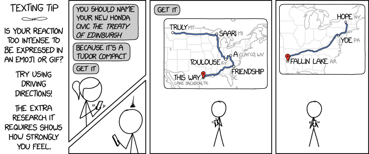
The latest xkcd comic suggests a fiendish way to express yourself: by creating phrases from driving direction waypoints.
An obvious upgrade would be to use one or more of the places from the Magnificently Rude Map of World Place Names (previously).
‘Cartograph’: History of a Back Formation
Inspired by its appearance in a recent science fiction novel,1 Matthew Edney explores the history of the odd word “cartograph”—a back formation of “cartography” whose existence suggests circumstances in which “map” is somehow insufficient. Edney traces three kinds of uses of the term: one referring to an early 20th-century instrument; one as a synonym for pictorial maps in the mid-20th century; and one, post-1980, that refers to map products that don’t, for some reason, adhere to Western cartographic ideals. (This piece expands on Edney’s book-length critique of the normative ideal of cartography, Cartography: The Ideal and Its History, which I reviewed here last October.)
Official and Unofficial German Rail Network Maps Compared

Deutsche Bahn

u/theflyingindonesian
On the left, Deutsche Bahn’s official network map of all Intercity and Intercity Express routes in Germany (PDF). On the right, a much more ambitious map of said network by Reddit user theflyingindonesian. Cameron Booth much prefers the unofficial map: while the official map is “incredibly average” (a putdown I will have to make a point of remembering), the unofficial map is “a major upgrade” that is “infinitely superior” to the official map. “I particularly like the dead straight trajectory of the lines from Hamburg down to Fulda, and the clear treatment of the potentially difficult and convoluted Rhine-Ruhr area. I also like the way that the routes for trains that pass through major stations get a ghosted-back line to link the routes across the (sometimes very large) station rectangles.” I know which one I’d rather spend a long time staring at.