
The family of a man who died after driving off a collapsed bridge is suing Google; they allege that despite multiple reports from users, Google Maps continued to mark the bridge in North Carolina, which partially collapsed in 2013, as passable, directing him and other drivers across it. The family is also suing local companies for failing to maintain the bridge or put up barricades and hazard warnings.
Category: Map Errors
What3Words Confusion Rate Under Scrutiny
The What3Words geocoding service assigns a three-word mapcode to every three-square-metre patch on the planet, the premise being that three words are easier to remember and share than longitude and latitude to the equivalent decimal places. But the main complaint about What3Words (apart from the proprietary nature of its algorithm and database) is that it’s possible to get even those three words confused, especially in contexts where plurals and homophones may not be heard clearly, or where similar combinations of words are close enough to each other that they can be mistaken for each other. There’s actually an entire website dedicated to chronicling errors in W3W.
W3W maintains that their algorithm keeps similar combinations “so far apart that an error is obvious. We also worked hard to remove homophones and near homophones like sale and sail.” They rate the the chance of two confusing combinations appearing close enough to be unclear at about 1 in 2.5 million. But in a new analysis of the algorithm, currently in preprint, computer scientist Rudy Arthur argues that despite W3W’s claims this chance of confusion is far higher, and warns against adopting W3W as critical infrastructure (it’s used by emergency services, particularly in the U.K.) without testing and comparing against available alternatives. [The Register]
Previously: What3Words Hasn’t Had the Greatest Couple of Months: A Roundup.
Can Places on Google Maps Be Trusted?
Google has been plagued with fraudulent and scammy business listings on Google Maps for years (1, 2). Last April, Google posted about the steps it takes to combat fake content. James Killick points to more recent incidents and wonders whether places on Google Maps can still be trusted; given that he was able to add a fake listing and have it appear on the map within hours, signs point to no.
‘One Bad Map a Day in February’

It’s like the #30daymapchallenge in November, in which mapmakers are challenged to make a map a day on a given daily theme, only the reverse: the MapFailbruaryChallenge is about making a bad map on a given daily theme. “The idea is to create the worst map possible.” Bad maps happen; will a deliberately bad map be better or worse? Either way, it’s probably worth stocking up on popcorn for when maps with the #mapfailbruarychallenge hashtag start showing up on our timelines.
(Failbruary. Fai-EL-bru-AIR-y. Say that ten times. And resign yourselves to the fact that Reddit is probably going to kick everyone’s ass on this.)
Update, 19 Jan: There’s an official website now.
All Online Maps Don’t Suck?
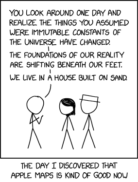 The notion expressed in Monday’s xkcd, particularly in the alt-text—
OpenStreetMap was always pretty good but is also now really good? And Apple Maps’s new zoomed-in design in certain cities like NYC and London is just gorgeous. It’s cool how there are all these good maps now!
—is unexpectedly more on point than not.
In 2013 I wrote a screed saying that all online maps sucked: that no one map platform had a monopoly on errors. At the time Exhibit A for the suckiness of online maps was Apple Maps; since then, and particularly since 2018, Apple has been putting in the work. Not that they’re done, but still: the product is fundamentally better now than it was then. And it’s not like the other platforms have been idle in the meantime. No one platform is going to achieve Cartography’s ideal of the universal and accurate Map—that’s inherently unachievable—but better? I’ll take better.
Engst’s Experience with Mapping Services
Adam Engst of TidBITS: “I’ve been working with mapping services a lot of late and wanted to share some of my experiences in the hope that they’ll help you boost your mapping game beyond simple navigation.” Mostly focuses on fitness-related mapping, but also on how to correct errors on online maps.
Google Rerouted Traffic Up Poorly Maintained Mountain Roads During a Blizzard

Last week, when a snowstorm closed Interstate 80 east of Sacramento, Google Maps started redirecting traffic up poorly maintained mountain roads, which is about as good an idea during a blizzard as it sounds.
.@googlemaps This is an abject failure. You are sending people up a poorly maintained forest road to their death in a severe blizzard. Hire people who can address winter storms in your code (or maybe get some of your engineers who are stuck in Tahoe right now on it). pic.twitter.com/IzagAXzBtA
— Dr. Crystal A. Kolden 🔥 (@pyrogeog) December 28, 2021
Other dispatches from Twitter allege that the service—particularly its mobile app—directed people to closed-off highways, mountain passes and lakeside roads to get around. This is in direct contrast to Caltrans’ messaging to avoid workarounds. Caltrans District 3 spokesperson Steve Nelson told SFGATE on Monday that they were seeing drivers trying to skirt highway closures with side streets. “They’ll take side roads and try and sneak past the closures, and that never ends well,” he said.
Google engineer Sören Meyer-Eppler responded on Twitter to spell out some of the technical and logistical problems involved in rerouting traffic during bad weather: the difficulty in finding timely data (and in such cases data need to be really timely) and the risk of false positives. More at Jalopnik.
This Map-Print Basketball Hurts My Brain
 There is something decidedly off about a map-print basketball that stretches a Mercator projection across the basketball’s surface instead of, you know, doing it like a globe. Why? Why would they do such a thing?
It’s a Spalding ball exclusive to Urban Outfitters, it costs $29, and it hurts my brain. [r/Maps]
Google Maps Called Out for Showing ‘Potentially Fatal’ Mountain Routes
The Guardian: “Scottish mountaineering charities have criticised Google for suggesting routes up Ben Nevis and other mountains they say are ‘potentially fatal’ and direct people over a cliff.” Google Maps’s issue with Ben Nevis is that it routes to a parking lot nearest the summit, then more or less straight-lines it from there; as a dotted line it’s meant to indicate a route very imprecisely, but it also corresponds to a higher-difficulty ascent route that could land even experienced hikers in trouble. Not meant to be taken by people who don’t know what they’re doing—the people who might have no clue that it’s a bad idea to use Google Maps for mountain hiking, for example.
To be clear, I think this one’s on Google. A lot of people trust online maps implicitly because they have poor navigation skills and have a hard time overruling what the directions tell them: this is why people keep driving into rivers and onto tracks. It’s a design failure not to account for this in every circumstance.
The COVID-19 Infodemic and Online Maps
So many COVID-19 maps: some misleading, some mislabelled or with other design flaws, some lacking key information, some misunderstood or misused. On GIS Lounge, Mark Altaweel explores how the COVID-19 “infodemic”—the overabundance of information, some reliable, some not—has manifested itself in online coronavirus maps.
When Google Won’t Let You Fix a Map Error
A couple of years ago, Amanda Ripley discovered that Google Maps had two locations listed for her home, which made giving directions difficult. As the change propagated to services that used Google Maps, the problem worsened. Deliveries kept turning up at the other location. But it turned out that there was no way to notify Google of this specific problem. She had to use her media credentials as a workaround to get it fixed. (Check out Google’s statement at the end: it’s a textbook case of customer service gaslighting.)
Whimsical Drawings Hide in Punctilious Swiss Topo Maps
Swiss topographic maps are legendary for their precision, but that hasn’t stopped cartographers from having a little fun. As Zoey Poll reports for AIGA Eye on Design, whimsical little drawings can be found hidden in some editions of Swiss topo maps:
But on certain maps, in Switzerland’s more remote regions, there is also, curiously, a spider, a man’s face, a naked woman, a hiker, a fish, and a marmot. These barely-perceptible apparitions aren’t mistakes, but rather illustrations hidden by the official cartographers at Swisstopo in defiance of their mandate “to reconstitute reality.” Maps published by Swisstopo undergo a rigorous proofreading process, so to find an illicit drawing means that the cartographer has outsmarted his colleagues.
It also implies that the mapmaker has openly violated his commitment to accuracy, risking professional repercussions on account of an alpine rodent. No cartographer has been fired over these drawings, but then again, most were only discovered once their author had already left. (Many mapmakers timed the publication of their drawing to coincide with their retirement.) Over half of the known illustrations have been removed. The latest, the marmot drawing, was discovered by Swisstopo in 2016 and is likely to be eliminated from the next official map of Switzerland by next year. As the spokesperson for Swisstopo told me, “Creativity has no place on these maps.”
The article suggests these drawings are a coping mechanism, an opportunity to blow off a little steam. I can believe it. [r/MapPorn]

In Search of Lost Islands
We expect maps to tell the truth; indeed we need them to on a fierce and primal level. “I believe cartography enjoys an enviable position of credibility and confidence among the people who see it. If you see it mapped, you believe,” wrote Charles Blow last fall; he was writing in response to Trump’s petty defacement of a hurricane forecast map with a marker. The reaction to Trump’s stunt, was, I thought, revealing. It’s part and parcel with what Matthew Edney refers to as the ideal of cartography: striving toward a universal, unbiased and perfect map.
When a map has a mistake on it, when it’s wrong, it does something funny to our heads. We obey our phones and dashboard GPS navigators even when they send us off a cliff. We concoct nutty theories about ancient civilizations because a 16th-century portolan chart had a funny bend on a coastline. We wonder, because someone wrote “here be dragons” on a map, whether dragons were actually real. We make brain pretzels trying to force maps to be truthful even when they are manifestly wrong.1
Maps have to tell the truth. They simply have to. Maybe that’s why stories about mistakes on the map, and the havoc those mistakes cause, fascinate us so much. Which brings me to three books, all published for the first time in 2016, that talk about map errors of an older kind: islands and other features that appeared on maps, sometimes for centuries, that in the end turned out not to exist.
Recent Google Maps Errors
Map data is not perfect and users are too trusting. They believe maps to be accurate, and the map data that GPS receivers, online maps and smartphones rely on is riddled with a thousand insignificant errors that show up in unexpected cases. Whenever we read a story about some driver getting themselves into trouble because they followed the directions their GPS receiver or phone gave them, that’s what caused it.
Take, for example, last month’s incident where Google Maps’ response to a traffic accident was to route traffic heading toward Denver International Airport along a private dirt road that was muddy and nearly impassible due to recent rains: about a hundred cars got stuck. That Google Maps thought the muddy part of East 64th Avenue was a viable route would not likely have been spotted were it not for the accident; said accident routed dozens of drivers along an unfamiliar route that they had no real option other than to trust Google on. [Jalopnik]
Meanwhile, see Dan Luu’s Twitter thread on Google Maps (and other map providers’) errors, their persistence, and the trouble it can sometimes take to get them dealt with.
Millions of Business Listings on Google Maps Are Fake: WSJ
The Wall Street Journal goes in-depth on a problem Google Maps has had for years: fake and deceptive business listings posted by scam artists that crowd out legitimate local businesses—as many as 11 million such listings at any given moment, according to experts.
Online advertising specialists identified by Google as deft fraud fighters estimated that Google Maps carries roughly 11 million falsely listed businesses on any given day, according to a Journal survey of these experts.
They say a majority of the listings for contractors, electricians, towing and car repair services, movers and lawyers, among other business categories, aren’t located at their pushpins on Google Maps. Shams among these service categories, called “duress verticals” inside Google, can snag people at their most vulnerable.
Those experts and Google disagree as to the extent of the problem. (Which is exacerbated by how easy it is to set up a business listing.) And the scam artists aren’t simply displacing local businesses: they’re resorting to outright extortion: pay up, or we’ll swamp you with bogus listings. [Engadget, The Verge]