
The upcoming film Barbie has been banned in Vietnam, the Washington Post reports, because it apparently depicts a map showing the nine-dash line—the line that depicts China’s territorial claims in the South China Sea. That line, and those claims, enclose the Paracel Islands, which Vietnam also claims as its territory. Blame Hollywood’s aversion to getting banned in the much larger Chinese market for not showing the nine-dash line, I guess; while Vietnam has a history of banning films for this reason (including, per the nine-dash line Wikipedia page, the recent films Abominable and Uncharted), it’s not remotely the only state that indulges in this sort of thing.
Author: Jonathan Crowe
Jonathan Crowe blogs about maps at The Map Room. His essays and reviews have been published by AE, Calafia, The New York Review of Science Fiction, the Ottawa Citizen, Strange Horizons and Tor.com. He lives in Shawville, Quebec.
Cartography and Geospatial Accounts on Mastodon
If you’re trying out Mastodon in the wake of Twitter’s latest fail (and given the uptick in new followers I’ve seen over the past few days, it seems more than a few of you are) but aren’t sure who to follow, here are two curated lists of cartography, geospatial, GIS and map-related accounts on Mastodon for you to follow: one from Florian Ledermann, the other from Jorge Sanz.
(The Map Room’s Mastodon account is on both lists. If you’re looking for an instance to join, mapstodon.space is aimed at map and geospatial professionals and enthusiasts.)
Previously: The Map Room on Mastodon; Mastodon for Mappers; A Mastodon Update.
A Huge, Super-Expensive Edition of the Cassini Map
 French publisher Conspiration Éditions has announced the forthcoming publication of a huge, luxury edition of the Cassini map. The 18th-century map is, famously, the first comprehensive map of France, and the first map to be based on triangulation. Their edition is enormous: at 56 × 65 cm (or 22 × 25.6 inches), it’s big enough to show each plate as a two-page spread at full size (Conspiration is reprinting a hand-coloured original apparently owned by Marie-Antoinette). At 15 kg (33 lbs), the book is also pretty heavy, and includes a foldable stand. It is, however, not remotely cheap: it’s being published in a limited edition of 900 copies that will be released for sale in April 2024 at the rather stunning price of €2,400; 300 copies can be purchased before the end of October 2023 at the low, low subscription price of €1,800.
Previously: La Carte de Cassini.
New Books on Early Modern Maps


Three books that have come out or are coming out this year that deal with maps of early modern Europe:
Navigations: The Portuguese Discoveries and the Renaissance by Malyn Newitt (Reaktion, 24 Apr). “Navigations re-examines the Portuguese voyages of discovery by placing them in their medieval and Renaissance settings. It shows how these voyages grew out of a crusading ethos, as well as long-distance trade with Asia and Africa and developments in map-making and ship design. The slave trade, the diaspora of the Sephardic Jews and the intercontinental spread of plants and animals gave these voyages long-term global significance.” £25/$40. Amazon (Canada, UK), Bookshop.
Here Begins the Dark Sea: Venice, a Medieval Monk, and the Creation of the Most Accurate Map of the World by Meredith F. Small (Pegasus, 6 Jun). A book about the famous Fra Mauro map. “Acclaimed anthropologist Meredith F. Small reveals how Fra Mauro’s mappamundi made cartography into a science rather than a practice based on religion and ancient myths.” $29. Amazon (Canada, UK), Bookshop.
Frames that Speak: Cartouches on Early Modern Maps by Chet Van Duzer (Brill, 25 May ebook, 19 Jul print). I’ve been following Van Duzer’s work on horror vacui, the lack of empty spaces on maps, for some time (1, 2); that work seems to be taken up by at least the first chapter on this new book on cartouches, which is available for free as an open-access download. “This lavishly illustrated book is the first systematic exploration of cartographic cartouches, the decorated frames that surround the title, or other text or imagery, on historic maps. It addresses the history of their development, the sources cartographers used in creating them, and the political, economic, historical, and philosophical messages their symbols convey. Cartouches are the most visually appealing parts of maps, and also spaces where the cartographer uses decoration to express his or her interests—so they are key to interpreting maps. The book discusses thirty-three cartouches in detail, which range from 1569 to 1821, and were chosen for the richness of their imagery.” $144. Amazon (Canada, UK), Bookshop.
More: Map Books of 2023.
Two Ways to Visualize Canada’s Wildfires

The European Space Agency released this map showing the impact on atmospheric carbon monoxide from Canadian forest fires. “Using data from the Copernicus Sentinel-5P mission, the image shows the average concentration of carbon monoxide for 1 May to 13 June. The extremely high concentrations, which are depicted in deep tones of orange, can be linked to active fires during the time. The image also shows how this air pollutant was carried as far as New York in the USA and over the Atlantic.”
Also from the ESA: this animated map of fire outbreaks in Canada during the same period.
Previously: Fire and Smoke Forecast Maps; Wildfires in Alberta.
The Wollongong Map
Alexander Pescud spent more than 500 hours drawing the Wollongong Map, a black-and-white panoramic map of the Australian city of Wollongong. I’ve been told that the map will have its official launch on 22 June at the Gong’s Bad News Gallery. Prints are available for sale, naturally.
Pierre Novat, French Painter of Ski Resort Panoramas
Pierre Novat (1928-2007) was another painter of panoramic mountain and ski resort maps working with the same techniques as Henrich Berann and James Niehues. Novat actually predates Niehues, and even Niehues’s mentor Bill Brown: his career ran from the early 1960s until his retirement in 1999. He mainly focused on French ski resorts; for the 1992 Winter Olympics in Albertville he pained a panorama of all the Savoie venues. In March 1992, France 3 aired this profile of Novat that explored his process; the above video relates to a 2014 exposition of his work. (All links in French; see this 2014 blog post from the Ski Adventures blog for something in English.)
Fire and Smoke Forecast Maps
Last week my location was blanketed by smoke from forest fires in northern Quebec, with the air quality index pegged as high as it goes (which is to say, eleven). The iPhone’s default weather app has an air quality map that I made use of—you could actually see the fire hotspots—but there are other wildfire maps out there. For example: NOAA’s experimental interactive map based on its HRRR-Smoke model; AirNow’s Fire and Smoke Map; and the interactive smoke forecast from FireSmoke Canada. [Maps Mania]
The Map Books of 2023 page is finally live. I typically have it up closer to the start of the year, but this hasn’t been a typical year, so it’s taken a while to get to. As always, please let me know if you know of a book that came out or is coming out this year—anything to do with cartography, maps or a related subject—that ought to be listed on this page; I’ll need a publication date and something to link to.
xkcd’s Drainage Basin Deep Cut
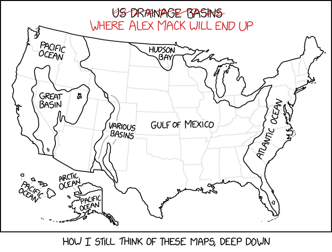
This xkcd cartoon requires deep Nickelodeon knowledge to understand.
The Lost Art of Map Reading
“The physical map has the same appeal, probably, as the vinyl record. It’s tactile, it’s there, it’s present—it’s not ephemeral.”
A nice piece from CBC News on the so-called lost art of map reading and paper maps, touching many of the usual points, featuring (among others) the co-owners of my local map store, Ottawa’s World of Maps.
The Great Globe Conspiracy
Hoo boy. Globes are everywhere and proof of round-earther brainwashing: that seems to be the point of view of Kandiss Taylor, a former Republican candidate for Georgia governor and recently elected GOP district chair who apparently went full flat-earther in a recent podcast episode. See coverage from Gizmodo, Rolling Stone and Salon.
Bellerby and the History and Craft of Globemaking
Profiles of premium globemaker Bellerby and Company aren’t exactly scarce, but this one from Geographical magazine is worth a read for its focus on the craft of making globes and its history, and where Bellerby fits into it.
Mapping Anti-Trans Legislation Risk

There has been an outbreak of anti-trans legislation at the state level in the United States, and Erin Reed has spent the last three years tracking it. Her anti-trans legislative risk map measures the extent to which trans people are endangered by such legislation, whether it’s already on the books or could be the offing before the next election. The map reveals, no surprise, a polarized America: one where some states are racing to put anti-trans laws on the books while others enact protections and set themselves up as safe harbours.
Previously: Mapping Safe Washrooms.
European Night Train Network Map

Night train advocacy group Back on Track has a map showing the current network of European night trains offered by various train operators. It’s colour coded by operator, but individual lines are a bit hard to follow, and using various dashed lines for both less-than-daily service and forthcoming service is a bit confusing. Then again, given the sharp uptick of night train services being offered, it’s almost unavoidable that any map of this sort will be a bit of a jumble: compare with Jug Cerović’s version (previously) to see what I mean.