
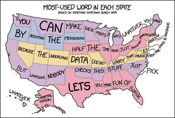
In yesterday’s xkcd cartoon, Randall makes explicit what I think a lot of us have been thinking about those maps assigning a word or a search term to each state or country or whatnot.
In yesterday’s xkcd cartoon, Randall makes explicit what I think a lot of us have been thinking about those maps assigning a word or a search term to each state or country or whatnot.
Daniel Raillant-Clark’s map of Montréal’s Métro with anglicized station names (in most cases) is full of awful translations in both directions and puns in both languages (example: “Georges-Vanier” becomes “George Go Deny It” because va nier means go deny). To see what the hell this map is messing with, the real Métro map is here. [MTL Blog/Reddit]

April 19th: The day the Leventhal Map Center finally snapped.

The Future Mapping Company has announced the discovery of a new island 20 kilometres off the coast of Great Britain. They have naturally already produced a new map of this island.
The Isle of Bait is a small, beautiful and untouched paradise, but there is a hitch—it is only visible through the Face Swap Snapchat filter.
It appears that a glitch during the most recent geological shift caused a permanent geofence to go up around the island, preventing it from being visible to the naked eye.
Geocached for so long, local authorities are debating whether to rename landmarks and points of interest to bring the island into the post-Brexit era. Bay of Bright Futures, the Eneychestuary and Happiness Hill are all remnants of a past that is no longer a reality for the rest of the country. Toblerone Ridge, a local favourite for its distinctive jagged shape, may be the worst affected as plans to widen the gaps between peaks are unveiled as part of a “Greater Value Modernisation Programme.”
For this reason, this map is already a collector’s item, so we would advise acting now before the facts are revealed to be of an alternative nature.
Not since the discoveries of Null Island or San Seriffe has there been news of this magnitude—indeed, this announcement comes 40 years to the day after the Guardian published its supplement on the latter island.
The CBC comedy show This Hour Has 22 Minutes has a sketch on the matter of Prince Edward Island being left off maps of Canada.

Randall Munroe is a bad man who is back with another bad map projection to make our eyes bleed. (If he does this often enough he’ll have enough for a book. Heaven forfend.) This one is, like his other maps, fiendishly subtle: it stretches and compresses countries to fit where their time zones ought to be, longitudinally speaking.

Every so often Randall Monroe puts up a map-related xkcd cartoon, and each time I dutifully post about it. This morning’s is called “Bad Map Projection: Liquid Resize.” Or: when Photoshop algorithms attack.

The firm of Strumpshaw, Tincleton & Giggleswick produces whimsical maps of funny place names, including the Magnificently Rude Map of World Place Names, which shows where on the globe there are places with names that mean Naughty Things in English. Because we are 12 years old. [Buzzfeed]
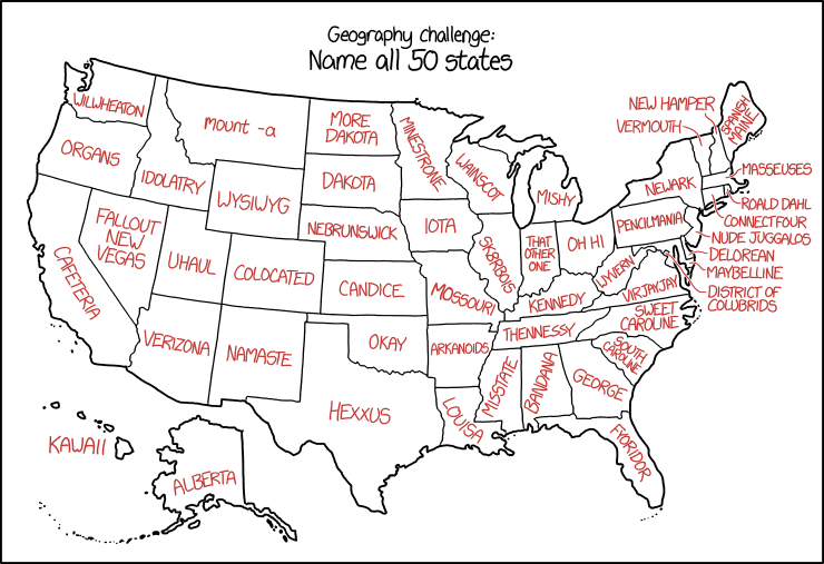
Randall is messing with us again in today’s xkcd, which assigns malapropisms and synophones to U.S. state names. The results are about what you’d expect.
Previously: xkcd’s United States Map.
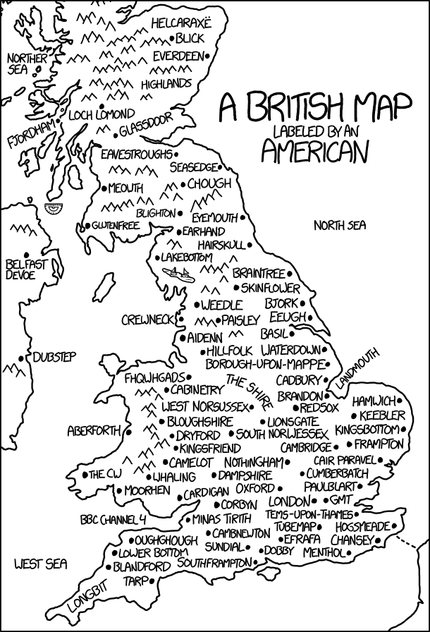
Today’s xkcd is a British map labelled by an American. It’s another one of those where the longer you stare at it, the more it hurts. Randall’s messing with us again.
While we wait for the results, think back, raise a glass, and remember fondly the meme that came and went so quickly a month or so ago: What if only … voted? Based on FiveThirtyEight maps showing the gender gap in voting intentions (What if only women voted? What if only men voted?) that quickly went viral, similar maps showing gap by race and education
 A decade ago Mark Monmonier published
Many of Evans’s humorous stories go a way to responding to some of the scientific inadequacies and toponymic foibles so common in place naming studies. And after I’ve spent almost a decade inundated with often sterile and uninspirational place name theory and how it may fit within more general research in onomastics, the study of proper names, Evans’s tongue-in-cheek take is more than welcome.
I get the distinct impression that this is a less-serious work of scholarship than Monmonier’s. [WMS]
Google’s Street View blurs people’s faces for privacy reasons. Licence plates, too. But a tweet by the Guardian’s David Shariatmadari reveals that Google’s algorithm sometimes extends privacy rights to cows.
https://twitter.com/D_Shariatmadari/status/775488250223947776
See the BBC’s coverage. Some context from Slate.
Map Men is a YouTube series by comedians Jay Foreman and Mark Cooper-Jones. It’s funny as hell, and quite informative too: it’s two silly people being very smart about often-silly cartographical situations. Six episodes so far; I hope they make more. [Geographical]

Boris Johnson is Britain’s new foreign secretary. The Independent’s indy100 news site has put together a map of all the countries BoJo has offended. It’s interactive: at the link, hover over the country to get the oh-god-what-did-he-say-and-did-he-really-use-that-word story.
Related: a map of countries with a buffoon for a foreign secretary.
