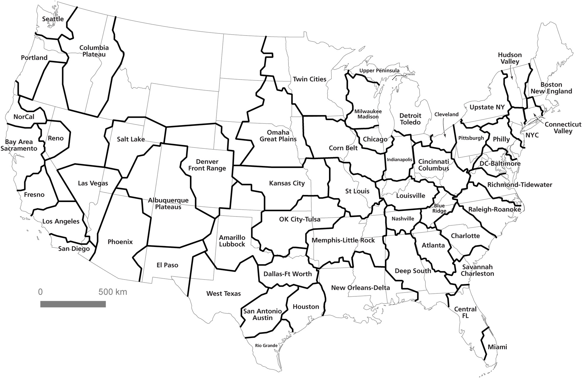
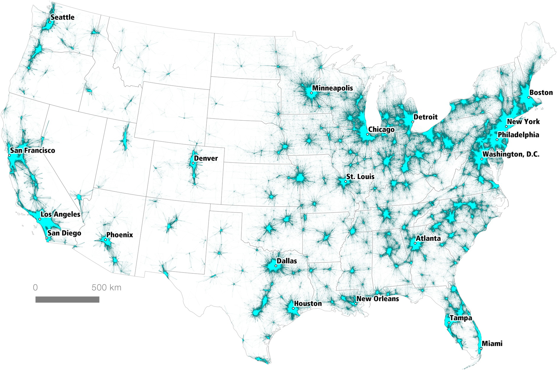
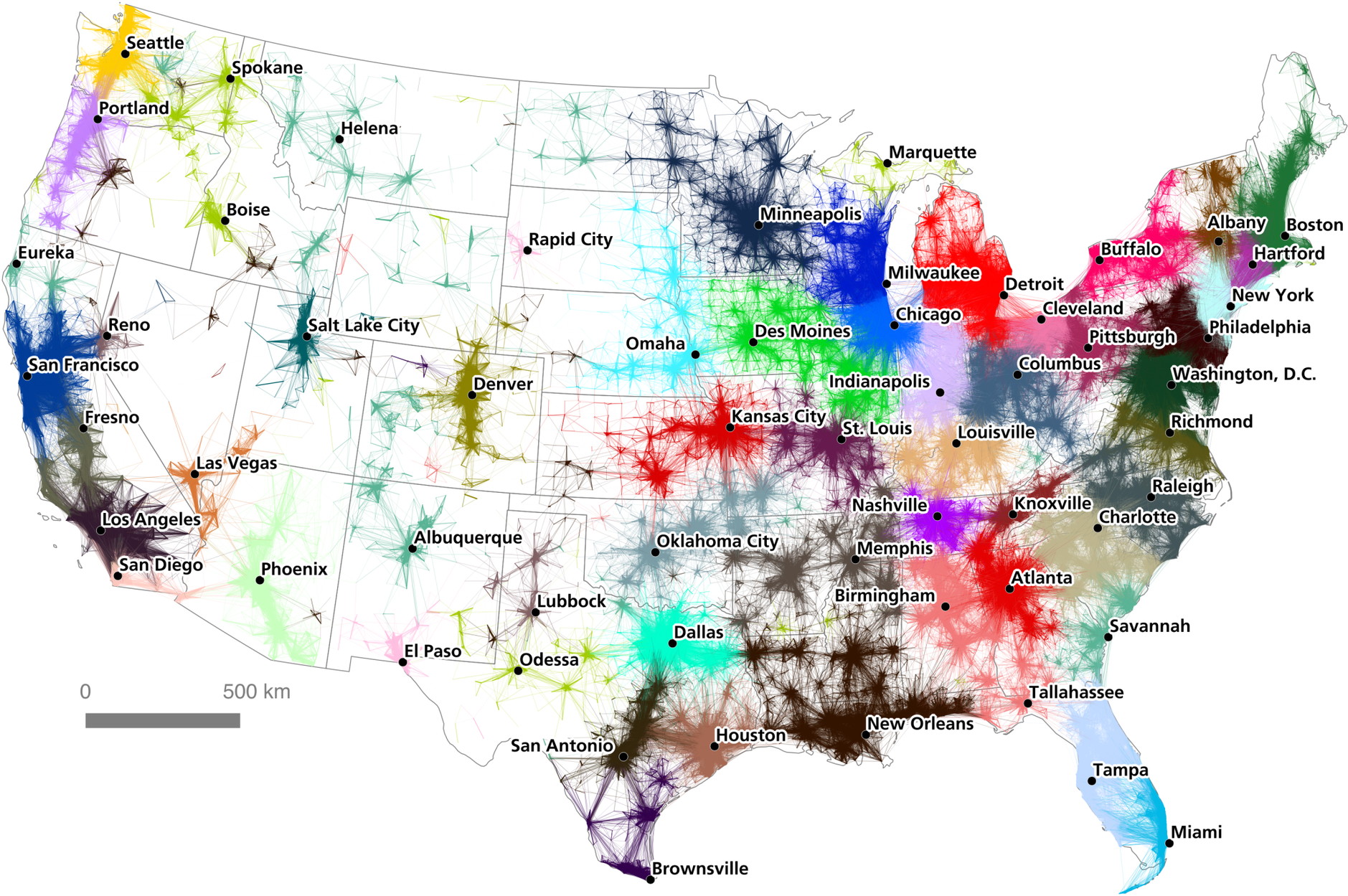
In a paper published in PLOS One, Garrett Dash Nelson and Alasdair Rae explore whether megaregions—i.e., a region centred on a major metropolitan area—can be determined algorithmically, using commuter flow data. In the end they conclude that “any division of space into unit areas will have to take into account a ‘common sense’ interpretation of the validity and cohesion of the regions resulting from an algorithmic approach. For this reason, the visual heuristic method coupled with the algorithmic method offers a good combination of human interpretation and statistical precision.” In the process, they’ve generated a series of maps that are fascinating on several levels, including a final map of megaregions that combines algorithmic results with visual heuristics (i.e., human judgment). [Atlas Obscura]
Austrian Presidential Election Cartograms

The second round re-vote of the Austrian presidential election took place yesterday. (The first round took place on 24 April; a repeat of the second round, narrowly won by Alexander Van der Bellen on 22 May, was ordered by the Constitutional Court.) Full, final results are not yet available, but austromorph.space has created the above cartogram of the preliminary results—showing, as you might expect, the strength of winning independent candidate Alexander Van der Bellen in the cities; support for the far-right FPÖ’s Norbert Hofer shrinks when you change from a map to a cartogram.
There are other cartograms of earlier rounds of the Austrian presidential election on the austromorph.space website.
2016 Holiday Gift Guide: Calendars
Calendars are apparently still a thing. If they’re still a thing for you, here are a few 2017 calendars that have, as you might expect, maps as their focus:
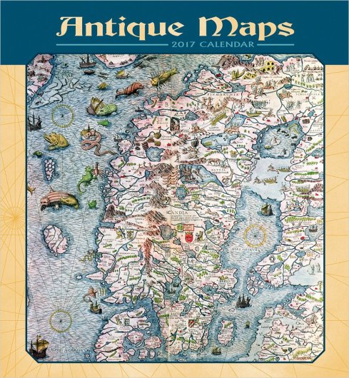
- Antique Maps (The British Library)
- Antique Maps of the World (Flame Tree)
- Scottish Maps (National Library of Scotland)
- Vintage Maps in wall and desk sizes (Cavallini)
- Wonderground Map of London (MacDonald Gill)
(Links go to Amazon. If you buy something, I get a cut.)
Previously: 2016 Holiday Gift Guide: Books; Wonderground Map Calendar.
‘The Massive Scope of America’s Infrastructure’

The Washington Post has six maps of U.S. flights, shipping lanes, electrical transmission lines, railroads and pipelines that highlight “the massive scope of America’s infrastructure” that will presumably be the focus of future Trump administration spending. [Benjamin Hennig]
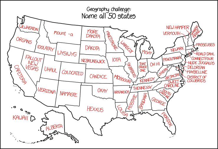
xkcd’s U.S. State Names

Randall is messing with us again in today’s xkcd, which assigns malapropisms and synophones to U.S. state names. The results are about what you’d expect.
Previously: xkcd’s United States Map.
Mapping Arctic Sea Ice
Something’s going on in the Arctic. As the Washington Post reported last month, the Arctic Ocean was far, far warmer than normal—about 20 degrees Celsius higher than average. (Meanwhile, the air over Sibera is at record cold levels.) According to the Post, the higher temperatures are the result of record low amounts of thinning sea ice, as well as warm air being brought north by an increasingly errant jet stream.
NASA has been tracking sea ice levels and thickness by looking at the age of the ice in the sea ice cap. The video above shows “how Arctic sea ice has been growing and shrinking, spinning, melting in place, and drifting out of the Arctic for the past three decades. The age of the ice is represented in shades of blue-gray to white, with the brightest whites representing the oldest ice.”
The ESA reports that their CryoSat satellite “has found that the Arctic has one of the lowest volumes of sea ice of any November, matching record lows in 2011 and 2012.” The animated GIF below shows the change in November sea ice from 2011 to 2016, as observed by CryoSat.
The Chimney Map
The big news in the map world this week is a 17th-century map that was found in Aberdeen, Scotland, stuffed up a chimney to stop drafts. Discovered during renovations, the map was handed over to the National Library of Scotland, which found it to be in very bad shape: the 2.2×1.6-metre map, identified as work by the Dutch engraver Gerald Valck, was disintegrating, with pieces falling off every time it was moved. The Library’s restoration process is featured in an article in the winter 2016 issue of their magazine, Discover (direct PDF link), and in two videos about the map: one I’ve posted above, plus another, shorter video. You should take a look at them all: they present a fascinating look inside the conservation process. More coverage at Atlas Obscura, BBC News and Smithsonian.com.
2016 Holiday Gift Guide: Books
Every year at about this time I post a gift guide that lists some of the noteworthy books about maps that have been published this year. If you have a map-obsessed person in your life and would like to give them something map-related—or you are a map-obsessed person—this guide may give you some ideas.
This year, as you will see, I’ve organized the books by theme: we have five atlases of unusual and non-existent places, several colouring books, and a large number of historical map collections, among other books.
This is by no means a complete list of what’s been published in 2016. The Map Books of 2016 page includes many, many other books that might also suggest themselves as gift possibilities.
Atlases of the Unusual and Non-Existent
Books that call themselves atlases, but really aren’t, are thick on the ground this year: these are illustrated compendiums of fascinating, unusual or simply made-up places around the world. In The Spectator, Alex Burghart looks at three of them: Atlas Obscura (which I reviewed here), Edward Brooke-Hitching’s Phantom Atlas, and Travis Elborough’s Atlas of Improbable Places. To which I’d add Aude de Tocqueville’s Atlas of Lost Cities, a catalogue of abandoned places that came out last April, and Malachy Tallack’s Un-Discovered Islands.
Children, crafts and colo(u)ring Books
Colouring books (or, if you’re American, coloring books) have been all the rage lately, and the past year has seen several such books with maps as their subject matter: A-Z Maps came out of the gate early back in October 2015, with Maps: A Colouring Book. Since then, we’ve seen Gretchen Peterson’s City Maps: A Coloring Book for Adults, the Ordnance Survey’s Great British Colouring Map, and the re-emergence of William Hole’s 17th-century illustrations of Michael Drayton’s poetry, repackaged as a 21st-century colouring book called Albion’s Glorious Ile—which is available both as a single volume and pamphlet-sized sections.
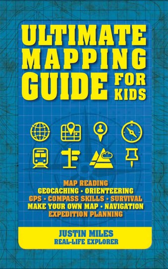
If colouring books aren’t for kids any more, but you’re looking for something child-sized, consider Justin Miles’s Ultimate Mapping Guide for Kids.
If making art is your thing, but you’re not so much about the colouring books, look at Jill Berry’s latest book on personal mapmaking, Making Art From Maps.
Historical Maps
These books explore some aspect of old and historical cartography. (Maps of the 20th Century and Great Britain get their own sections, below.) Cartographic Japan is a collection of essays exploring Japanese maps from the late 1500s. China at the Center (reviewed here) accompanies an exhibition of two pivotal Chinese world maps. Great City Maps collects historical and contemporary city maps. Jeremy Black’s Maps of War is a history of war cartography. Treasures from the Map Room is a diverse sampling of the Bodleian Library’s extensive cartographic holdings (I’m currently working on a review).
The Twentieth Century
Art, marketing and propaganda meet in the 20th Century. Paul Jarvis’s
Great Britain in Maps
Old maps of Britain, particularly at the city and county level, continue to find a renewed existence in book form. Birlinn continues its line of regional atlases of historical maps with Oxford: Mapping the City and Scotland: Mapping the Islands. Also seeing print this year was Somerset Mapped and a reprint collection of John Speed’s county maps called Britain’s Tudor Maps.
New York, New York: Maps and the City
New York City is the subject of two new books in which art, story and cartography intersect: Katherine Harmon’s third volume of map art, You Are Here: NYC: Mapping the Soul of the City; and Rebecca Solnit’s third city atlas,
Data into Maps
Where the Animals Go provides beautiful maps of animal tracking data, People and Places is a human atlas of the United Kingdom, and Speaking American maps the American vernacular: “who says what, and where they say it.”
World Atlases
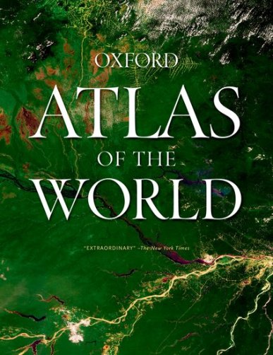
When it comes to big, satisfying world atlases, the most recent to come out are the Oxford Atlas of the World, which is updated every year, and the Times Concise Atlas of the World. The Concise is the second-largest of the Times world atlases: see the comparative chart. (The largest atlases—the Times Comprehensive and the National Geographic—were last revised in 2014.)
(Links go to Amazon. If you buy something, I get a cut.)
Iwan Bala’s Controversial Brexit Exhibition
Running until 30 November at the Penarth Pier Pavilion in Penarth, Wales, Dyma Gariad (fel y moroedd)/Here is a love (deep as oceans) is an exhibition by Welsh artist Iwan Bala. It’s an angry, provocative collection of caricatures and maps about Brexit, from a strongly Remain perspective, done in a style described by the Penarth Times as “the rapid often stumbled, crossed out, corrected, blotted, re-adjusted rush to put thoughts on paper and the attempt of a poet to capture a line before it ebbs in the memory.” As the Pavilion describes the exhibition:
Responding to the result of the electorate’s vote on the UK’s EU membership, Bala began to make (alongside politicized ‘maps’), satirical caricatures of the principle [sic] players in the lead up to and result of Brexit. An Artist has a duty to comment, protest and become an agent provocateur through the medium of visual communication. Cartoons have a long and illustrious history, and have always lurked somewhere in the background environs of his artwork.
They may have been anticipating some pushback—the exhibition also had a content warning—and indeed the exhibition has gotten some angry responses sufficient that the Pavilion had to issue a statement defending their decision to host it. That alone tells me it was a success: art provokes. [WMS]
Missing Maps
Quartz takes a look at the Missing Maps project, which I suppose can best be described as a way to jumpstart mapping the unmapped developing regions of the world with OpenStreetMap. What’s interesting about Missing Maps is how it systematically deals out tasks to people best able to do them: remote volunteers trace imagery, community volunteers do the tagging and labelling. There’s even an app, MapSwipe, that gives its users “the ability to swipe through satellite images and indicate if they contain features like houses, roads or paths. These are then forwarded onto Missing Maps for precise marking of these features.” [WMS]
Map Art to Adorn Dubai Hotel
Map art will be featured on the walls of a new hotel in Dubai: the upcoming Address Boulevard Hotel will display art by Matthew Picton (previously) and Ewan David Eason. [WMS]
Great Circles in Cardboard

The Global Map is a neat toy from the 1940s. The whole thing is just under one by two feet in area, and consists of two rotating hemispheres that touch at a single point, with the purpose of showing the shortest distance by air or sea between two points—a quick and dirty way of showing a great-circle route with a bit of cardboard and no math. From the David Rumsey Map Collection. [Maps on the Web]
Mapping Post-Election Violence in the U.S.
Crisis mapper Ushahidi is turning its focus to the United States, with an interactive map that collects reports of post-election violence, hate speech, protests and harassment. [The Verge]
Mapping Ineligible Voters
Last year Neil Freeman produced a map of ineligible voters in the United States. “There are three main groups of people who aren’t eligible to vote: children, non-citizens, and disenfranchised felons. The Census does a survey of voting age and citizenship, this map uses 2013 estimates.”
Where the Animals Go

Co-authored by James Cheshire and Oliver Uberti, Where the Animals Go: Tracking Wildlife with Technology in 50 Maps and Graphics (Particular Books, 2016) is a book of maps by wild animals. It’s a compendium of tracking data from field biologists’ research projects, ably curated and turned into some spectacular maps (if the excerpts on the authors’ website are any indication). Greg has written a piece at All Over the Map.
Where the Animals Go is available now in the U.K.; the U.S. edition comes out in September 2017.
Cheshire and Uberti first teamed up to produce London: The Information Capital (2014), which should be out in paperback any time now.