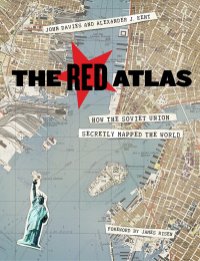
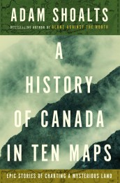
I’ve finally updated the Map Books of 2017 page to account for all the books that were brought to my attention over the past few months.
Later this month it’ll be time for me to post the 2017 edition of The Map Room’s Holiday Gift Guide. Each year I put out a list of some of the noteworthy books about maps that have been published over the previous year. This year’s guide will be a rather smaller selection of the above list, focused on gift-giving (academic monographs and GIS manuals make less-than-ideal gifts, I’m thinking); the Map Books of 2017 page is meant to be more comprehensive.
Hal Shelton, “Cartographers in the Field,” 1940. Oil painting, 4 × 6 feet. USGS Library, Menlo Park, California. Photo by Terry Carr, USGS. Public domain.
Cartographers in the Field: “This Depression-era oil painting was created by USGS field man Hal Shelton in 1940. The painting depicts mapping techniques used in the early days of cartography, including an alidade and stadia rod for determining distances and elevations and a plane-table for sketching contour lines. A USGS benchmark is visible near the top. The straight white lines represent survey transects. Note the ‘US’ marking on the canteen: many of the USGS field supplies were obtained from Army surplus.” [Osher Map Library]
Join Alex Acks and Paul Weimer as they talk about fantasy maps in order to give you the tools you need to create and map your world. Topics include basic geologic principles, common mistakes, forms maps can take, how maps reflect world view, and how maps change over time.
Roland Chambers is selling limited-edition prints of his maps for Lev Grossman’s Magicians trilogy. Each print costs £100 and is A2-sized (42 × 59.4 cm); only 100 copies of each will be printed. More at The Verge. I’ve admired Chambers’s work for a while: these are fantasy maps that are less derivative and closer to their original source matter (children’s book illustrations) than the standard fantasy map fare. [Lev Grossman]
NASA’s Jet Propulsion Laboratory: “New maps of Greenland’s coastal seafloor and bedrock beneath its massive ice sheet show that two to four times as many coastal glaciers are at risk of accelerated melting as previously thought. Researchers at the University of California at Irvine (UCI), NASA and 30 other institutions have published the most comprehensive, accurate and high-resolution relief maps ever made of Greenland’s bedrock and coastal seafloor. Among the many data sources incorporated into the new maps are data from NASA’s Ocean Melting Greenland (OMG) campaign.”
Martin Waldseemüller (Matthias Ringmann). Globe segments, ca. 1507. Ludwig-Maximilians-Universität München.
AP reports that Christie’s will be auctioning “a previously unknown copy” of Martin Waldseemüller’s globe gores on 13 December. This would be the sixth known remaining copy of Waldseemüller’s gores, which were designed to form a small globe a few inches across when pasted onto a sphere. They’re a smaller, less-detailed version of Waldseemüller’s famous 1507 world map, and yes, the globe gores have “America” labelled as well.
The New York Times’s graphics department generally does very good election maps, and their work on yesterday’s gubernatorial election in Virginia is no exception. I particularly like how the interactive map toggles from a standard choropleth map to maps that better account for population density, show the size of each candidate’s lead and the shift in vote since the 2016 presidential election.
Meridian, an “experiment” from the DX Lab at the State Library of New South Wales, overlays old maps onto virtual, 3D interactive globes. Two globes have been created to date—one based on the 1706 Miranda world map (previously), the other on a set of Coronelli globe gores from 1693—with more in the works. Details here. [Cartophilia]
It took over one thousand hours for the 11 person team at the Grimwade Centre to painstakingly restore the 354-year-old map.
“Normally we’d only dedicate one or two people to a conservation project, but this was a very special object, and it was significantly more difficult to conserve than most of our projects.
“The surface was very fragile and there were a lot of complications along the way.
“We thought we were just removing varnish, but we discovered a dirty layer underneath which meant we had four passes at each square on the gridded map—of which there were around 300.”
There’s a video of the conservation process:
And if you need a reminder of what the map looked like before restoration:
Joan Blaeu, Archipelagus Orientalis, sive Asiaticus, 1663. Map, 118.5 cm × 152 cm. National Library of Australia. Pre-restoration.
It looks like posters from Andrew DeGraff’s Cinemaps are available for sale: not just prints (which go for around $55-85), but originals (which go for rather more).