John Nelson reports that the Spilhaus projection will be supported in the next version of ArcGIS—version 2.5, to be released in a few months. This odd projection, which centres Antarctica on a world map showing the oceans as a single, uninterrupted body of water; went viral last year. Requests for ArcGIS support soon followed. Thing is, ArcGIS support requires the math behind the projection: figuring out that math took some sleuthing. The Spilhaus is, it turns out, basically an oblique aspect of the Adams World in a Square II projection.
The winners—or as Daniel Huffman is calling them, the “final selection”—of the Monochrome Mapping Competition (now called MonoCarto 2019) have been announced. All 15 of them, with notes from the judges on why each of them was awesome.
The premise of the competition—a map made with any tint of a single colour of “ink”—was fascinating, and the resulting maps put paid to any assumption that you couldn’t produce a visually appealing or informative map with just one colour. The diversity of map styles is something to see as well.
Here’s a gallery of all 68 map projections supported in ArcGIS 10.7.1 and ArcGIS Pro 2.4, from Bojan Šavrič and Melita Kennedy. Some interesting projections included here, some of which are only suitable for a specific region (such as the complex New Zealand map grid). No Gall-Peters, interestingly.
Chris Whong
Chris Whong uses a clementine as a substitute for Tissot’s indicatrix: “I found myself eating a clementine this morning, and thought it would be interesting to slice up the orange peel on an 8×8 grid to visualize how much of the earth’s surface is represented in WebMercator tiles at zoom level 3. This is kind of an inverse of the Tissot’s Indicatrix above, showing chunks of the spheroid’s surface over the projected tiles that represent them in web maps.”
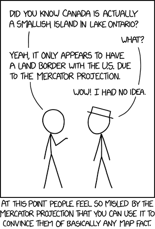
Alberto Cairo’s short piece arguing that the Mercator projection isn’t a monstrosity doesn’t cover particularly new ground: the Mercator was created for a specific purpose (bearing-based navigation) and is a good choice for small-scale maps, but it has no business on a world map. But it’s probably worth reiterating, since I still see over-the-top condemnations of the projection on colonialist grounds, channeling Arno Peters (which, you know: not new).
After a hiatus of more than two and a half years, Jay Foreman and Mark Cooper-Jones are back to producing new episodes of Map Men. Back in 2016 I called the series “two silly people being very smart about often-silly cartographical situations” (though I may have gotten that backward). Anyway, they’re back, with episodes on the geological origins of the English-Scottish border and trap streets.
I love working in monochrome (and gave a talk about it at NACIS 2018). I think color is overused, and the challenges of a limited palette can be liberating. I want to draw more attention to the great work that mapmakers are doing in this medium, and encourage more people to experience the joy of composing with only one ink.
Daniel emphasizes that “monochrome” doesn’t mean black and white: “They can be made from tints of any ‘ink.’ So if you’ve got a green & white map, it’s welcome here.” Submission details at the link. Deadline 25 June 2019. Submissions to be reviewed by a surprisingly high-powered panel of judges. No prize; it’s for the honour and glory, says Daniel.
On Sunday Tom Patterson announced that the Equal Earth Physical Map is now available for download in JPEG, Illustrator and GeoTIF formats. Unlike its political counterpart, no territorial boundaries appear on this map (though cities do). Not having borders doesn’t mean that Tom and his collaborators won’t get into trouble with the names of natural features, though: I note they use Sea of Japan rather than East Sea, for example (see above). But, importantly, they’ve released the map into the public domain: if you don’t like their labels, or their choice of cities or colours or textures, you can make changes to the map and put out your own version.
It looks like every map style is doomed to be replicated in ArcGIS Pro. See, for example, Warren Davidson’s Vintage Road Atlas: which renders Toronto and its surrounding area in the style of a 1950s tourist map. It’s double-sided and is designed to be folded (which is to say that there are some upside-down bits). The ArcGIS Pro style—which is called Are We There Yet? and can be downloaded here—even simulates the creases and weathering of an old folded map, though it does so a little too regularly if you look closely. (Also there are some inconsistencies in road lines and highway markers: the map is prisoner of its data.)
A feature of hurricane maps is the so-called cone of uncertainty, which shows the range of likely paths the hurricane is forecasted to follow. The problem is that the cone of uncertainty is easily misinterpreted by the reader. The MIT Technology Review’s Karen Hao looks at five ways the cone can be misinterpreted, along with some alternative methods of visualizing a hurricane’s projected path. [Gretchen Peterson]
It was announced today at NACIS that the Equal Earth projection is now available as a wall map—which is a necessary thing if it’s going to go toe-to-toe with the Peters map. The political wall map is only available as a download (three versions, centred on Africa and Europe, the Americas, or the Pacific): the 19,250 × 10,150-pixel, 350 dpi file results in a 1.4 × 0.74 m (55″ × 29″) print—assuming you have access to a large-format plotter. Not everyone does, so it’s only a matter of time, I suspect, before they have prints available for sale.
The map shows countries and territories in surprising detail (it includes Clipperton, for example); and while it does show disputed regions as such, its choices of boundaries and nomenclature won’t make it many fans in South Korea or India.
But computer mapping may be about to overtake hand-drawn illustration. John M. Nelson has created an ArcGIS style that does the very thing Dan Bell does by hand: emulate the maps of Middle-earth executed by Christopher Tolkien and Pauline Baynes. The style is called, naturally, My Precious: John explains it here and here, and demonstrates the style with this map of the Americas.
There are, of course, some flaws in this method: a mechanical representation of a hand-drawn style risks falling into the uncanny valley’s cartographic equivalent, especially when mountain and forest signs are clone-stamped over large areas. And to be honest I’m not a fan of the Aniron font: those letterforms were used in the Lord of the Rings movies, but never the books’ maps, and now they’re found on damn near every Tolkien-style map, and we hates it, precious, we hates it forever. But Nelson is basically emulating modern fantasy map practice: modern fantasy maps are invariably done in Illustrator, labels are computer generated rather than hand-drawn, and hill signs are clone stamped. Applying it to real-world maps, and GIS software, is new, but a difference in degree.
The Gall-Peters projection is a second-rate projection with first-rate public relations; cartographers’ responses to the projection that focused on its cartographic shortcomings ended up missing the point. Something different is happening with the Equal Earth projection, which was announced last month as a response to Gall-Peters: an equal-area projection with “eye appeal.” It’s getting media traction: the latest news outlet to take notice is Newsweek. So, finally, there’s an alternative that can be competitive on the PR front, without having to mumble something about all projections being compromises until the eyes glaze over.