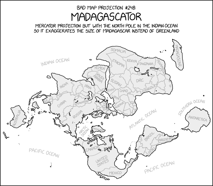
Uncharacteristically for xkcd’s Bad Map Projection series, the Madagascator is actually totally legitimate as a projection. Not that it’s any less mischievous, mind.
Update, 3 May: Turns out there was more to this xkcd cartoon. See Mercator: Extreme.
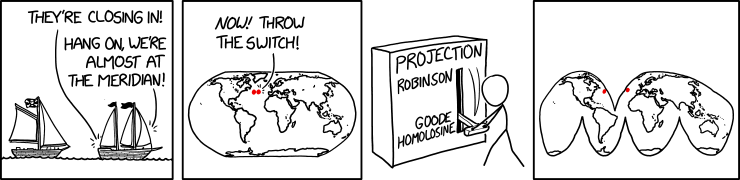
Randall Munroe’s map projection humour is increasingly on point, as last Friday’s xkcd demonstrates. (The mouseover text is even better: “There are two rules on this ship: Never gaze back into the projection abyss, and never touch the red button labeled DYMAXION.”)
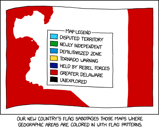
Randall Munroe, “Flag Map Sabotage,” xkcd, 13 Oct 2021.
Maps where countries are coloured in with flag patterns: I’ve seen a lot of them around, especially on Reddit, but I haven’t necessarily liked them; xkcd’s comic from last Wednesday goes one step further in that it offers a way to hack them.
Randall Munroe, “Bad Map Projection: The Greenland Special,” xkcd, 14 July 2021
At some point, xkcd cartoonist Randall Munroe is going to put out a book focusing on his map-related cartoons, isn’t he. The latest in his “Bad Map Projection” series (previously: All South Americas, Time Zones, Liquid Resize) is The Greenland Special, an equal-area projection except for Greenland, which uses Mercator. And I thought he was messing with us before.
It tries to address something that I find frustrating about election maps: Very few of them do a good job of showing where voters are. […] There are more Trump voters in California than Texas, more Biden voters in Texas than New York, more Trump voters in New York than Ohio, more Biden voters in Ohio than Massachusetts, more Trump voters in Massachusetts than Mississippi, and more Biden voters in Mississippi than Vermont.
Randall Munroe, “Contiguous 41 States.” xkcd, 4 Dec 2020.
The thing about this xkcd cartoon is that at first glance it’s entirely plausible: Randall has done violence to state boundaries while maintaining the rough overall shape of the lower 48. He’s snipped out seven states without anyone noticing if they don’t look too closely.
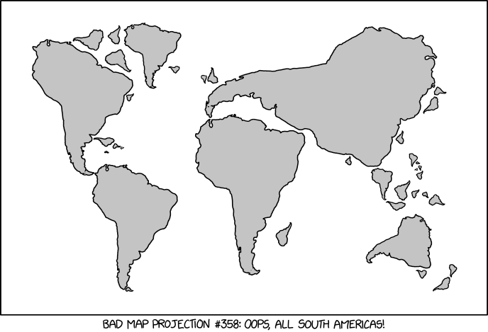
Randall Munroe, “Bad Map Projection: South America.” xkcd, 17 Jan 2020.
xkcd is back with another bad map projection: in this one, it’s all South Americas. The alt-text: “The projection does a good job preserving both distance and azimuth, at the cost of really exaggerating how many South Americas there are.”
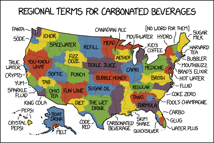
By law, I am required to share every xkcd comic about maps. Today’s makes great fun of pop versus soda maps—the maps showing where in the U.S. carbonated beverages are referred to as pop versus where they’re referred to as soda. Randall takes things to their ludicrous extremes, as he is, by law, required to do.
The web comic xkcd has done maps before (and I’ve covered most of them) but Friday’s iteration was a departure all the same: an interactive map of the challengers in the 2018 U.S. midterm elections: the larger the candidate’s name, the more significant the office and the better their odds of winning. Remember, these are only the challengers: no incumbents are listed.