

More proof that Randall hates us and wants to hurt our eyes comes from last Wednesday’s xkcd, which does what I’m pretty sure no cartogram has ever done: size by alphabetical order.
More proof that Randall hates us and wants to hurt our eyes comes from last Wednesday’s xkcd, which does what I’m pretty sure no cartogram has ever done: size by alphabetical order.
Some Pokémon Go players are apparently adding fake beaches to OpenStreetMap in order to improve their chances of catching a new pokémon. The pokémon in question was added to the game last month and only spawns in beach areas. Pokémon Go uses OpenStreetMap as its base map. It’s not hard to see how players can cheat by adding natural=beach nodes where no actual beaches exist, and indeed beaches started turning up in odd places in the game—and in the real-world map as well, because the game uses real-world map data, and that’s what gamers have been messing with. Receipts at the OSM community forum thread. [Atanas Entchev]
Custom route creation and topographic maps are rumored to be coming to Apple Maps in the next iOS release, iOS 18. Google Maps has had custom routes since approximately forever; on Apple Maps we’ve had to choose between Apple’s generated routes without being able to edit them.
Google Maps announced updates focusing on EVs (EV charger search, nearby chargers in the in-car map, suggested charging stops, forecast energy consumption) and sustainability (lower-carbon travel options rolling out in 15 cities, estimated flight emissions). Also, Street View came to Kazakhstan last month. Meanwhile, Ben Schoon at 9to5Google says that while Google Maps on Android Auto is “a pretty solid experience,” it’s a different matter when you use Google Maps via Apple CarPlay, an experience he calls “a bit of a dumpster fire.”
Google-owned Waze announced updates last month that include roundabout assistance and notifications for the presence of emergency vehicles, speed limit changes, and things like sharp curves, speed bumps and toll booths [TechCrunch].
It used a vector display and cassette tapes for data storage. It was too early for GPS; instead it invented a process called “augmented dead reckoning” that snapped the car’s position back to the known road grid whenever you made a turn. It was the Etak Navigator, and it launched back in 1985. James Killick explores its history in the ninth installment of his series, “12 Map Happenings that Rocked our World,” with some surprises in how it influenced later GPS-based navigation systems (among other things, Etak eventually ended up in the hands of Tele Atlas). See also this 2015 article in Fast Company.
Previously: Guidestar and GM’s Early Attempts at In-Car Navigation.
There’s no shortage of books about phantom islands—islands on the map that later turn out never to have existed—but now the Map Men have done a video about them, using as a narrative hook the case of Sandy Island, and how it managed to stay on maps into the Google Maps era.
“In the age of Google Earth, watches that triangulate and cars with built-in GPS, there’s something about a globe—a spherical representation of the world in miniature—that somehow endures.” The Associated Press has a fairly light feature on the relevance and popularity of globes today; the bespoke globes of Bellerby and Co. (whence) are prominently featured, of course (Replogle not so much, oddly), but they’re intermixed with some historical trivia. Not in-depth in the slightest, but something a few newspapers would have found interesting enough to run.

Looks like we’re not quite done with eclipse maps, especially the whimsical sort, and it’s not at all invalid for xckd to have (what is probably going to be) the last word on the subject (at least for a while), with this fictional map showing the fictional path of a fictional eclipse over a fictional landscape, with rueful descriptions of fictional places where trying to see the fictional eclipse will come to a bad end for the fictional observers. (And you thought it was bad you got clouds.)
This Mastodon post makes a bad map of this week’s eclipse into the funniest map of this week’s eclipse.
CNN: “New map calculations have raised some concerns that the path of totality—where it’s possible to see the moon completely block out the sun—is slightly narrower than NASA calculated. That means some cities on the edge of the route that were expecting to experience a second or two of total darkness might be left out.” The calculations were done by John Irwin, whose revised map can be found here. This page has the technical details, while Jamie Carter explains the implications: if Irwin’s correct, we’re talking about a literal edge case of a few hundred metres. Go further into the path of totality!
Previously: Cloud Cover Risk During the 2024 Solar Eclipse; Mapping Two Solar Eclipses.
GIS analyst and cartographer Andrew Middleton moved across the country to become the new owner of the Map Center, a Rhode Island map store, after the previous owner announced that he was looking for someone to give the store away to. In an interview with GeoHipster’s Randal Hale, Andrew outlines what he sees as the state of the market for paper maps: the antique map business is pretty healthy; what he’s interested in is contemporary cartography.
The bigger and more mysterious question for me is: Can I build a store off of something that focuses on contemporary cartography and do it in a physical location? Some people more talented than I have been able to pull it off selling their own work online. Only a couple of people in the U.S. are doing it in a physical space with overhead. With rent. I like knowing that there are places like the Map Center still around and I want to be a part of keeping Rhode Island quirky and worth exploring. But it’s not 1995 any more. I sell gas station 8-folds and prints of USGS topo maps and guide books and trail maps but it’s hard to sell information that someone on the internet is giving away for free. The value add of a paper map is providing that information in a portable, digestible and familiar way that includes context and that does have value. Lots of folks buy paper maps for outdoor activities, trip planning and conceptualizing space in large areas or putting on their walls to remind them off a place they love or a place they want to explore.
He’s looking for maps to sell: see the Map Center’s call for cartographers. As for the kind of customer Andrew is looking for, it would probably look a lot like Mary Ann Sternberg, who in a piece for Next Avenue writes about her history with and love of paper maps.
Here’s a short video from the BBC Global YouTube channel on the 1450 Fra Mauro map.
Related: Meredith F. Small’s Here Begins the Dark Sea: Venice, a Medieval Monk, and the Creation of the Most Accurate Map of the World (Pegasus, June 2023): Amazon (Canada, UK), Bookshop.
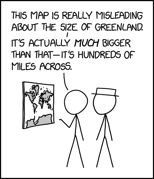
The 25 March 2024 xkcd honours Greenland’s place as a measure of cartographic distortion. It’s also, unexpectedly, a riff on the idea of the 1:1 scale map (cf. Borges), especially if you consult the comic’s alt text: “The Mercator projection drastically distorts the size of almost every area of land except a small ring around the North and South Poles.”
Previously: xkcd: The Greenland Special.
The U.S. congressional electoral map was redrawn after the 2020 census, but now parts are being redrawn again. ABC News has a page tracking developments in what they call midcycle redistricting. “More than a half-dozen states face the prospect of having to go through the redistricting process again, mostly due to federal and/or state litigation over racial or partisan gerrymandering concerns. Both Democrats and Republicans have the opportunity to flip seats in districts drawn more favorably than they were last cycle. For example, Democrats appear poised to pick up at least one seat in Alabama and could theoretically get more favorable maps in Louisiana and Georgia. Republicans, meanwhile, could benefit from more favorable 2024 maps in North Carolina and New Mexico.”
Another map of GPS interference, also based on GPS accuracy information reported by aircraft, this one from Flightradar24. Data updates every six hours. And once again high levels of interference are being reported from conflict zones: Ukraine and other foci of Russian mischief like the Baltics, plus Israel/Palestine, though to be honest I didn’t expect Myanmar. Data is archived, so you can look up previous dates (7 days free, more than that needs a site subscription). [Maps Mania]
Previously: GPSJam Maps GPS Interference.

Eclipses aren’t any fun if you travel to go see one and it’s cloudy. I’ve been debating with myself what to do about next month’s total solar eclipse: the path of totality is a couple hours’ drive away and therefore manageable, but from what I’ve gathered the odds of clear skies aren’t great. These odds are based not on weather forecasts—still too early for that—but on historical data. For example, NASA Earth Observatory’s map, above, shows the average of the past 20 years of cloud cover across North America’s eclipse track on the day of the eclipse (April 8). Want more detail? Like, a lot more? See this incredibly detailed analysis from Eclipsophile’s Jay Anderson; I believe he’s a former meteorologist, and boy does it show in this piece. See also this Weather Underground article from last January, plus coverage from CBC News.
Previously: Mapping Two Solar Eclipses.