Two stunning maps of the Moon have been released by the USGS, both based on data collected by the Lunar Reconnaissance Orbiter: one an image mosaic assembled from visual imagery, the other (above) a colour-coded topographical map derived from laser altimeter data. Via io9.
Space Maps: Ceres, Mars, Exoplanets
- Dawn’s first colour map of Ceres: map-projected false-colour images of the dwarf planet taken as the spacecraft approached, assembled from images taken through blue, green and infrared filters. (Previously: At Ceres.)
- An elevation map of the Ares Vallis region of Mars (above) from the DLR, the German space agency (via io9).
- A map of known exoplanets in the Milky Way; most of them were found during the Kepler mission, which pointed at a a particular region of space.
Unruly Places (Off the Map)
Alastair Bonnett’s Unruly Places (first published in the U.K. as Off the Map) is a light, entertaining exploration of some of the world’s more unusual places. Bonnett, a social geography professor at Newcastle University, has written 47 short essays about locations that, in the grand scheme of things, don’t make any sense: the exceptions, the asterisks, the ink blots (in at least one case literally) on the map.
These range from the deeply frivolous to the profoundly injust: from bits and pieces of New York City transformed into environmental time capsules and art projects to places meaningful to the author; from rendition sites and pirate bases to Bedouin settlements in the Israeli Negev desert; from destroyed landscapes to Potemkin cities. The places often feel almost science-fictional; and in fact several of them evoked settings in existing science fiction works, like Christopher Priest’s Dream Archipelago and Maureen McHugh’s Nekropolis.
All in all, a pleasant diversion for the geographically minded, though I did have one quibble: the book calling latitude and longitude “Google Earth coordinates,” as though degrees are as proprietary as limited to the KML format.
Emily Garfield’s Map Art

Emily Garfield’s art is a pen-and-watercolour exercise in the cartography of imaginary places. Her drawings “are inspired by the visual language of maps, as well as the fractal similarity that cities share with biological processes such as the patterns of cells and neurons.” Above: “Branching Networks (Cityspace #178).”
Map Anniversaries
Google Maps turned 10 years old on Sunday—a milestone observed by Samuel Gibbs in the Guardian. See also Liz Gannes’s retrospective at Re/Code. My reaction on launch day was pretty effusive—I was blown away mainly by the user interface. But it wasn’t immediately dominant: it took roughly four years for Google to surpass MapQuest in traffic.
Meanwhile, the Pro version of Google Earth, which used to cost $400/year, is now free. Google Earth itself launched in June 2005, so is approaching its own 10-year anniversary, but it began its existence a few years earlier as Keyhole EarthViewer 3D.
Speaking of map anniversaries, National Geographic Maps is marking its centennial.
The photo above marks another anniversary: It shows Apollo 14 astronaut Ed Mitchell consulting a map during his second lunar EVA on February 6, 1971. Apollo 14 returned to Earth 44 years ago yesterday.
Daniel Reeve, Film Cartographer
Someone was responsible for the maps developed for the film adaptations of The Lord of the Rings, The Hobbit and other movies (on-screen and in promotional materials), and that someone is Daniel Reeve, a freelance artist who also did a lot of the letterwork and calligraphy. Via Boing Boing.
Atlas of Canada
I only just now found out about the new edition of Canadian Geographic‘s Atlas of Canada—via an item broadcast on CTV yesterday—or I would have included it in this year’s gift guide. It’s apparently the first new edition in a decade. (Incidentally this should not be confused with the Canadian government’s online Atlas of Canada, an entirely distinct beast.)
The Patterson Projection
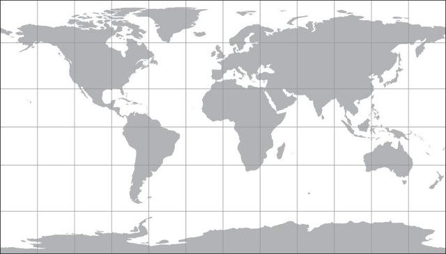
Map projections are inherently interesting, and also a great way to start a fight among a group of cartographers: just ask them their favourite and step back. Everyone has their preferred projection, me included, that fits their own needs and aesthetic. Cartographer Tom Patterson, whose work I’ve featured previously on The Map Room, has added another projection to the mix, the eponymous Patterson Projection, a cylindrical projection which “falls between the popular Miller 1, which excessively exaggerates the size of polar areas, and the Plate Carrée, which compressess the north-south dimension of mid latitudes.” It looks like a compromise projection in cylindrical form. A full article on the design and development of the projection is forthcoming at the link.
Previously: Shaded Relief World Map and Flex Projector; New, Free Physical Map of the United States; Shaded Relief.
Geologic Maps of Vesta

Geologic maps of Vesta, the asteroid visited by the Dawn spacecraft between July 2011 and September 2012, have been produced for a special issue of the planetary science journal Icarus. Above, a global geologic map of Vesta, compiled from 15 individual quad maps and using a Mollweide projection (Vesta itself is decidedly non-spheroid, but still).
Previously: Atlas of Vesta.
Sorol

Another one for those of you who like geofiction as much as I do. The Sorolpedia is an online encyclopedia of the distant and fictional world of Sorol, containing articles about the planet and its inhabitants. The maps are something else: far better than you’d expect from such a project (there’s even a KML file to import it into Google Earth). Its creator has put it on indefinite hiatus since 2010, so we may not see any more updates, but it’s still fascinating stuff.
Gift Guide: 10 Map Books of 2014
Every year, at about this time of year, I assemble a gift guide listing some of the noteworthy books about maps that have been published over the previous year. This list is by no means comprehensive, but if you have a map-obsessed person in your life and you’d like to give that person a map-related gift, this list might give you some ideas.
This year’s list includes several lavishly illustrated histories of maps and globes, interesting reads about map thieves and forgotten places, an a couple of guides to map art and personal mapmaking.
Once again, books bought through these Amazon affiliate links (routed to what my web server thinks is your nearest English-language Amazon store) make me a little money. Thanks for your support.
Moon and Comet Maps
Maps of planets, moons and other objects in our solar system always get me excited, though truth be told they were among the less popular posts on my old Map Room blog. Here are a couple of rather colourful recent examples:
- Above left, a preliminary map of Comet 67P/Churyumov-Gerasimenko, the subject of a visit by the Rosetta mission, that colour-codes several morphologically different regions.
- Above right, a topographical map of the Moon’s surface based on laser altimeter data from the Lunar Reconnaissance Orbiter.
Image credits: ESA/Rosetta/MPS for OSIRIS Team MPS/
Fantasy Maps of U.S. Cities

For another example of using fantasy map design language to create real-world maps, here’s the work of geography professor Stentor Danielson, who draws maps of U.S. cities in the style of fantasy maps and sells them on Etsy. Boston, Cleveland (above), Philadelphia, Pittsburgh and Washington are available. His Tumblr. Via io9.
Previously: A Fantasy Map of Great Britain; A Fantasy Map of Australia; A Fantasy Map of the U.S.
Geologic Map of Mars

As I said during the Q&A part of my fantasy maps presentation at Readercon (see previous entry), maps of other worlds in the solar system are usually images from space probes that have been set to a map projection. The key word is usually. On Monday the U.S. Geological Survey released a geologic map of Mars that “brings together observations and scientific findings from four orbiting spacecraft that have been acquiring data for more than 16 years.” Via io9 and Wired.
Readercon 25
I had a very good Readercon. I was a nervous wreck leading up to it, because I had to rewrite the fantasy maps presentation from the ground up. (The first draft was too long and too unfocused. Thanks ever so much to my beta testers who pointed out its flaws the Sunday before the convention.)
Fortunately the presentation on Friday night went off without a hitch—the computer connected properly to the projector, I forgot to stammer—and was very well received: one person called it “probably my favorite event of the con,” which is astonishing when you consider that the con in question is freaking Readercon.
(My presentation also seems to have resulted in Wesleyan University Press selling out its on-hand copies of Stefan Ekman’s Here Be Dragons, which was referenced heavily.)
The Thursday night panel on maps in fiction also seems to have gone over well, based on what I’ve been hearing. It’s not always easy to tell if a panel goes well when you’re leading it: even if it doesn’t turn out the way you expected it to, as was the case here, it may still be a success if the audience enjoys it. Which appears to have been the case. If nothing else, I managed to emit something quotable:
"Maps are the antithesis of dragons" @mcwetboy #readercon
— Ella Drake (@Lori_Ella) July 11, 2014
As for the context of that remark, if you weren’t there, I’ll leave that for you to figure out. (I’m working on something along those lines, let me just say.)
For my final panel on Sunday morning, I joined my fellow panellists in a discussion of spoilers. I found myself jumping in and throwing little idea bombs into the discussion, hopefully not too annoyingly or in too derailing a fashion. I saw Scott Edelman recording it on video (the photo above is his) so you may well see the whole thing online at some point.
Meanwhile, I took photos sporadically: here’s the photo album. (Goes without saying that I didn’t bring a camera to my own panels.)
I’d say more, and in more fulsome detail, but I’m off to Detcon 1 in the morning, so this is all you get for now. (This is entirely too little time between conventions.)