Bad Maps, Kindness and Empathy

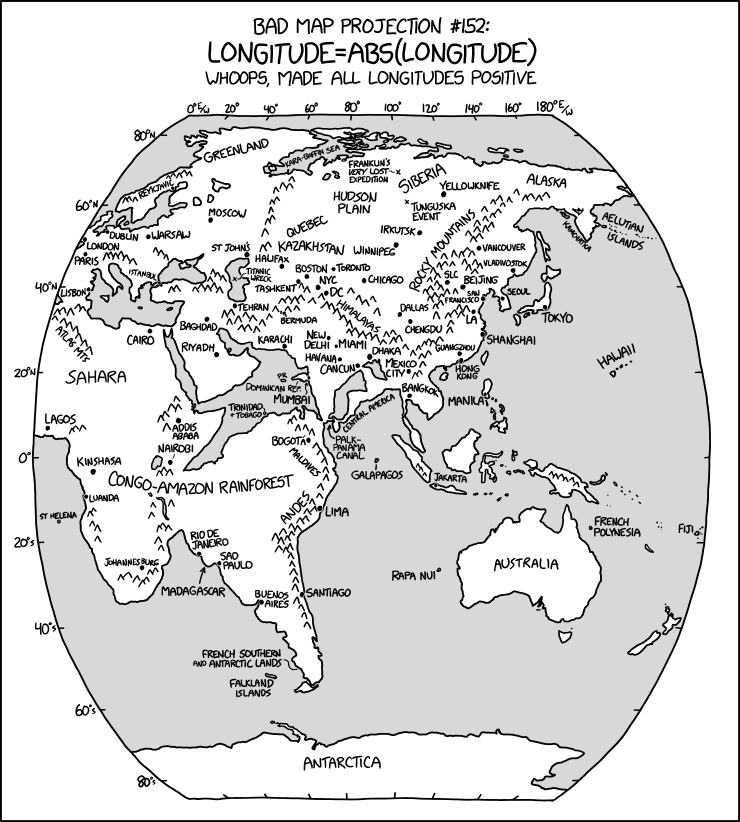
The 2023 iteration of the 30 Day Map Challenge is coming up, and Daniel Huffman has some thoughts about the day four prompt (“a bad map”) and making room for kindness in the mapmaking community.

It’s fun to play with those things that you’re not supposed to do! But, these are also same kinds of choices that might be made by someone who’s new to our community, and who isn’t as experienced. I’ve seen plenty of students who start out their careers by producing work that is very similar to the material that my colleagues produced when they were prompted to make “a bad map.”

Imagine, then, being one of those novices and seeing someone out there make something in the same style as you, and then see people laugh at it. Might you learn a useful lesson about design? Maybe. But there’s a kinder and more effective way to teach the next generation, isn’t there? […]

It’s no secret that I think our community has had a history of toxic critique and gatekeeping. I’ve written about it here, and talked about it at NACIS. This year, when prompted to make “a bad map,” I invite you to think of “bad” in more ways than just “what a beginner would make.”

Previously: Thirty Day Map Challenge; ‘One Bad Map a Day in February’.

A Book Roundup: Recent New Publications

Book cover: A History of the World in 500 MapsWriting for Geographical magazine, Katherine Parker reviews A History of the World in 500 Maps by Christian Grataloup (Thames & Hudson, 13 Jul 2023), which was originally published in French in 2019. “[E]ven with 500 maps, there’s a selection process at work that may leave some readers wanting for specific trajectories and topics. For example, although there’s a continual emphasis on economics, commerce and migration, the impact of the Transatlantic slave trade is only lightly addressed. Similarly, Indigenous perspectives are present, but not abundant. However, such critiques of lacuna in subject coverage are inevitable in any book that attempts to include all of human history.” Note that the maps are modern maps of history created for this book, not old maps. UK-only publication. £35. Amazon UK.

Book cover: Esri Map Book Volume 38The 38th volume of the Esri Map Book (Esri, 5 Sep 2023) came out earlier this month. Like the NACIS Atlas of Design (previously),1 it’s a showcase of maps presented at a conference—in this case, maps from the Map Gallery exhibition of Esri’s International User Conference. The Esri Map Book website has a gallery of maps presumably from this volume, and given the number of pages in the book (140) and the number of maps in the gallery (65), it may actually be complete (assuming a two-page spread per map). $30. Amazon (Canada, UK), Bookshop.

Book cover: The GlobemakersPeter Bellerby, of bespoke premium globemaker Bellerby & Co. fame, has written a book: The Globemakers: The Curious Story of an Ancient Craft (Bloomsbury) is out today in hardcover in the UK, and in North America on October 17; the ebook is available worldwide as of today. From the publisher: “The Globemakers brings us inside Bellerby’s gorgeous studio to learn how he and his team of cartographers and artists bring these stunning celestial, terrestrial, and planetary objects to life. Along the way he tells stories of his adventure and the luck along the way that shaped the company.” £25/$30. Amazon (Canada, UK), Bookshop.

‘Whoops, Made All Longitudes Positive’

xkcd:Bad Map Projection: ABS(Longitude)
Randall Munroe, “Bad Map Projection: ABS(Longitude),” xkcd, 26 Jul 2023.

The latest in Randall Munroe’s Bad Map Projection series on xkcd is perhaps his most evil yet: it turns all longitudes positive—i.e., it turns west longitude into east longitude, putting Quebec somewhere in Kazakhstan and the Panama Canal off Sri Lanka.

Map Men on Why North Is Up

The latest episode of Jay Foreman and Mark Cooper-Jones’s all-too-infrequent series Map Men looks at why north is at the top of modern maps, and features examples of maps where this was, or is, not the case, and why.

For something a bit more … academic, see Mick Ashworth’s Why North Is Up: Map Conventions and Where They Came From (Bodleian, 2019).

Previously: The Origins of North at the Top of Maps; The Idea of North.

Review: Atlas of Design, Vol. 6

Late last year I received, as a review copy, the sixth volume of the Atlas of Design. Things being what they are around here, there has been somewhat of a gap between receiving it, reading it, and saying something about it. But it’s worth saying something about that volume now, and the Atlas of Design in general, for at least one small reason I’ll get to in a moment.

I’ve mentioned the Atlas of Design series before, but it’s worth introducing it properly. Published every two years since 2012 by the North American Cartographic Information Society, the Atlas of Design is powered by volunteer editors and contributor submissions. Nobody’s getting paid for working on or appearing in these volumes—though it must be said that many of these maps are commercial ventures (posters available for sale at the mapper’s website) or works for hire (National Geographic and the Washington Post are represented in volume six), so the mapmakers aren’t doing this just for the exposure.

Continue reading “Review: Atlas of Design, Vol. 6”

Tien Shan and Other Panoramic Maps by Eric Knight

Eric Knight, “Tien Shan” (2022).

Eric Knight’s amazing panoramic maps aren’t the mountain panoramas you’re used to (if, that is, your point of reference is Berann or Niehues). Knight, who’s produced detailed relief and panoramic maps for National Geographic (see this page for examples of his work) gives us maps of vast regions, viewed in some cases from such a height that the Earth’s curvature is visible: see for example the Alps, the Caucasus, and Tien Shan (above). Available in online zoomable versions and for sale as prints. [Cartoblography]

Confused by Cartographic Conventions

Daniel Huffman writes that “there are certain cartographic conventions out there for which I don’t understand the logic.” (Such as that thematic or choropleth maps should be on equal-area projections.) “I do not suggest that these conventions are wrong; only that I lack a clear, intuitive rationale for following them, and so haven’t always incorporated them into my own practice. Maybe you can help explain them, or maybe you’re confused, too.”

In Praise of Dot Grid Maps

Screenshot
Historical FEWS NET Data

Mikel Maron is a fan of dot grid maps:

Dot grids are a clear, informative, multidimensional and flexible cartographic technique. They effectively leverage patterns of human perception to present information dense but readily comprehensible maps. Compared to choropleth maps, dots retain the base map context, and invite us to fill in the gaps. They emphasize the limits of data sampling. Dot grids can be joined together across different boundaries flexibly. The density of a dot grid can be varied depending on the scale. And that visual regularity … it just looks so cool.

He offers some examples of dot grid maps from his work at Earth Genome (see e.g above), and elsewhere, and gives some history of the format.

Ordnance Survey Soliciting Ideas for New Map Symbols

The Ordnance Survey is asking its users to propose new symbols for its paper and digital maps, the Sunday Times reports [paywalled;  News+]. “The national mapping agency is suggesting a list of potential updates, such as cafés, dog-waste bins and bicycle repair shops, as well as annotations to alert wheelchair and pushchair users about paths that have stiles. It may also include defibrillators once there is a reliable register.” Symbols were last updated in 2015. The Times article quotes a number of people who point out that the OS map could stand more radical change: among other things, there are still no separate symbols for non-Christian places of worship. See also the Guardian’s coverage.

‘One Bad Map a Day in February’

#mapfailbruarychallenge: a list of categories to create one bad map a day in February.

It’s like the #30daymapchallenge in November, in which mapmakers are challenged to make a map a day on a given daily theme, only the reverse: the MapFailbruaryChallenge is about making a bad map on a given daily theme. “The idea is to create the worst map possible.” Bad maps happen; will a deliberately bad map be better or worse? Either way, it’s probably worth stocking up on popcorn for when maps with the #mapfailbruarychallenge hashtag start showing up on our timelines.

(Failbruary. Fai-EL-bru-AIR-y. Say that ten times. And resign yourselves to the fact that Reddit is probably going to kick everyone’s ass on this.)

Update, 19 Jan: There’s an official website now.

Projection Connections: A Genealogy of Map Projections

Projection Connections: a diagram showing the relationships between various map projections by Daniel Huffman
Daniel Huffman

Fresh off of producing a (now sold-out) line of map projection trading cards, Daniel Huffman has produced a 16×24-inch poster showing the surprisingly close and entangled relationships between the various map projections.

I first learned about a couple of these connections several years ago. I don’t quite remember how or where, but I found out that the Mercator projection was equivalent to a Lambert Conformal Conic with the standard parallels set opposite each other across the Equator. And that if you moved both those parallels up to a pole, you got a Stereographic. My mind was suitably blown, and I saved it as a fun fact to share with people. This year, while working on The Projection Collection, I spent a lot of time on daan Strebe’s site looking up details, and I often saw his notes (usually derived from Snyder/Voxland) about how projections were related to each other. I started to realize there were a lot of these connections out there, and I thought it might be fun to diagram them in some way.

The diagram is digital-only (PDF) and donationware.

Will Using Fuller’s Projection Get You in Trouble?

Buckminster Fuller’s Dymaxion map: is the projection it uses patented, trademarked or copyrighted to the extent that you have to pay a licencing fee or face a lawsuit? Daniel Huffman digs into this very question, which apparently has been circulating around the cartographic world for some time. “Here’s the summary of what I’ve concluded: if you don’t pay a license fee before you publish a map that uses the Fuller projection, you may find yourself hearing from the projection’s ‘owner.’ At the same time, I don’t think that the owner (the Buckminster Fuller Institute) has any rights that would actually hold up in court.”

What Do You Mean, Three Norths?

The Ordnance Survey is making a small deal over a so-called “triple alignment” of true north, magnetic north and grid north early this month: “the historic triple alignment will make landfall at the little village of Langton Matravers just west of Swanage in early November and will stay converged on Great Britain for three and a half years as it slowly travels up the country.”

Now, grid north is an artifact of a map projection’s grid lines. On a map grid there’s always some difference between true north and grid north except along the central meridian, which in Ordnance Survey maps is two degrees west of Greenwich. The further away from that central meridian, the greater the difference.

What the Ordnance Survey is hyping is that magnetic north, which is constantly shifting, has moved to a point where magnetic declination (the difference between true north and magnetic north) is zero along that central meridian. Kind of neat—if you’re using an Ordnance Survey map. Because this particular triple alignment only exists for Ordnance Survey maps. It’s all a bit anglocentric, really (especially the bit in the video that describes true north as “the line which runs through Britain to the North Pole”).

From Analemma to Zodiac: Bellerby’s Glossary of Globe Terminology

Globemaker Bellerby & Co. has posted a glossary of globe terminology that covers more general geographical terms and concepts (equator, hemisphere) as well as things that are mainly found on globes, covering the various mount types, to common features like time dials and analemmas, to calottes (which are the little circles that cover the poles, where the gore points meet; oddly enough “gore” doesn’t get its own listing).