
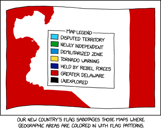
Maps where countries are coloured in with flag patterns: I’ve seen a lot of them around, especially on Reddit, but I haven’t necessarily liked them; xkcd’s comic from last Wednesday goes one step further in that it offers a way to hack them.
Maps where countries are coloured in with flag patterns: I’ve seen a lot of them around, especially on Reddit, but I haven’t necessarily liked them; xkcd’s comic from last Wednesday goes one step further in that it offers a way to hack them.

The Wall Street Journal is reporting that New York’s Metropolitan Transit Authority is experimenting with new network maps that adopt a diagrammatic design that harkens back to Massimo Vignelli’s 1972 design, or (frankly) to designs used by most other transit systems. The new maps appear in nine subway stations side-by-side with geographically accurate maps of the MTA system, and embed QR codes so riders can submit feedback. If the maps are positively received, they could replace the MTA’s current network map—but New York being New York, and New York’s map wars being what they’ve been for the past fifty years or so, it’s anyone’s guess how this will shake out. More at Gizmodo.
 Back in 1978, Massimo Vignelli and John Tauranac debated the future of New York’s subway map. That debate—which in many ways never quite ended—is now the subject of a book coming out later this month. Edited by Gary Hustwit, The New York Subway Map Debate includes a full transcript of the debate and subsequent discussion (thanks to the discovery of a lost audio recording), plus contemporary photos and new interviews. Paperback available for $40 via the link.
A lot of fun can be had at Florian Ledermann’s Map Projection Playground, which loads up nearly a hundred map projections for you to manipulate: controls enable you to change the centre meridian and several other parameters. You can even overlay a simplified Tissot’s indicatrix! [Maps Mania]
 Geographer Christopher Winters maps car ownership—or rather the lack thereof—in The Geography of Carfree Households in the United States. In only a few census tract do more than 75 percent of the population go without owning a car. Not surprisingly, most of them are in New York, plus other densely populated cities: “New York has many more such households than any other urban area. It’s the one large place in the United States where only a minority of households have a vehicle available.”

The New York Times and Texas Monthly look at the bizarre shapes in the new congressional electoral map of Texas, which gains two new representatives. Texas Monthly’s Dan Solomon: “Across the state, there will be one more majority-Anglo district than under the prior map, and one fewer majority-Hispanic one. The two new seats Texas was awarded for its booming population will be placed in Austin and Houston—and even though non-Anglo newcomers made up 95 percent of the state’s population growth the last decade, both districts will be Anglo-majority.” Kenneth Field has some thoughts. [Maps Mania]
A Surge of Citizen Activism Amps Up the Fight Against Gerrymandering (Bloomberg): “From North Carolina to Michigan to California, voting rights groups, good government advocates, data crunchers and concerned voices are finding new ways into the fight for fair representation, via informational meetings, mapping contests, testimony workshops and new technologies.”
Can Math Make Redistricting More Fair? (CU Boulder Today): “Clelland doesn’t advocate for any political party or for any particular redistricting proposal. Instead, she and her colleagues use mathematical models to build a series of redistricting statistics. These numbers give redistricting officials a baseline that they can compare their own maps to, potentially identifying cases of gerrymandering before they’re inked into law.”
Previously: The Washington Post Examines Proposed Congressional District Maps.

Inspired, he says, by Itchy Feet’s maps of Every European City and Every American City, Alfred Twu has come up with a Map of Every Chinese City. (Chinese version here.) Twu is no stranger to these parts: he worked on rail maps for California and the Northeast Corridor some years back.
Previously: Itchy Feet’s Map of Every European City; Itchy Feet’s Map of Every American City.
Another time-lapse map of the spread of COVID-19 in the United States, this one from David A. West, who posted the above to r/dataisbeautiful on Reddit. This one shows new cases per capita on a county-by-county basis.
Previously: COVID-19 Spreading Across the United States.
Albert H. Small, whose donation of maps and other items to the George Washington University Museum in 2011 became the Albert H. Small Washingtoniana Collection, died on 3 October, shortly before what would have been his 96th birthday. NEH statement, obituary. [Tony Campbell]
Previously: The Albert H. Small Washingtoniana Collection.
You Are Here: California Stories on the Map is an exhibition showing at the Oakland Museum of California through 2022. “Showcasing a diverse range of maps from Oakland, the Bay Area, and California—from environmental surroundings and health conditions to community perspectives and creative artworks—experience how maps can be a powerful tool to share unique points of view and imagine a better future.” San Francisco Examiner coverage. Admission is $16 or free to museum members.

Legendary ski resort map artist James Niehues has announced on his blog and on Twitter that he will be “stepping away from creating ski resort trail maps” after more than three decades. He plans to work on other projects, including the American Landscape Project, and will, for the first time, be selling original paintings and sketches of his ski resort trail maps later this month.
Using Johns Hopkins University data, Nicholas Bauer has created this time-lapse map showing the spread of COVID-19 across the United States. This pandemic has been described as having waves; now you can watch them ripple across the continent. [Kottke]

El Confidencial maps COVID-19 mortality rates in Spain at the municipal level; smaller municipalities are not included in the data. [Maps Mania]
Google Maps updates this week: wildfires are getting their own dedicated layer in Google Maps; their tree canopy coverage tool is being expanded to 100 cities; and a new Address Maker app will make it possible to bulk-add Plus Codes to locations without addresses.

Redistricting—and gerrymandering—is one of the blacker cartographic arts. With the release of data from the 2020 U.S. Census, and the changes in state congressional delegations—some states gain a seat or two, some states lose a seat, others are unchanged—new congressional maps are being drawn up for the 2022 elections. The Washington Post takes a look at proposed congressional district maps in Colorado, Indiana and Oregon, and what their impact may be.