
A wide-ranging article at Bristol 24/7 explores at the different ways that Bristol has been mapped throughout history. It begins with a look at Jeff Bishop’s 2016 book, Bristol Through Maps (Redcliffe), which includes 24 maps of the city from 1480 to today. Then it goes on to Bristol City Council’s Know Your Place, which layers historic maps on top of a web mapping interface, and finishes with a roundup of the work of local artists and graphic designers. Quite the microcosm: so many kinds of mapping activity, all focused on one British city. [Tony Campbell]
Links
Children Map the World, Volume 4
 So it turns out that the Children Map the World series, which collects entries from the Barbara Petchenik Children’s World Map Drawing Competition, is still a going concern: the fourth volume, which includes 50 maps drawn by children aged 5 to 15 for the 2015 competition plus another 50 maps from previous competitions, came out last month from Esri Press. Amazon. [Caitlin Dempsey]
Previously: Children Map the World: The Book; Children Map the World, Volume Two.
Mapping in the Enlightenment
 Mapping in the Enlightenment: Science, Innovation, and the Public Sphere, an exhibition at the University of Michigan’s William L. Clements Library, “uses examples from the Clements Library collection to tell the story of creating, distributing, and using maps during the long 18th century. Enlightenment thinking stimulated the effort to make more accurate maps, encouraged the growth of map collecting and map use by men and women in all social classes, and expanded the role of maps in administration and decision-making throughout Europe and her overseas colonies.” Fridays from 10 to 4 through October. [History of Cartography Project]
Picturing Places and the Klencke Atlas

This week the British Library launched an online collection of digitized “topographical materials” (i.e., views of and writings about places) called Picturing Places. More than 500 items—paintings, prints, drawings, texts and yes, maps—so far, sorted by theme and with dozens of accompanying articles.
Picturing Places demonstrates that topography involves far more than straightforward ‘pictorial evidence’ of what a place looked like in the past. We showcase some of the Library’s most treasured topographical materials, including Tudor views collected by Robert Cotton and maps and views owned by George III. But much of this material remains uncharted, and is being brought to wider attention for the first time. The first phase of Picturing Places features over 500 collection items, most never published before, and over 100 articles providing fresh perspectives and new ideas.
One of these digitized items is one of the Library’s crown jewels: the gigantic Klencke Atlas presented to Charles II in 1660, all of the pages of which can now be viewed online. How do you digitize an atlas that is 1.76 by 2.31 metres wide when open? Not with a flatbed scanner, you don’t. Here’s how:
Previously: British Library Digitizing George III’s Map Collection.
The Penguin Projection
“A world map tells a lot about the person who has made it, or about the market it is made for,” says Frans Blok. The edges of equatorial projections are determined so as to put the map’s audience at the centre of the map: European maps put the Bering Strait at the edges, Australian and Asian maps the Atlantic, American maps break Asia in two. If, however, only the polar regions were habitable—or if you were making a map for penguins—you might use a polar projection centred on Antarctica.

“And no, for European use this map is less suitable. But there aren’t that many penguins living here,” says Blok. [ICA]
Maps and Empire: New Books


Three academic books out this month deal with the subject of mapping, surveying, and empire-building:
The New Map of Empire: How Britain Imagined America before Independence by S. Max Edelson (Harvard University Press) covers the period between the Seven Years’ War and the American Revolution. From the publisher:
Under orders from King George III to reform the colonies, the Board of Trade dispatched surveyors to map far-flung frontiers, chart coastlines in the Gulf of St. Lawrence, sound Florida’s rivers, parcel tropical islands into plantation tracts, and mark boundaries with indigenous nations across the continental interior. Scaled to military standards of resolution, the maps they produced sought to capture the essential attributes of colonial spaces—their natural capacities for agriculture, navigation, and commerce—and give British officials the knowledge they needed to take command over colonization from across the Atlantic.
Britain’s vision of imperial control threatened to displace colonists as meaningful agents of empire and diminished what they viewed as their greatest historical accomplishment: settling the New World. As London’s mapmakers published these images of order in breathtaking American atlases, Continental and British forces were already engaged in a violent contest over who would control the real spaces they represented.
Maps and visualizations to accompany the book are available online.
The First Mapping of America: The General Survey of British North America by Alex Johnson (I. B. Tauris) seems to cover similar territory, if you’ll pardon the pun, though I have very little information about it. [Amazon]
Finally, Daniel Foliard’s Dislocating the Orient: British Maps and the Making of the Middle East, 1854-1921 (University of Chicago Press) “vividly illustrates how the British first defined the Middle East as a geopolitical and cartographic region in the nineteenth and early twentieth centuries through their imperial maps. Until then, the region had never been clearly distinguished from ‘the East’ or ‘the Orient.’ In the course of their colonial activities, however, the British began to conceive of the Middle East as a separate and distinct part of the world, with consequences that continue to be felt today.” [Amazon, iBooks]
Related: Map Books of 2017.
Whither the Waters
 Out this month from the University of New Mexico Press: John L. Kessell’s Whither the Waters: Mapping the Great Basin from Bernardo de Miera to John C. Frémont, a relatively short book that places 18th-century colonial New Mexican artist and cartographer Bernardo de Miera in his historical context and explores how later cartographers made use of his work. The Santa Fe New Mexican covers the launch of the book with a look at both author and subject. Amazon. [WMS]
Mapping the 2017 French Presidential Election (First Round)
France held the first round of its presidential election this past Sunday. Unlike U.S. presidential elections, it’s by popular vote, with the top two vote-getters moving on to a second round in two weeks’ time.
The major candidates’ support was distributed unevenly around the country. Media organizations used several different methods to show this. The New York Times used a choropleth map, showing who among five candidates (including Lassalle, excluding Hamon, who finished fifth but does not appear to have won a commune: ouch) finished first on a commune-by-commune basis. Of course, when you have four candidates finishing within a few points of one another, when you win a district, you don’t necessarily win by much. The print edition of Le Figaro included choropleth maps detailing five candidates’ regional support as well.
#cartographie de la #Presidentielle2017 Et le futur duel #macron vs #lepen à lire demain dans @Le_Figaro pic.twitter.com/cP0kEmOPsE
— Guillaume Balavoine ?? (@gbalavoine) April 24, 2017
Both the Times and Le Figaro use geographical maps, which can be misleading because of the number of votes concentrated in large cities, as Libération’s Julien Guillot points out. (This comes up in most countries’ elections, to be honest—certainly the ones where it’s the popular vote, rather than the constituency, that’s being looked at.) Slate uses a cartogram to compensate for that. (Both of these pages are in French.)
For those seeking local results rather than analysis, several French media organizations provide them through a very similar map interface: see, for example, the online results pages for France 24, Le Figaro and Le Monde. Each begins with a map of France: clicking on a département provides results for that département that includes a map showing each commune, which can also be clicked on. For some reason neither France 24 nor Le Monde show actual vote totals at the local level, which doesn’t seem sensible in an election by popular vote.
Finally, a couple of outliers. This page looks at the results from all presidential elections under the French Fifth Republic. And this page marks the 56 communes in which Marine Le Pen received not a single vote.
Persuasive Cartography Collection Expands

More than 500 maps have just been added to the P. J. Mode Collection of Persuasive Cartography at the Cornell University Library. That’s almost double the number they began with. Via email, P. J. Mode also says that “Cornell has implemented a much-improved image browser with a very robust search function. I hope there are some things that you’ll find new and interesting!”
Previously: Persuasive Cartography; Another Look at Persuasive Cartography.
Patents and Cartographic Inventions
 Published late last month, Mark Monmonier’s new book, Patents and Cartographic Inventions: A New Perspective for Map History (Palgrave Macmillan) is on a somewhat more arcane and non-obvious subject than his usual fare. It’s an exploration of the U.S. patent system that focuses on map- and navigation-related inventions. The publisher’s description: “In probing evolving notions of novelty, non-obviousness, and cumulative innovation, Mark Monmonier examines rural address guides, folding schemes, world map projections, diverse improvements of the terrestrial globe, mechanical route-following machines that anticipated the GPS navigator, and the early electrical you-are-here mall map, which opened the way for digital cartography and provided fodder for patent trolls, who treat the patent largely as a license to litigate.” Actually sounds interesting as hell; the book is quite expensive, though. Amazon, iBooks.
Mapping Global Landslide Susceptibility

NASA Earth Observatory notes the release of a new map of global landslide susceptibility that models the risks of landslides that are triggered by heavy rain. “The map is part of a broader effort to establish a hazards monitoring system that combines satellite observations of rainfall from the Global Precipitation Measurement (GPM) mission with an assessment of the underlying susceptibility of terrain.” [Geographical]
Early French Maps of the Great Lakes
 On Tuesday, Jean-François Palomino of the Bibliothèque et Archives nationales du Québec gave a talk on early French mapmaking efforts in the Great Lakes region at the University of Michigan. I missed being able to tell you about it in advance, but student newspaper The Michigan Daily has a writeup. [WMS]
(Palomino is one of the co-authors of Mapping a Continent: Historical Atlas of North America, 1492-1814, the French edition of which is La Mesure d’un continent.)
‘Please Return to the Map Center’

April 19th: The day the Leventhal Map Center finally snapped.
Burmese Maps at Cambridge

Natasha Pairaudeau: “Imagine maps as big as bedsheets, and then imagine the sheets big enough for beds made wide enough to sleep extended families. Only such a double stretch of the imagination can provide the scale of the three Burmese maps in the University Library’s collection, which have recently been made available online in digital format.” [Cartophilia]
Tube Maps of the Thames
Transport for London also operates river buses along the Thames; their maps of the London River Services are very much in the Tube map vein, in both tourist and non-tourist versions:
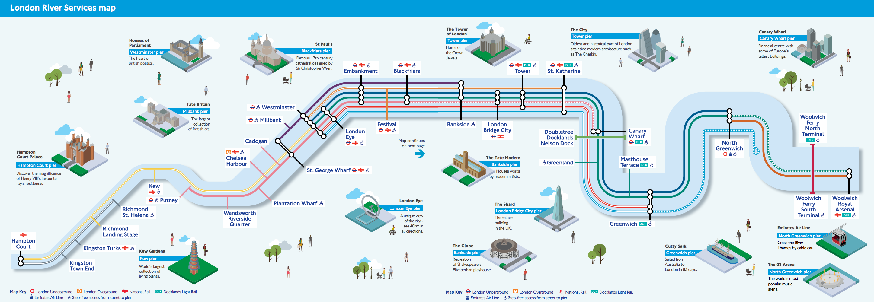

Of the tourist version Ollie O’Brien of Mapping London says this: “We like the pseudo-tube-map styling, although it could of course be simplified even further, with the Thames just being shown as a straight line. The inclusion of isometric squares showing the major landmarks near each pier is a nice touch. TfL has never really decided whether its river services are for tourists or commuters, but this map should satisfy both.”