Classroom materials and maps produced by the Utah Historical Society for the State of Utah’s commemoration of the 250th anniversary of the founding of the United States include this rather interesting map of the peoples of North America in 1776. It shows “colonial communities” alongside Indigenous language groups. [John Garrison Marks]
Two recent articles on the contentiousness that breaks out at the local level when FEMA updates its flood maps. Jordan Wolman’s piece in the Commonwealth Beacon focuses on the disconnect between FEMA’s maps and actual flooding risk in Massachusetts (as has been noted before, FEMA flood maps are based on past flooding and can’t make projections based on expected climate change effects). Meanwhile, the Wall Street Journal [Apple News+ alt link] looks at how properties in a Montana town that were removed from the flood zone in proposed FEMA maps were later inundated by floods (properties in flood zones require flood insurance, and face additional restrictions, so there are incentives to appeal that designation; on the other hand, if you win your appeal and your property floods anyway and you don’t have flood insurance, well).
VoteHub has released a precinct-level map of the 2024 U.S. presidential election results that includes vote density as well as margin—in other words, taking into account how many votes are in a district, not just by how much (tempering the fact of winning 90% of the vote in a district with the fact that there are only 100 votes to be had in the district, say). [Maps Mania]
The new USGS map, called The Cooperative National Geologic Map, was created using more than 100 preexisting geologic maps from various sources and is the first nationwide map to provide users with access to multiple layers of geologic data for one location. This feature allows users to access the multiple data sources included in the map to look at or beneath the surface to understand the ancient history of the nation recorded in rocks.
Of note: the USGS cites automated processes to speed up the integration of data from its various sources (e.g., state geologic surveys), resulting in a new map after only three years of development.
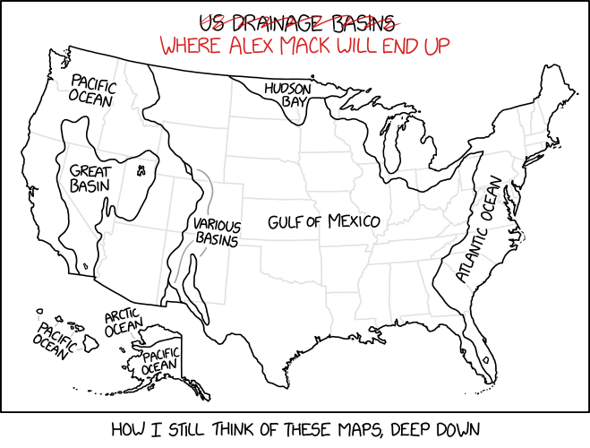
Randall Munroe, author of the xkcd web comic, posts a surprising amount of map-related content, which I invariably end up linking to here. With some exceptions, they fall into one of two categories, each of which has a recent example.
The second category is where Randall chooses the path of violence, with maps clearly designed by Black Hat Guy to hurt our brains. These include a series of maps that mangle U.S. state borders (1, 2, 3). But the most insidious are his Bad Maps Projections series, the most recent of which projects continents onto their own globes:
Thing is, this one isn’t as brain-curdling, because similar globes—globes that depict a portion of the world on an entire sphere—exist in the real world.
The decline in passenger rail service in the U.S. and Canada is charted by this interactive map, which uses a slider to compare Amtrak and Via Rail service in 1980 with what it is today. [Maps Mania]
I haven’t seen many maps of the 2024 U.S. presidential election results, but then I haven’t been looking very hard for them either. Last week, CNN posted some charts and maps showing where the candidates under- or overperformed relative to the 2020 election. “Perhaps it shouldn’t be surprising that in the states where the campaign was the most hotly contested, more people voted in 2024, whereas in states where one side or the other seemed more likely to win, turnout generallydropped.”
A short video from Vivid Maps showing the evolution of time zone boundaries in the United States. (The trend was inexorably westward: Michigan started out completely CST.)
The U.S. congressional electoral map was redrawn after the 2020 census, but now parts are being redrawn again. ABC News has a page tracking developments in what they call midcycle redistricting. “More than a half-dozen states face the prospect of having to go through the redistricting process again, mostly due to federal and/or state litigation over racial or partisan gerrymandering concerns. Both Democrats and Republicans have the opportunity to flip seats in districts drawn more favorably than they were last cycle. For example, Democrats appear poised to pick up at least one seat in Alabama and could theoretically get more favorable maps in Louisiana and Georgia. Republicans, meanwhile, could benefit from more favorable 2024 maps in North Carolina and New Mexico.”
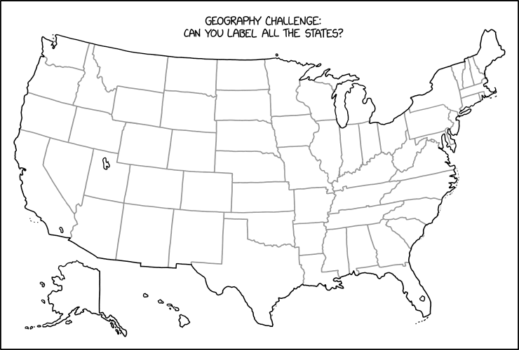
Randall Munroe, “Label the States,” xkcd, 15 Dec 2023.
Stare at this map for a while until you figure out what Randall Munroe has done in last Friday’s xkcd. Then scream. (Kottke says: “This is evil.”) It’s not the first time that xkcd has committed mischief and violence on an outline map of the contiguous United States: see, for example this one, or this one. I worry it may not be the last.
Curious about the origins of American place names, Lia Prins built a dataset of U.S. county names and categorized them by what they’re named for and the language they’re named in. There’s an interactive map, detailed inset maps showing how names types are clustered, and a discussion of methodology. [Maps Mania]
There has been an outbreak of anti-trans legislation at the state level in the United States, and Erin Reed has spent the last three years tracking it. Her anti-trans legislative risk map measures the extent to which trans people are endangered by such legislation, whether it’s already on the books or could be the offing before the next election. The map reveals, no surprise, a polarized America: one where some states are racing to put anti-trans laws on the books while others enact protections and set themselves up as safe harbours.
A book about the work of Emma Hart Willard (1787-1870) is coming out this month from Visionary Press. The book, Emma Willard: Maps of History, includes an essay by Susan Schulten (who also edited the book) along with reproductions of Willard’s maps, atlases and time charts (for example, the 1828 set of maps that accompanied her History of the United States, or Republic of America), which proved hugely influential in terms of using maps in pedagogy, as well as historical maps and graphical depictions of time. The book is part of a series, Information Graphic Visionaries, that was the subject of a successful Kickstarter last year. Outside of that crowdfunding campaign, the book can be ordered from the publisher for $95 (it’s on sale right now for $85). [Matthew Edney]


 A book about the work of