
In The Atlantic’s May 2019 issue, Frank Portnoy looks at an unexpected use of satellite imagery: stock analysts counting cars in retail parking lots, among other things, to predict a company’s revenues.
Mapping Disasters in America
The Washington Post maps disasters in the United States, with a page that shows maps of flood warnings, tornadoes and hurricanes, extreme heat and cold (see above), wildfires, lightning, and earthquakes and volcanoes. In the wake of a natural disaster there’s usually someone suggesting that the victims are at fault for living in a disaster zone. The WaPost’s maps have an answer to that: “It turns out there is nowhere in the United States that is particularly insulated from everything.”
Le Monde en sphères
 Le Monde en sphères, a new exhibition at the Bibliothèque nationale de France, looks at spherical representations of the world throughout history. Globes, to be sure, but there are other spherical representations to consider as well. See the exhibition website (in French; buggy in some browsers) or visit the physical exhibition, which opens on 16 April 2019 and runs until 21 July at the François Mitterand building. Tickets €7-9.
Measles in America

The New York Times maps confirmed measles cases in the United States as of April 29, 2019. “Measles was declared eliminated in the United States in 2000 but the highly contagious disease has returned in recent years in communities with low vaccination rates. The number of cases reported this year is already nearly double last year’s count and has surpassed the previous post-elimination high of 667 cases in 2014.”
The Russians Are Spoofing! The Russians Are Spoofing!
Russian authorities appear to be systematically messing with GPS and other GNSS signals in multiple locations, a new report from the Center for Advanced Defense Studies concludes (CBS News, Foreign Policy, Moscow Times, Wired). The tactic is called GPS spoofing: broadcasting a false GPS/GNSS signal in a specific location to fool GPS/GNSS receivers and render them unreliable or unusable. The incidents appear to correlate with sensitive Russian facilities, active combat zones, and the travel itinerary of one Vladimir V. Putin. In one case, while Putin was opening a bridge between Russia and Crimea, nearby ships were suddenly informed by their GPS/GNSS receivers that they were dozens of kilometres away from their actual position.
Archaeology Magazine on Ancient Maps
The May/June 2019 issue of Archaeology magazine looks at some truly ancient maps, many of which—tablets, papyruses, stick charts—challenge our ideas of what maps ought to look like.
Pasha Omelekhin’s Berlin Transit Map
Among other things, Pasha Omelekhin’s redesign of the Berlin S-Bahn map brings the dog back: the Ringbahn’s route is roughly in the shape of a dog’s head, but in most Berlin transit maps since the 1930s it’s been shown as a circle. It also shows rivers and channels, and adds other curves to give Omelekhin’s unofficial map a flowing, organic look. [MetaFilter]
Happy GPS Week Rollover!
It’s probably overstating things to compare the GPS week rollover to the Y2K bug (The Next Web, The Verge) but it’s hard not to see some parallels. In each case, it’s a function of too little memory assigned to timestamps.
One of the things that GPS satellites do is transmit precise timing information. It does this in part by stating the week as a 10-bit integer, counting from week one. That means the date number rolls over every 1,024 weeks. Every 19.7 years, then, the GPS week “rolls over” and a new GPS epoch begins. It’s already happened once: the GPS era started on 6 January 1980, and the first rollover occured in August 1999. The next one takes place—oh dear—tomorrow. Cue the mass hysteria.
How will our GPS receivers respond to that rollover? Because it’s happened before, and because consumer GPS tech doesn’t necessarily stay in use for long periods of time, it’s unlikely that your or my GPS receivers are affected. Anything released in the past two decades would have programmed after the last rollover. Also, receivers might have have had an offset to the 1,024-week limit programmed into their firmware, starting the clock from the date of compilation rather than August 1999, so devices affected may not be affected all at once. U.S. government agencies note that GPS receivers that conform to the IS-GPS-200 specification should not be affected: PC Mag pins that on devices manufactured in 2010 or later.
My own legacy GPS receivers—a Garmin eTrex Legend H and an Oregon 450t—date from just before 2010, and while I haven’t used them in years (when your smartphone has built-in GPS, dedicated receivers are superfluous in the most common use cases), I’m half tempted to fire them up and see what happens. Both TomTom and Garmin claim that the vast majority of their devices are unaffected, but neither go so far as to give us a list of affected devices. Firmware updates are apparently being issued for some of those affected devices—but again, a list would help.
In any event, it appears that using GPS for location, even on an affected device, will not be broken: at worst your tracklogs will have inaccurate timestamps. Receivers that use GPS for accurate timekeeping that have not been updated to handle the rollover might run into some trouble, though. And, like Y2K, any problems might be in industrial or embedded systems rather than consumer tech—and from what I’ve seen online they’ve been getting warnings about this for years.
In other words, as far as I can tell, the GPS world will not come crashing down tomorrow.
Great Britain’s National Parks Poster

To mark the 70th anniversary of the legislation creating the United Kingdom’s national parks, the Ordnance Survey has released the above poster showing each of Britain’s 15 national parks in relief. The 84 × 119 cm poster can be had for £15 via the Ordnance Survey’s shop.
The Geography of Partisan Prejudice

The Atlantic maps political polarization in America. “The result was surprising in several ways. First, while virtually all Americans have been exposed to hyper-partisan politicians, social-media echo chambers, and clickbait headlines, we found significant variations in Americans’ political ill will from place to place, regardless of party.” Includes an interactive map with county-level data based on polling and analytics.
Search Results for Forgotten Towns
Online maps are giving ghost towns a new life, of sorts. The Daily Southtown’s Ted Slowik looks at the case of Gilletts, Illinois, a forgotten milk stop on the Rock Island line. But thanks to its listing in the USGS’s Geographic Names Information System and the fact that it’s surrounded on all sides by medium-sized cities and towns, doing a search on Gilletts generates all kinds of results.
Shopping for a new home? A search on Zillow produces 12 results of homes for sale near Gilletts. Trulia, another real estate website, generates 84 results.
Searching for a job? The website Indeed shows 718 employment opportunities within 5 miles of Gilletts. Another site, Simply Hired, shows 563 jobs available within 5 miles of Gilletts.
You can find Gilletts on Mapquest. You can get the forecast for Gilletts on AccuWeather’s website. If you’re looking for a hotel room, Booking.com can show you more than 70 rooms available and their distance in miles from downtown Gilletts.
Except there is no downtown Gilletts, since it was never anything more than a depot where trains stopped to pick up milk that local farmers sold to markets in Chicago and elsewhere.
But according to Yelp, there are 115 places to eat, 233 things to do and 353 places to shop within striking distance of Gilletts.
The same is no doubt true with any named point on the map, and to be honest this is probably how it should be. Web services are providing results based on proximity to a given location: there’s no judgment about the significance of that location. You’re the one who put the ghost town’s name into the search engine: here you go.
An Exhibition of Historic Maps of New York City: New Amsterdam to Metropolis
Untapped Cities has photos from an exhibition of historic and antique maps of New York City at the gallery of Manhattan rare book dealer Martayan Lan. New Amsterdam to Metropolis: Historic Maps of New York City features maps of the city dating back to the 16th century. It opened last November and runs until the end of May 2019. Some (but not all) of the maps, the New York Times notes, are for sale, which is what happens when it’s a rare book dealer rather than a museum or library doing the exhibition.
xckd’s ‘Least Informative’ Google Trends Maps
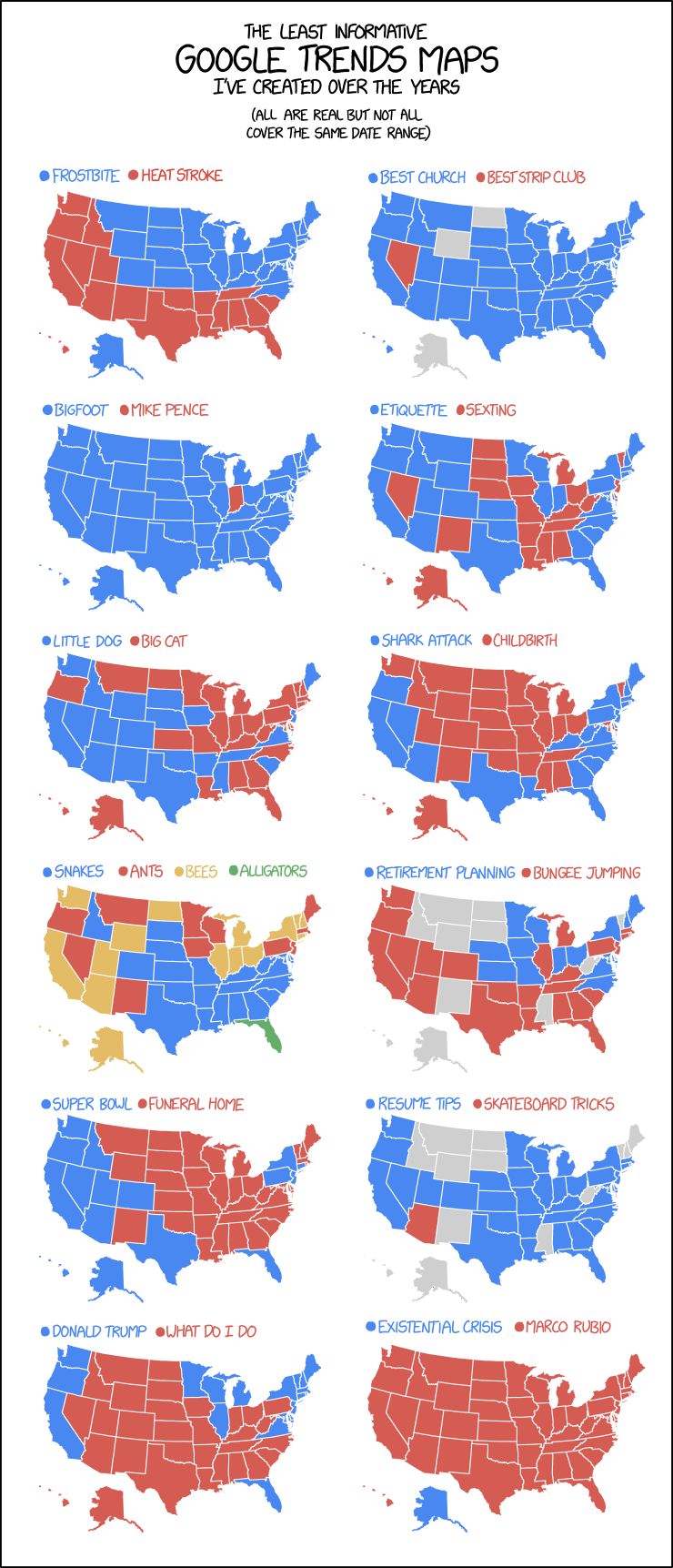
Oh look, another map-themed comic/infographic thingy from xkcd: the March 20 edition is having some fun with the maps generated by Google Trends data. The maps are real, says Randall.
Priscilla Spencer, Fantasy Mapmaker


I’m impressed by the work of fantasy mapmaker Priscilla Spencer, whose maps have illustrated novels by Seanan McGuire, Myke Cole, Jim Butcher and Saladin Ahmed, among others. Spencer’s maps push the boundaries of the default fantasy map style: some of them appear as they would in-universe, others adopt elements appropriate to the culture of the world being mapped. Making a note for future reference.
A Map of Modern-Day Westeros

Art designer James Shadrach Schoenke imagines a modern-day Westeros with a modern-style map that mimics the design of European road maps.