The Bad Map Projection series of xkcd cartoons are mischievous and brain-melting but often as not come with a kernel of truth. Last Friday’s is a case of geomagnetorectification, distorting the map to line up true north with magnetic north. Is it wrong that I think it’s more interesting than brain-melting?
Randall Munroe, author of the xkcd web comic, posts a surprising amount of map-related content, which I invariably end up linking to here. With some exceptions, they fall into one of two categories, each of which has a recent example.
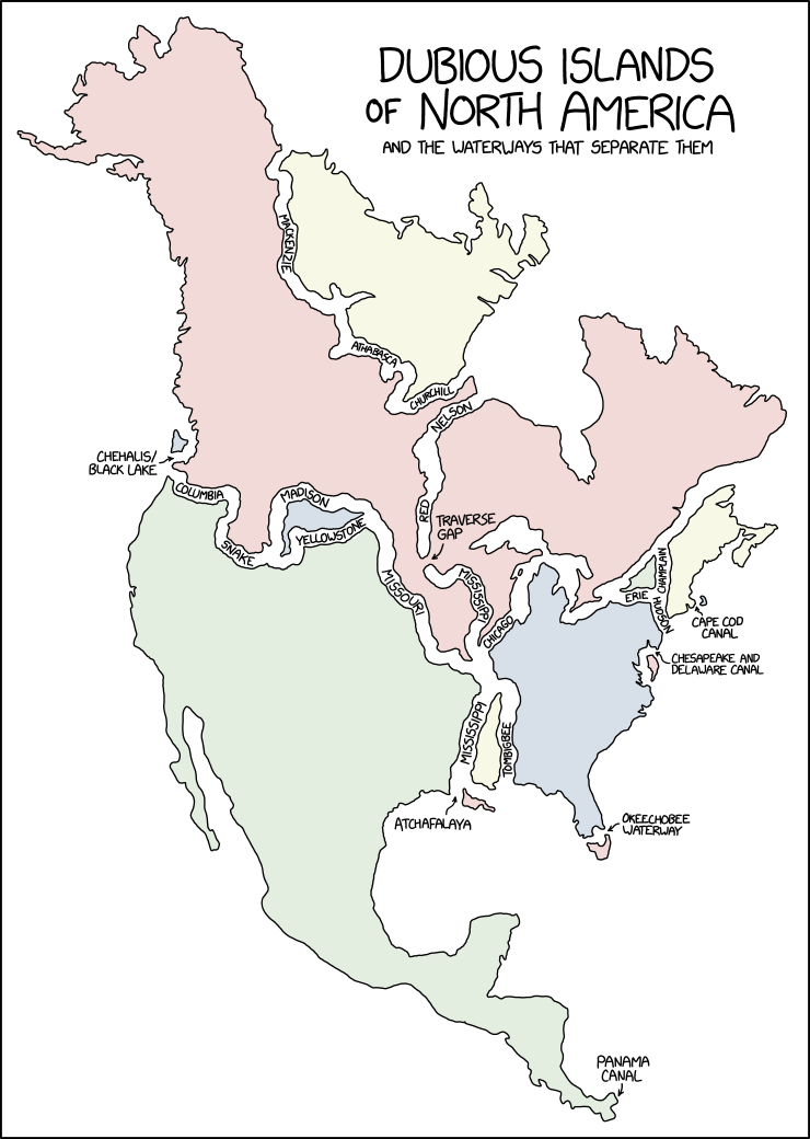
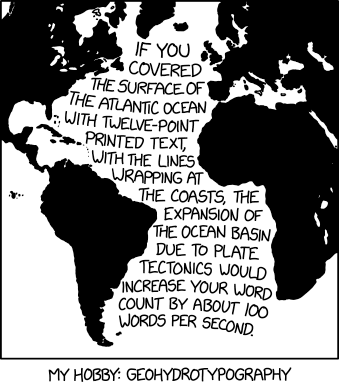
The second category is where Randall chooses the path of violence, with maps clearly designed by Black Hat Guy to hurt our brains. These include a series of maps that mangle U.S. state borders (1, 2, 3). But the most insidious are his Bad Maps Projections series, the most recent of which projects continents onto their own globes:
Thing is, this one isn’t as brain-curdling, because similar globes—globes that depict a portion of the world on an entire sphere—exist in the real world.
In Wednesday’s xkcd comic, Replogle has apparently been taken over by mad scientists. I’m having a hard time resisting the urge to explain the joke (I doubt many of my readers are physicists, but then I’m not one either). But in a weird Einsteinian way Randall is doing with globes and mass what Carroll, Borges and Eco did with maps and space: assume a 1:1 ratio between the map and the mapped.
In the latest iteration of xkcd’s series of bad map projections, Randall puts Kansas—the putative centre of the contiguous 48 states—at the edge of the map.
Randall Munroe, “Alphabetical Cartogram,” xkcd, 1 May 2024.
More proof that Randall hates us and wants to hurt our eyes comes from last Wednesday’s xkcd, which does what I’m pretty sure no cartogram has ever done: size by alphabetical order.
Looks like we’re not quite done with eclipse maps, especially the whimsical sort, and it’s not at all invalid for xckd to have (what is probably going to be) the last word on the subject (at least for a while), with this fictional map showing the fictional path of a fictional eclipse over a fictional landscape, with rueful descriptions of fictional places where trying to see the fictional eclipse will come to a bad end for the fictional observers. (And you thought it was bad you got clouds.)
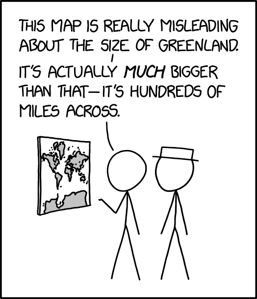
Randall Munroe, “Greenland Size”, xkcd, 25 March 2024.
The 25 March 2024 xkcd honours Greenland’s place as a measure of cartographic distortion. It’s also, unexpectedly, a riff on the idea of the 1:1 scale map (cf. Borges), especially if you consult the comic’s alt text: “The Mercator projection drastically distorts the size of almost every area of land except a small ring around the North and South Poles.”
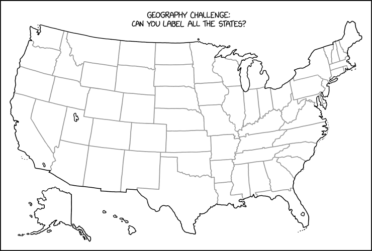
Randall Munroe, “Label the States,” xkcd, 15 Dec 2023.
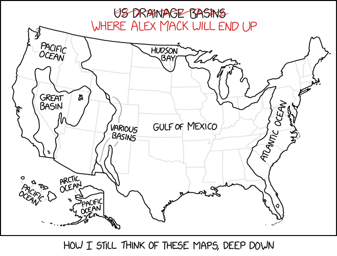
Stare at this map for a while until you figure out what Randall Munroe has done in last Friday’s xkcd. Then scream. (Kottke says: “This is evil.”) It’s not the first time that xkcd has committed mischief and violence on an outline map of the contiguous United States: see, for example this one, or this one. I worry it may not be the last.
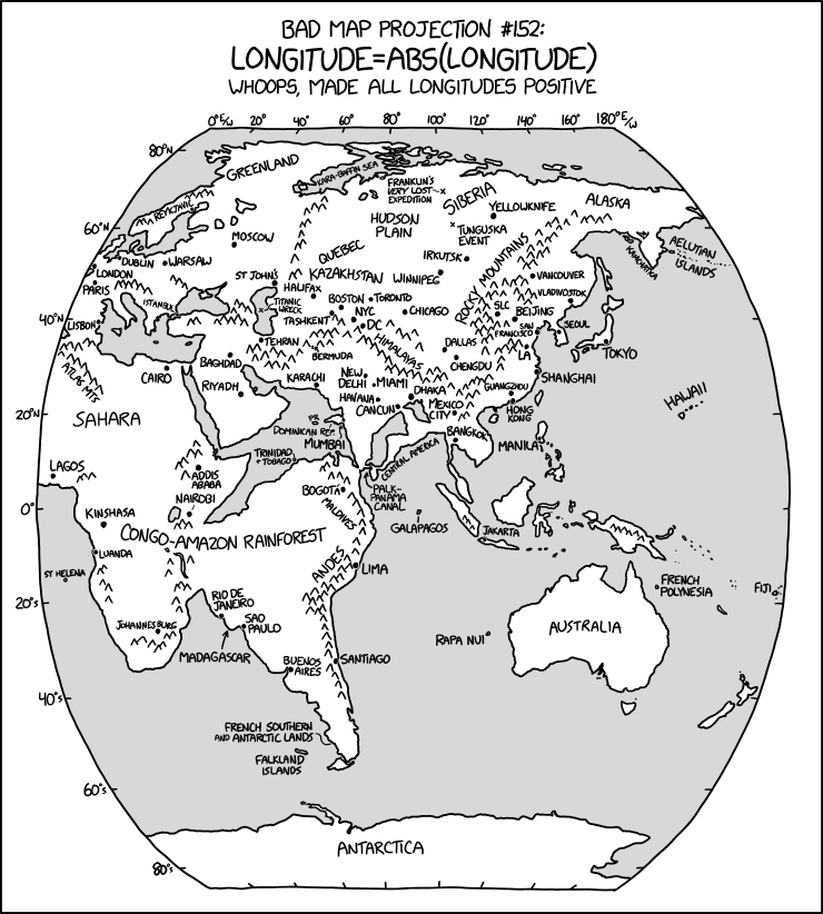
The latest in Randall Munroe’s Bad Map Projection series on xkcd is perhaps his most evil yet: it turns all longitudes positive—i.e., it turns west longitude into east longitude, putting Quebec somewhere in Kazakhstan and the Panama Canal off Sri Lanka.
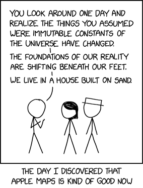
The notion expressed in Monday’s xkcd, particularly in the alt-text—
OpenStreetMap was always pretty good but is also now really good? And Apple Maps’s new zoomed-in design in certain cities like NYC and London is just gorgeous. It’s cool how there are all these good maps now!
—is unexpectedly more on point than not.
In 2013 I wrote a screed saying that all online maps sucked: that no one map platform had a monopoly on errors. At the time Exhibit A for the suckiness of online maps was Apple Maps; since then, and particularly since 2018, Apple has been putting in the work. Not that they’re done, but still: the product is fundamentally better now than it was then. And it’s not like the other platforms have been idle in the meantime. No one platform is going to achieve Cartography’s ideal of the universal and accurate Map—that’s inherently unachievable—but better? I’ll take better.