
“In the age of Google Earth, watches that triangulate and cars with built-in GPS, there’s something about a globe—a spherical representation of the world in miniature—that somehow endures.” The Associated Press has a fairly light feature on the relevance and popularity of globes today; the bespoke globes of Bellerby and Co. (whence) are prominently featured, of course (Replogle not so much, oddly), but they’re intermixed with some historical trivia. Not in-depth in the slightest, but something a few newspapers would have found interesting enough to run.
xkcd: ‘Every Eclipse Path Map’

Looks like we’re not quite done with eclipse maps, especially the whimsical sort, and it’s not at all invalid for xckd to have (what is probably going to be) the last word on the subject (at least for a while), with this fictional map showing the fictional path of a fictional eclipse over a fictional landscape, with rueful descriptions of fictional places where trying to see the fictional eclipse will come to a bad end for the fictional observers. (And you thought it was bad you got clouds.)
Worst Eclipse Map Ever Becomes the Funniest
This Mastodon post makes a bad map of this week’s eclipse into the funniest map of this week’s eclipse.
New Eclipse Map Claims Narrower Path of Totality
CNN: “New map calculations have raised some concerns that the path of totality—where it’s possible to see the moon completely block out the sun—is slightly narrower than NASA calculated. That means some cities on the edge of the route that were expecting to experience a second or two of total darkness might be left out.” The calculations were done by John Irwin, whose revised map can be found here. This page has the technical details, while Jamie Carter explains the implications: if Irwin’s correct, we’re talking about a literal edge case of a few hundred metres. Go further into the path of totality!
Previously: Cloud Cover Risk During the 2024 Solar Eclipse; Mapping Two Solar Eclipses.
Paper Maps: New Business, Lost Loves
GIS analyst and cartographer Andrew Middleton moved across the country to become the new owner of the Map Center, a Rhode Island map store, after the previous owner announced that he was looking for someone to give the store away to. In an interview with GeoHipster’s Randal Hale, Andrew outlines what he sees as the state of the market for paper maps: the antique map business is pretty healthy; what he’s interested in is contemporary cartography.
The bigger and more mysterious question for me is: Can I build a store off of something that focuses on contemporary cartography and do it in a physical location? Some people more talented than I have been able to pull it off selling their own work online. Only a couple of people in the U.S. are doing it in a physical space with overhead. With rent. I like knowing that there are places like the Map Center still around and I want to be a part of keeping Rhode Island quirky and worth exploring. But it’s not 1995 any more. I sell gas station 8-folds and prints of USGS topo maps and guide books and trail maps but it’s hard to sell information that someone on the internet is giving away for free. The value add of a paper map is providing that information in a portable, digestible and familiar way that includes context and that does have value. Lots of folks buy paper maps for outdoor activities, trip planning and conceptualizing space in large areas or putting on their walls to remind them off a place they love or a place they want to explore.
He’s looking for maps to sell: see the Map Center’s call for cartographers. As for the kind of customer Andrew is looking for, it would probably look a lot like Mary Ann Sternberg, who in a piece for Next Avenue writes about her history with and love of paper maps.
BBC Global on the Fra Mauro Map
Here’s a short video from the BBC Global YouTube channel on the 1450 Fra Mauro map.
Related: Meredith F. Small’s Here Begins the Dark Sea: Venice, a Medieval Monk, and the Creation of the Most Accurate Map of the World (Pegasus, June 2023): Amazon (Canada, UK), Bookshop.
xkcd on Greenland’s Size
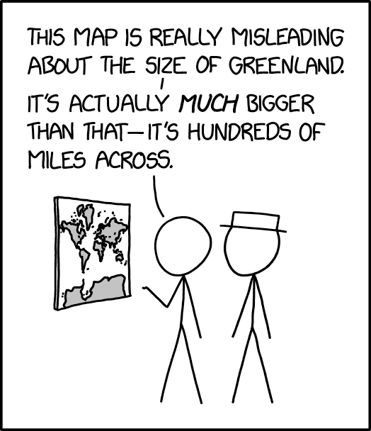
The 25 March 2024 xkcd honours Greenland’s place as a measure of cartographic distortion. It’s also, unexpectedly, a riff on the idea of the 1:1 scale map (cf. Borges), especially if you consult the comic’s alt text: “The Mercator projection drastically distorts the size of almost every area of land except a small ring around the North and South Poles.”
Previously: xkcd: The Greenland Special.
Adventures in Midcycle Redistricting
The U.S. congressional electoral map was redrawn after the 2020 census, but now parts are being redrawn again. ABC News has a page tracking developments in what they call midcycle redistricting. “More than a half-dozen states face the prospect of having to go through the redistricting process again, mostly due to federal and/or state litigation over racial or partisan gerrymandering concerns. Both Democrats and Republicans have the opportunity to flip seats in districts drawn more favorably than they were last cycle. For example, Democrats appear poised to pick up at least one seat in Alabama and could theoretically get more favorable maps in Louisiana and Georgia. Republicans, meanwhile, could benefit from more favorable 2024 maps in North Carolina and New Mexico.”
Flightradar24’s Map of GPS Interference
Another map of GPS interference, also based on GPS accuracy information reported by aircraft, this one from Flightradar24. Data updates every six hours. And once again high levels of interference are being reported from conflict zones: Ukraine and other foci of Russian mischief like the Baltics, plus Israel/Palestine, though to be honest I didn’t expect Myanmar. Data is archived, so you can look up previous dates (7 days free, more than that needs a site subscription). [Maps Mania]
Previously: GPSJam Maps GPS Interference.
Cloud Cover Risk During the 2024 Solar Eclipse

Eclipses aren’t any fun if you travel to go see one and it’s cloudy. I’ve been debating with myself what to do about next month’s total solar eclipse: the path of totality is a couple hours’ drive away and therefore manageable, but from what I’ve gathered the odds of clear skies aren’t great. These odds are based not on weather forecasts—still too early for that—but on historical data. For example, NASA Earth Observatory’s map, above, shows the average of the past 20 years of cloud cover across North America’s eclipse track on the day of the eclipse (April 8). Want more detail? Like, a lot more? See this incredibly detailed analysis from Eclipsophile’s Jay Anderson; I believe he’s a former meteorologist, and boy does it show in this piece. See also this Weather Underground article from last January, plus coverage from CBC News.
Previously: Mapping Two Solar Eclipses.
The ‘River Sins’ of Fantasy Maps
Author K. M. Alexander has some thoughts about rivers on fantasy maps, and the mistakes authors make with rivers when drawing those maps.
When it comes to rivers, I’ve noticed that quite a few fantasy writers don’t understand the basics. While their intent is noble, I’ve seen plenty of examples of authors struggling with the underlying science of rivers and river systems. I sympathize. These are mistakes I have made myself. Early on, in one of my first projects, I made a mess with the waterways in my fantasy world. Mistakes like these—I like to jokingly call them “river sins”—might go unnoticed at first, but when they are noticed, they can draw a reader out of the story or setting. It wasn’t until I later learned more about the behavior of these ecosystems that I was able to hone in on my worldbuilding, and the end result was something much more interesting and complex. The cool got cooler.
Previously: ‘The Perplexing River Systems of Middle-earth’.
All Mapped Out
 Cultural geographer Mike Duggan’s 2017 Ph.D. thesis was an ethnographic study of digital mapping practices in everyday life. His new book, All Mapped Out (Reaktion, 1 Feb 20241) “is an exploration of how maps impact our lives on social and cultural levels.” He explains a bit about what this means in a recent article in The Conversation.
Maps and what we do with them cannot be defined universally. Ideals and ideas about maps frequently clash with the reality of how and why maps are used. By bringing together my own research studying map users in London, and the work of others who have researched mapping practices around the world, I want to show how uses of maps are shaped by different cultures, communities, contexts and technology. […]
In my work there are several overlapping themes that chart how maps have become tied to culture and society. I want to do more than identify maps that have changed the world, or lay out the history of maps and society. Instead, I want to show that all maps have the potential to change the world and shape society. It’s just a matter of where you look and whose world you are interested in.
One Map to Rule Them All: Fantasy Map Design Elements in ArcGIS Pro

John Nelson’s One Style to Rule Them All is an ArcGIS Pro map style that applies fantasy map design elements to real-world geographic data. It does something similar to his earlier (2018) map style, My Precious (described here) only differently and with fewer assets (and 1/60th the download size). John has examples and links to a four-part video tutorial at this ArcGIS Blog post.
Previously: Maps Middle-earth Style: By Hand and by ArcGIS.
Deep Learning Applied to Satellite Imagery Reveals Untracked Ships

Speaking of AI-assisted global monitoring: researchers affiliated with Global Fishing Watch have revealed that the global fishing, transport and energy fleets are a lot bigger than expected. They were able to compare the locations of ships carrying AIS transponders with satellite imagery, to which deep learning was applied to classify ships. They conclude that something like three-quarters of industrial fishing vessels, and thirty percent of transport and energy vessels, go untracked. This isn’t necessarily so much about clandestine activity—in many regions ships, especially fishing boats, simply aren’t required to be tracked—but it can, among other things, reveal illegal fishing in protected areas. Results of the study were published in Nature last month. Global Fishing Watch also has an interactive map. [The Verge]
Google, EDF Partner to Build Map of Global Methane Emissions
Methane is a greenhouse gas, more powerful than CO2 but shorter-lived. Google is partnering with the Environmental Defense Fund to map global methane emissions, much of which result from leaks from fossil fuel infrastructure and are undercounted. The EDF’s MethaneSAT satellite (itself a partnership between the EDF and New Zealand’s space agency) launches next month: it’ll measure methane emissions at high resolution. Google’s bringing to the party algorithms and AI, the latter to build a global map of oil and gas infrastructure.
Once we have this complete infrastructure map, we can overlay the MethaneSAT data that shows where methane is coming from. When the two maps are lined up, we can see how emissions correspond to specific infrastructure and obtain a far better understanding of the types of sources that generally contribute most to methane leaks. This information is incredibly valuable to anticipate and mitigate emissions in oil and gas infrastructure that is generally most susceptible to leaks.
Previously: Mapping Methane Emissions.