
 Out this month from the University of New Mexico Press: John L. Kessell’s Whither the Waters: Mapping the Great Basin from Bernardo de Miera to John C. Frémont, a relatively short book that places 18th-century colonial New Mexican artist and cartographer Bernardo de Miera in his historical context and explores how later cartographers made use of his work. The Santa Fe New Mexican covers the launch of the book with a look at both author and subject. Amazon. [WMS]
Montreal’s Anglo Metro Map
Daniel Raillant-Clark’s map of Montréal’s Métro with anglicized station names (in most cases) is full of awful translations in both directions and puns in both languages (example: “Georges-Vanier” becomes “George Go Deny It” because va nier means go deny). To see what the hell this map is messing with, the real Métro map is here. [MTL Blog/Reddit]
Mapping the 2017 French Presidential Election (First Round)
France held the first round of its presidential election this past Sunday. Unlike U.S. presidential elections, it’s by popular vote, with the top two vote-getters moving on to a second round in two weeks’ time.
The major candidates’ support was distributed unevenly around the country. Media organizations used several different methods to show this. The New York Times used a choropleth map, showing who among five candidates (including Lassalle, excluding Hamon, who finished fifth but does not appear to have won a commune: ouch) finished first on a commune-by-commune basis. Of course, when you have four candidates finishing within a few points of one another, when you win a district, you don’t necessarily win by much. The print edition of Le Figaro included choropleth maps detailing five candidates’ regional support as well.
#cartographie de la #Presidentielle2017 Et le futur duel #macron vs #lepen à lire demain dans @Le_Figaro pic.twitter.com/cP0kEmOPsE
— Guillaume Balavoine ?? (@gbalavoine) April 24, 2017
Both the Times and Le Figaro use geographical maps, which can be misleading because of the number of votes concentrated in large cities, as Libération’s Julien Guillot points out. (This comes up in most countries’ elections, to be honest—certainly the ones where it’s the popular vote, rather than the constituency, that’s being looked at.) Slate uses a cartogram to compensate for that. (Both of these pages are in French.)
For those seeking local results rather than analysis, several French media organizations provide them through a very similar map interface: see, for example, the online results pages for France 24, Le Figaro and Le Monde. Each begins with a map of France: clicking on a département provides results for that département that includes a map showing each commune, which can also be clicked on. For some reason neither France 24 nor Le Monde show actual vote totals at the local level, which doesn’t seem sensible in an election by popular vote.
Finally, a couple of outliers. This page looks at the results from all presidential elections under the French Fifth Republic. And this page marks the 56 communes in which Marine Le Pen received not a single vote.
Persuasive Cartography Collection Expands

More than 500 maps have just been added to the P. J. Mode Collection of Persuasive Cartography at the Cornell University Library. That’s almost double the number they began with. Via email, P. J. Mode also says that “Cornell has implemented a much-improved image browser with a very robust search function. I hope there are some things that you’ll find new and interesting!”
Previously: Persuasive Cartography; Another Look at Persuasive Cartography.
Patents and Cartographic Inventions
 Published late last month, Mark Monmonier’s new book, Patents and Cartographic Inventions: A New Perspective for Map History (Palgrave Macmillan) is on a somewhat more arcane and non-obvious subject than his usual fare. It’s an exploration of the U.S. patent system that focuses on map- and navigation-related inventions. The publisher’s description: “In probing evolving notions of novelty, non-obviousness, and cumulative innovation, Mark Monmonier examines rural address guides, folding schemes, world map projections, diverse improvements of the terrestrial globe, mechanical route-following machines that anticipated the GPS navigator, and the early electrical you-are-here mall map, which opened the way for digital cartography and provided fodder for patent trolls, who treat the patent largely as a license to litigate.” Actually sounds interesting as hell; the book is quite expensive, though. Amazon, iBooks.
Mapping Global Landslide Susceptibility

NASA Earth Observatory notes the release of a new map of global landslide susceptibility that models the risks of landslides that are triggered by heavy rain. “The map is part of a broader effort to establish a hazards monitoring system that combines satellite observations of rainfall from the Global Precipitation Measurement (GPM) mission with an assessment of the underlying susceptibility of terrain.” [Geographical]
Amtrak Before and After
Following up on this post about maps of cuts to Amtrak, here’s a visualization from Will Geary showing a week of Amtrak trips before and after the proposed budget cuts. [CityLab]
Early French Maps of the Great Lakes
 On Tuesday, Jean-François Palomino of the Bibliothèque et Archives nationales du Québec gave a talk on early French mapmaking efforts in the Great Lakes region at the University of Michigan. I missed being able to tell you about it in advance, but student newspaper The Michigan Daily has a writeup. [WMS]
(Palomino is one of the co-authors of Mapping a Continent: Historical Atlas of North America, 1492-1814, the French edition of which is La Mesure d’un continent.)
‘Please Return to the Map Center’

April 19th: The day the Leventhal Map Center finally snapped.
Burmese Maps at Cambridge

Natasha Pairaudeau: “Imagine maps as big as bedsheets, and then imagine the sheets big enough for beds made wide enough to sleep extended families. Only such a double stretch of the imagination can provide the scale of the three Burmese maps in the University Library’s collection, which have recently been made available online in digital format.” [Cartophilia]
Tube Maps of the Thames
Transport for London also operates river buses along the Thames; their maps of the London River Services are very much in the Tube map vein, in both tourist and non-tourist versions:
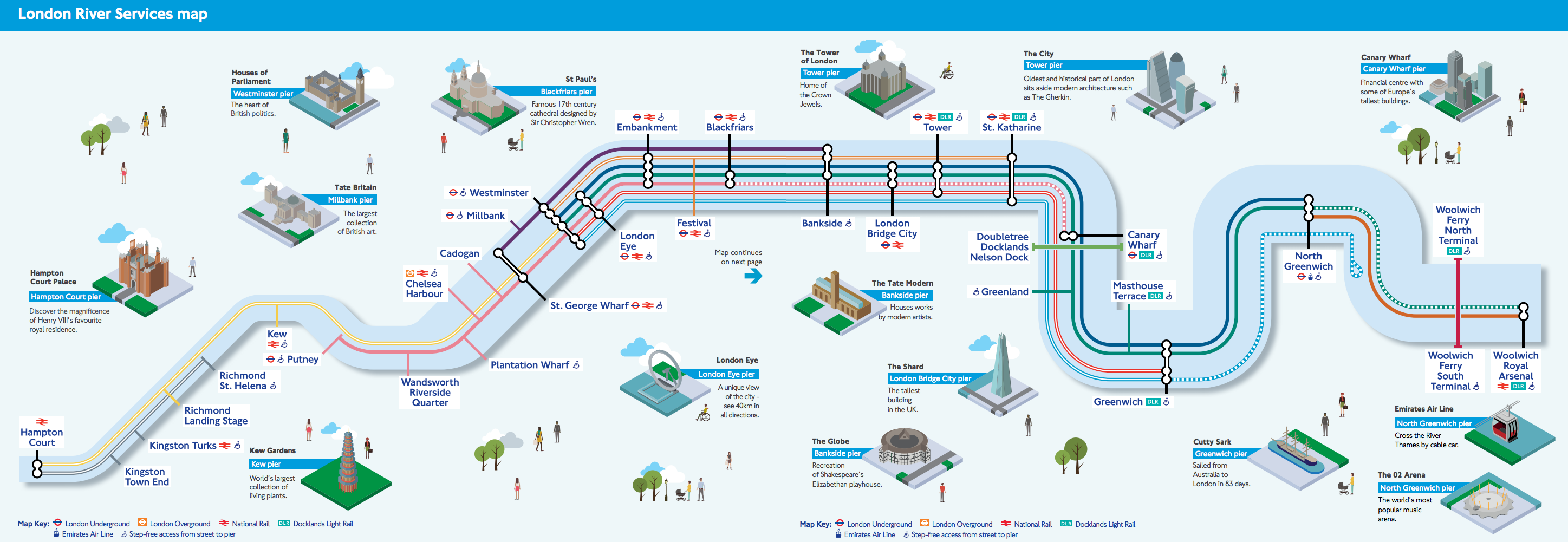

Of the tourist version Ollie O’Brien of Mapping London says this: “We like the pseudo-tube-map styling, although it could of course be simplified even further, with the Thames just being shown as a straight line. The inclusion of isometric squares showing the major landmarks near each pier is a nice touch. TfL has never really decided whether its river services are for tourists or commuters, but this map should satisfy both.”
The Only Star Chart You’ll Ever Need

The successor to the Only Fantasy Map You’ll Ever Need is the Only Star Map You’ll Need, a riff on maps of galactic empires and space-opera tropes that emerged from the discussion in this thread. It’s a few years old, but Boing Boing spotted it yesterday.
Previously: Mapping Star Trek.
The Earth at Night, Updated

NASA has released updated global maps of the Earth at night. The so-called “black marble” maps show where human activity lights up the darkness. NASA’s page highlights some of the differences between the 2016 and 2012 versions of the map with before/after interactive sliders. John Nelson has tried something different: overlaying the 2016 map on the 2012 map with a clipping mask shows newly illuminated parts of the globe as dark patches.

New Google Earth Launches
A new version of Google Earth launched today. Unlike previous versions, the desktop version runs in a web browser rather than a standalone app. Also unlike previous versions, it’s no longer cross-platform: for now at least, the desktop version only runs in Chrome, and the mobile app is Android-only.
Frank Taylor has been covering the new release at the venerable Google Earth Blog and has a first review.
For my part, I’ve poked around in it in Chrome a bit and I found it fairly responsive and easy to use. If it runs this well in the browser I can see how a standalone app would be redundant; this is a better delivery method. I would much prefer it, though, if it also ran on platforms that didn’t belong to Google.
Update, 21 April: Coverage from AFP and Geoawesomeness focuses on the features, which I gave short shrift to above.
When Users Don’t Interact with Interactive Maps
Brian Timoney responds to the argument that few users actually interact with interactive infographics with some thoughts on how that might apply to online maps, with their sometimes-complicated, GIS-derived user interfaces. His suggestions? Static maps, small multiples, animated GIFs, text-based search—simpler, more user-friendly, more familiar UIs and ways to present mapped data.