
Google Maps will be improving its coverage of U.S. national parks: an update later this month to both the Android and iOS versions will add park attractions, trail maps (and directions to the trailhead) and offline park maps. [Jalopnik/TechCrunch]
A Martian Mosaic at Five Metres per Pixel

The Global CTX Mosaic of Mars, produced by CalTech’s Bruce Murray Laboratory for Planetary Visualization, is a 5.7-terapixel mosaic of the Martian surface at a resolution of five metres per pixel. The mosaic is available in a number of different formats (via ArcGIS Online, KML, shapefiles), as well as via this online viewer; and the Lab is quite transparent about how they constructed it from Mars Reconnaissance Orbiter Context Camera (CTX) data. [Maps Mania/La Cartoteca]
How Google Deals with Fake Content on Google Maps
In a blog post last Friday, Google offers some detail on how it combats fraudulent user-submitted content on Google Maps. These include fake business profiles, fake reviews, contributed photos with fake phone numbers—it’s basically about business listings. (There was a time, of course, when fake user-submitted content was to the map itself.) They report something like 115 million reviews, 200 million photos and 20 million fake business profiles—no wonder they’re using machine learning to deal with it all. (Compare with Google’s February 2021 post on the same subject: the numbers are up.)
Previously: Millions of Business Listings on Google Maps Are Fake: WSJ; How Many Fake Business Listings Are There on Google Maps?
Twenty Years
Today is The Map Room’s 20th anniversary.
The rule of thumb is that an item is vintage if it’s more than 40 years old, and antique if it’s more than 100 years old. (That tan-coloured Replogle globe with South Sudan on it? Not antique.) Time runs faster on the web, though: something 20 years old feels geologically ancient. Running a 20-year-old blog in 2023 feels like keeping a pet coelacanth: you’re keeping a living fossil alive.
As social media approaches what may well be its extinction event, there’s been a lot of talk about “bringing back blogs.” Um, blogs never went away: Kottke.org just marked its 25th anniversary, and there are still plenty of websites out there powered by WordPress or something similar that don’t call themselves blogs. What faded away, I think, was the idea of, and self-identification as, a blogger. Lots of people started blogs in the format’s early years but didn’t keep up with them; social media was a better fit for what they wanted to do. Not many people start a blog qua blog to be a blogger nowadays. But institutions still post updates in blog form, and experts share their insights on platforms that blur the lines between blog, social media and newsletter.
(Certainly the map blog never went away: we still have general-interest blogs like Maps Mania and Lat × Long; industry and academic figures like Matthew Edney, Kenneth Field and James Killick regularly post commentary and links; and plenty of working cartographers share their latest creations on blogging platforms as well.1)
The Map Room is not an institution, nor am I an expert. No really: I’m not. The idea that someone with an intense interest in a subject but not much knowledge could start a blog as a way to explore the subject—“an exercise in self-education” is what I called it—was something that made sense in 2003. It might be a bit more archaic now.2 I am also, twenty years on, rather more self-educated: I understand what I’m linking to more than I used to, and I’ve seen enough to know when to be skeptical. I’ve called bullshit on more than one occasion. I still can’t make a map of my own (there’s an alternate universe in which I’m making a perfectly happy living as a freelance cartographer), but my appreciation for them is all the richer for having spent two decades at this.
The Michigan Mitten, Orthorectified
The lower peninsula of the U.S. state of Michigan is often called the mitten, for its resemblance to a human hand, and apparently Michiganders indicate where they’re from by using their hands as a rudimentary map of the state. The upper peninsula too. See Strange Maps. Now John Nelson has taken this entirely too far: he’s made the Michigan hand map geographically accurate.
Some Map How-to Videos
Most of their videos are a few years old, but I only recently stumbled across the YouTube channel of New World Maps. They have a number of short, practical videos aimed at map buyers and map owners who want to display their maps: tips for framing maps, for flattening maps so they can be framed (above), for dealing with small chips and tears (at least on inexpensive maps), among other subjects. Useful—and not just for maps.
Confused by Cartographic Conventions
Daniel Huffman writes that “there are certain cartographic conventions out there for which I don’t understand the logic.” (Such as that thematic or choropleth maps should be on equal-area projections.) “I do not suggest that these conventions are wrong; only that I lack a clear, intuitive rationale for following them, and so haven’t always incorporated them into my own practice. Maybe you can help explain them, or maybe you’re confused, too.”
xkcd: ‘Island Storage’
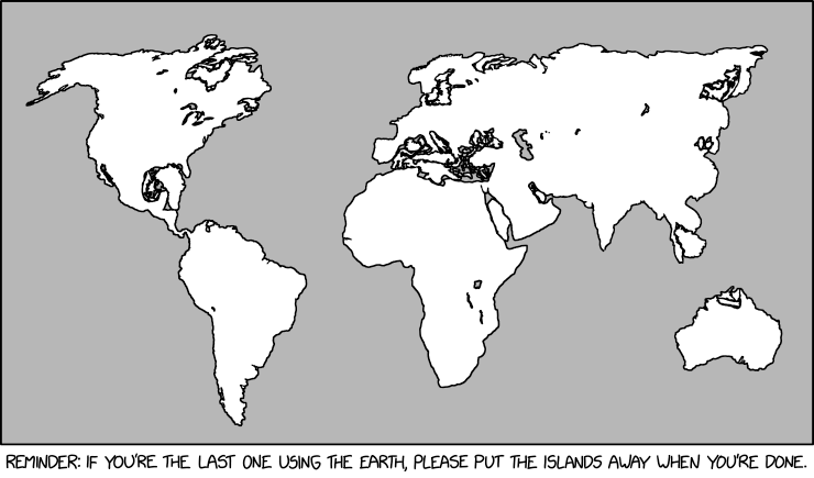
The xkcd from last Friday, “Island Storage,” is the most recent map-related way that Randall Munroe has hurt us in the eyes.
Apple Updates Its Map in Europe
Apple has added its detailed 3D city “experience” to Berlin, Hamburg and Munich and cycling directions to Germany in general: see Justin O’Beirne and MacRumors.
Its redesigned maps have also come to Norway, Sweden and Finland: see AppleInsider, Justin O’Beirne and MacRumors for details.
The Russian Invasion of Ukraine, One Year Later
Russia invaded Ukraine a year ago last Friday. Kenneth Field looks at how media organizations have used maps to mark the anniversary. Via Maps Mania, Grid’s map-heavy interactive timeline of the war. Also via Maps Mania, The Undeniable Street View uses street-level imagery to show the damage inflicted on six Ukrainian cities.
An SF/Fantasy Map Roundup
In December Tor.com revealed the map for Martha Wells’s upcoming fantasy novel, Witch King, which comes out in May. The post includes both Rhys Davies’s map and Wells’s initial sketch: compare and contrast. Amazon (Canada/UK) | Bookshop
How often do Star Trek tie-in novels come with maps? John Jackson Miller’s Strange New Worlds novel, The High Country, which comes out today, includes maps of the low-technology world on which it is set; in Miller’s Twitter thread last month, he wondered whether his book was the first, but it turns out that a 2000 Deep Space Nine novel also had maps. Amazon (Canada/UK) | Bookshop
In my article about maps in science fiction I made reference to the maps in Kim Stanley Robinson’s 1993-1996 Mars trilogy. Mastodon user 65dBnoise decided those maps were “very few” and “very coarse” (he’s not wrong3) and made some higher resolution maps based on USGS topographical maps of Mars.
Google Maps Updates (February 2023)
Updates to Google Maps announced earlier this month include a rollout of immersive view—first announced last year—in the previously announced cities of London, Los Angeles, New York, San Francisco and Tokyo (the rollout is delayed somewhat: it was promised for later this year last year), with more cities, including Amsterdam, Dublin, Florence and Venice, coming soon [Engadget]. Also announced: an expansion of the augmented-reality Live View feature (previously: 1, 2) to more cities and indoor venues [AppleInsider]; “glanceable directions” enabling navigation from the lock screen (“in the coming months”) [9to5Google]; and improved charging station search results for electric vehicles with built-in Google search [Jalopnik].
Previously: Immersive View and the Death of Consumer Maps.
SMBC on GPS
Saturday Morning Breakfast Cereal has a take on what GPS does to our ability to navigate.
In Praise of Dot Grid Maps

Mikel Maron is a fan of dot grid maps:
Dot grids are a clear, informative, multidimensional and flexible cartographic technique. They effectively leverage patterns of human perception to present information dense but readily comprehensible maps. Compared to choropleth maps, dots retain the base map context, and invite us to fill in the gaps. They emphasize the limits of data sampling. Dot grids can be joined together across different boundaries flexibly. The density of a dot grid can be varied depending on the scale. And that visual regularity … it just looks so cool.
He offers some examples of dot grid maps from his work at Earth Genome (see e.g above), and elsewhere, and gives some history of the format.
Colour and the New York Subway Map
Gothamist looks at how colour has been used on maps of New York’s subways: first to to distinguish between subway companies, then to distinguish lines from one another. The post talks to, and draws on the work of, Peter Lloyd, who’s been studying the history of subway mapping in New York and gave a talk last Saturday on the subject of colouring the map’s subway lines. See Peter’s blog post on the subject from this time last year.