

The National Weather Service’s National Mosaic provides an uninterrupted look at the Doppler weather radar for the 48 contiguous U.S. states. Full-size version. [via]
The National Weather Service’s National Mosaic provides an uninterrupted look at the Doppler weather radar for the 48 contiguous U.S. states. Full-size version. [via]
[sciba leftsrc=”https://www.maproomblog.com/xq/wp-content/uploads/2016/01/lake-poopo-2013.jpg” leftlabel=”12 April 2013″ rightsrc=”https://www.maproomblog.com/xq/wp-content/uploads/2016/01/lake-poopo-2016.jpg” rightlabel=”15 January 2016″ mode=”horizontal” width=””]
Lake Poopó has become the Aral Sea of the Andes. Thanks to drought, water diversion and mining activity, the lake—long, wide, shallow, saline and the second-largest in Bolivia—has basically dried up, as this comparison of 2013 and 2016 Landsat 8 images demonstrates. CBC News, The Independent.
According to analyses by NASA and NOAA scientists, 2015 was the warmest year on record, with average surface temperatures the highest they’ve been since 1880. The above video shows the long-term warming trend since 1880 as a five-year rolling average. The baseline average is from 1951 to 1980; orange colours are warmer than that average, blue colours cooler. (Credit: GSFC Scientific Visualization Studio.)
[sciba leftsrc=”https://www.maproomblog.com/xq/wp-content/uploads/2016/01/new-year-flooding-1.jpg” leftlabel=”8 Dec 2015″ rightsrc=”https://www.maproomblog.com/xq/wp-content/uploads/2016/01/new-year-flooding-2.jpg” rightlabel=”1 Jan 2016″ mode=”horizontal” width=””]
These two Landsat images illustrate the extent of flooding along the Wabash and Illinois Rivers at the end of last year, as 6-10 inches of rain fell over the midwestern United States. The image from 8 December 2015, above left, shows normal water levels; the image from 1 January 2016, above right, shows the rivers in flood. Use the slider to compare the two views. Original image. [via]

Scientists have been tracking seasonal freeze-thaw patterns for 30 years. This map, produced from data collected by NASA’s Soil Moisture Active Passive satellite, “shows the freeze-thaw status of areas north of 45 degrees latitude on March 5, 2015, as spring approached. Frozen land is blue; thawed land is pink. The measurement is possible because frozen water forms crystalline structures that can be detected by satellites.” NASA Earth Observatory.

The federal government’s new map of Canada, part of the Atlas of Canada reference series, came out this week. Among the changes between it and its predecessor (which came out in 2006), one in particular is drawing attention. Ivan Semeniuk in the Globe and Mail:
Whereas the older version of the map showed only that part of the sea ice that permanently covered Arctic waters year round at that time, the new edition uses a 30-year median of September sea-ice extent from 1981 through 2010. September sea ice hit a record low in 2012 and is projected to decline further. The change means there is far more ice shown on the 2015 version of the map than on its predecessor.
The changes can be seen below: the 2006 map is on the left, the 2015 map on the right.

Now as Semeniuk’s piece points out, neither way is wrong. But all maps have a point of view, and it’s naive to think that this change was made in a value-neutral environment: this was the result of a conscious decision. The reason for that decision—that’s what’s interesting.

Reddit user atrubetskoy has produced a map of the U.S. showing how much snow it takes to cancel school. It’s an approximation, to be sure. But it’s not a map of winter wussiness: areas that rarely get a lot of snow don’t tend to have the infrastructure to deal with it. [io9]

Earth Wind Map is a transfixing animated visualization of global wind forecasts, updated every three hours. It would be fine enough to enjoy passively, but you can play with it: click and drag to change the view, select from a variety of map projections and pressure levels. Via io9 and GIS Lounge, among many others.
Previously: Wonderful Wind Map.

Forest fires near Eastmain, Quebec had a dramatic impact on air quality around here last week; I woke up hacking and wondering why. (Air filters to maximum!) The above photo, taken by the MODIS sensor aboard NASA’s Aqua satellite on June 28, gives some idea of the situation on the eastern shores of James Bay. (The photo also shows a brown-stained James Bay, the result of tannin-stained water from bogs spilling into the bay in spring.) Image credit: NASA Earth Observatory.
This is a list of maps related to the flooding in southern Alberta (Calgary, Canmore, Bragg Creek, High River, Okotoks, etc.). This list will be added to as needed. Feel free to contribute additional links in the comments.
Update, 10:15 PM:
Update, June 22 at 8:25 AM:
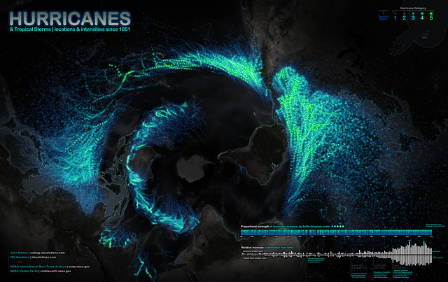
IDV Solutions, source of that map of tornado tracks across the U.S., has released a map of the paths of all known hurricanes since 1851. An added twist is that this map uses a polar azimuthal equidistant projection centred on Antarctica, creating a point of view that is unexpected and that has already created a few double-takes. Via io9.

Hotter than usual? Yes. This map shows how much land surface temperatures during the week of June 17-24, 2012 have been above or below the average for 2000-2011. Now this map measures something very specific: land surface temperatures (LSTs) aren’t the same as air temperatures: “LSTs indicate how hot the surface of the Earth would feel to the touch. From a satellite vantage point, the ‘surface’ includes a number of materials that capture and retain heat, such as desert sand, the dark roof of a building, or the pavement of a road. As a result, daytime land surface temperatures are usually higher than air temperatures.” Via Bad Astronomy.

Using more than 50 years of NOAA data, John Nelson of IDV Solutions has created a map of tornado tracks across the United States, categorized by their F-scales (he’s also broken them out by each F-scale). Via O’Reilly Radar.

An amazing visualization of near-term wind forecasts by Fernanda Viégas and Martin Wattenberg, based on data from the National Weather Service’s National Weather Forecast Database. Looks gorgeous; slows my browser right down. Via Boing Boing, Kottke and O’Reilly Radar, among others.
