The Great Polish Map of Scotland, a giant concrete relief map 50 metres by 40 metres in size, was the brainchild of Jan Tomasik, a hotelier and former Polish Army soldier who was stationed in Scotland during the Second World War. He envisioned the map as a monument to Scotland’s hospitality to the visiting Polish soldiers. The map, designed and built by visiting academics from Kraków’s Jagiellonian University, was completed in 1979; it stands on the grounds of Barony Castle Hotel in Eddleston, which Tomasik had bought in 1968.
The hotel closed in 1985 (for a while), and the map began to deteriorate. In 2010 a campaign began to restore the map, which proved successful: the restored version of the map, complete with water surrounding the Scottish land mass, was unveiled to the public last Thursday, in the presence of the Scottish culture secretary and Polish diplomats.
We’ve seen maps reimagining the United States reorganized into a different number and configuration of states before, but this map by Reddit user Upvoteanthology_ looks north of the border for inspiration. It imagines what would happen if the U.S. were organized like Canada, with the same population imbalances: Ontario, for example, has 38.9 percent of the Canadian population, so this map imagines a superstate, Shanherria, with 38.9 percent of the U.S. population that spans the entire U.S. South, plus Kentucky, Missouri, Kansas and the non-Chicago parts of Illinois. Meanwhile, Maine is roughly equivalent to Prince Edward Island, and the three northern territories map to Alaska.
Clickhole, The Onion’s satirical clickbait website, had a hilarious piece last October declaring that rising sea levels will turn Australia into a rhombus: good news for cartographers, for whom Australia will be easier to draw.
According to a new study by the National Ocean Service, melting icecaps and glaciers will raise sea levels enough to cause drastic coastal erosion to virtually every landmass on the planet, including Australia, which will transform from its current shapeless continental configuration into a crisp, tightly angled quadrilateral. While this will unquestionably result in an incalculable amount of economic and ecological devastation, it will likely be a welcome change for cartographers, who instead of spending hours trying to perfect the jagged and asymmetrical outline of the Australian coast like they do now, will in the coming decades be able to handily dash off a geographically accurate rendering of the continent in just a few seconds flat.
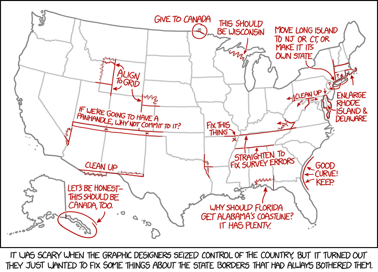
The map is bad, is my point, and obviously bad, and I sincerely wish that we didn’t have to talk about it. But we do. Because maps like this one aren’t merely birdbrained schlock: They are a social media plague, a scourge that can reduce just about any social network to gibbering in-fights in the space of a few virally shared minutes. We’re all susceptible; we’re all defenseless. A dumb internet map with incendiary falsehoods is coming for all of us, and there is just about nothing we can do to stop it.
The formula goes something like this: Map plus declaration of definitive statewide preference equals profit. Profit here means eyeballs or clicks or reshares or, most likely, some combination of all three, especially the last one, because it turns out that there are few sentiments more appealing than Oy, check out the terrible things the cretins in [Bad State] get up to.
The truth is we’re all very boring, and our preferences aren’t all that different.
Worth reading in full.
The problem is that even though their methodologies are shoddy and their conclusions are dubious, clickbaity maps like these are popular. The competition for attention is fierce, and maps are a quick and dirty way of generating traffic. My traffic skyrockets whenever I post a link to something even remotely like these maps (xkcd is usually a safe bet), and if I resorted to posting maps like these all the time, I’d be making muchmore money at this. But I wouldn’t be able to look myself in the mirror.
Geographical magazine reviewsThe Red Atlas, the survey of Soviet-era topo maps of the world by John Davies and Alexander J. Kent out this month from University of Chicago Press. National Geographic’s All Over the Map blog also has a feature on The Red Atlas. I’ve received my own review copy of The Red Atlas and hope to have a review for you … at some point (I’m rather backlogged).
A rare Braille globe held by the Queensland State Library is being digitized so as to create a 3D-printed replica. The globe, invented by Richard Frank Tunley in the 1950s, is one of the last copies still in existence and is in poor physical shape—problematic for something designed to be touched. That’s where the replica comes in. It’s funded by the library foundation’s crowdfunding initiative, which will also help fund the original globe’s restoration. ABC News, Sydney Morning Herald. Media release. [ANZMapS]
Mapa en Relieve de Guatemala. Photo by H. Grobe, July 2012. Wikimedia Commons. Creative Commons licence.
Atlas Obscura has the story of Guatemala’s Mapa en Relieve, an exaggerated-relief 3D relief model of the country. The 1:10,000-scale horizontal, 1:2,000-scale vertical map is approximately 1,800 square metres in area and made of concrete. Built by Francisco Vela and put on display in 1905, the map includes present-day Belize as part of Guatemala, which claimed the British Honduras at that time. It kind of reminds me of British Columbia’s Challenger Map, only a half-century older and made of concrete rather than wood. [WMS]
This cake in the form of an Ordnance Survey map is the creation of Scottish cake decorator World of Cake; it marks “a spot where the birthday hiker apparently got quite lost!” Now the rest of us will want one. [Ordnance Survey]
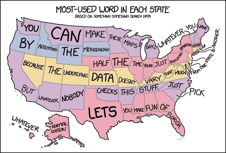
In yesterday’s xkcd cartoon, Randall makes explicit what I think a lot of us have been thinking about those maps assigning a word or a search term to each state or country or whatnot.
A new post-Brexit map of the European Union shows Scotland as an EU member separate and independent from a rump “United Kingdom of England, Wales and Northern Ireland,” which is coloured like other non-EU members. Commissioned by Interkart and produced by XYZ Maps, the 119 × 84 cm wall map costs £24/40€. Interkart, XYZ Maps. [WMS]
The U.S. military uses a huge floor map of Washington, D.C. to plan for presidential inaugurations, as the Tech Insider video above shows. According to this, it’s used by the Armed Forces Inaugural Committee, a joint-service organization that provides military ceremonial support. (See this U.S. Army article from 2012 about the 2013 inauguration, and this 2008 Pruned blog post about the 2009 inauguration.) [Tim Wallace]
End of the Line is an attempt to be the last word in tube map pastiche. […]
While Beck himself likely ‘copied’ a number of aspects that ended up on his map he did so with consummate skill to create something unique, innovative and functional. Most subsequent schematic maps are pale imitations. We wrote a semi-academic paper about it which you can access from my blog here.
All too often we see transit map templates used as a short-cut to recognition and success. With no hint of irony whatsoever (!) we’ve done exactly the same and mapped the weird and wonderful world of Becksploited maps onto some tube lines and stations.
Becksploitation. There’s a term for you. It’s not like there’s no use for it.