
 Belatedly noted, thanks to a story in Penn State News last month: Cynthia Brewer was awarded the American Geographical Society’s O. M. Miller Cartographic Medal at the AGS’s symposium last fall. Brewer, a geography professor at Penn State since 1994, is the author of Designing Better Maps: A Guide for GIS Users (previously) and the creator of the ColorBrewer colour design tool for cartographers. The Miller medal is no minor award: this is only the eighth time it’s been awarded since it was created in 1968; past recipients have included Waldo Tobler, Arthur Robinson, Mark Monmonier and, in 2017, John Hanke and Brian McClendon (basically, the team behind Google Maps). Brewer is the first woman to receive the award.
Category: GIS
Mapbox Elections

This week Mapbox launched a tool for the upcoming 2020 U.S. elections: Mapbox Elections, “a resource to help individuals, journalists, and organizations cover the elections, analyze the results, and build modern maps to display it all.” Their first product is a dataset including U.S. presidential election results from 2004 to 2016.
Everything’s Coming Up Spilhaus

John Nelson reports that the Spilhaus projection will be supported in the next version of ArcGIS—version 2.5, to be released in a few months. This odd projection, which centres Antarctica on a world map showing the oceans as a single, uninterrupted body of water; went viral last year. Requests for ArcGIS support soon followed. Thing is, ArcGIS support requires the math behind the projection: figuring out that math took some sleuthing. The Spilhaus is, it turns out, basically an oblique aspect of the Adams World in a Square II projection.
Previously: About the Spilhaus Projection.
Don’t Use Zip Codes in Geospatial Analysis
Matt Forrest of Carto says we should stop using Zip codes in geospatial analysis.
Even though there are different place associations that probably mean more to you as an individual, such as a neighborhood, street, or the block you live on, the zip code is, in many organizations, the geographic unit of choice. It is used to make major decisions for marketing, opening or closing stores, providing services, and making decisions that can have a massive financial impact.
The problem is that zip codes are not a good representation of real human behavior, and when used in data analysis, often mask real, underlying insights, and may ultimately lead to bad outcomes.
Zip codes, Matt says, are arbitrary: too many things going on at a local level can be missed if they don’t line up with zip code boundaries (such as the Flint water crisis). He does offer some alternatives: census tracts, spatial indices and good old fashioned addresses.
Meanwhile, on Twitter, Bill Morris defends the use of Zip codes: yes, they’re overused; yes, they should only be used in the worst case; but they may be the only local unit a client or user will find easy to understand.
Mapping with Style
 John M. Nelson’s ArcGIS style emulating the maps of Middle-earth is only one of several styles he’s been working on recently. He’s also created other ArcGIS styles emulating classic cartographic designs, including 19th-century physical geography diagrams, Eduard Imhof’s topographic maps, and hachures. Five of these styles, including the Tolkien style, have been collected in a short PDF booklet from Esri, Mapping with Style, Vol. 1, the title of which all but promises at least one sequel.
Previously: Maps Middle-earth Style: By Hand and by ArcGIS.
Maps Middle-earth Style: By Hand and by ArcGIS

Dan Bell’s career drawing maps of real-world places in the style of maps of J. R. R. Tolkien’s Middle-earth continues apace; a recent piece, a map of San Francisco, got written up in the San Francisco Chronicle, and his website is full of other recent works.
But computer mapping may be about to overtake hand-drawn illustration. John M. Nelson has created an ArcGIS style that does the very thing Dan Bell does by hand: emulate the maps of Middle-earth executed by Christopher Tolkien and Pauline Baynes. The style is called, naturally, My Precious: John explains it here and here, and demonstrates the style with this map of the Americas.
There are, of course, some flaws in this method: a mechanical representation of a hand-drawn style risks falling into the uncanny valley’s cartographic equivalent, especially when mountain and forest signs are clone-stamped over large areas. And to be honest I’m not a fan of the Aniron font: those letterforms were used in the Lord of the Rings movies, but never the books’ maps, and now they’re found on damn near every Tolkien-style map, and we hates it, precious, we hates it forever. But Nelson is basically emulating modern fantasy map practice: modern fantasy maps are invariably done in Illustrator, labels are computer generated rather than hand-drawn, and hill signs are clone stamped. Applying it to real-world maps, and GIS software, is new, but a difference in degree.
Previously: Dan Bell’s ‘Tolkien-Style’ Maps of the Lake District.
More on Equal Earth

The Gall-Peters projection is a second-rate projection with first-rate public relations; cartographers’ responses to the projection that focused on its cartographic shortcomings ended up missing the point. Something different is happening with the Equal Earth projection, which was announced last month as a response to Gall-Peters: an equal-area projection with “eye appeal.” It’s getting media traction: the latest news outlet to take notice is Newsweek. So, finally, there’s an alternative that can be competitive on the PR front, without having to mumble something about all projections being compromises until the eyes glaze over.
It’s turning up in GIS packages, too: in D3, in G.Projector and in proj4. There’s even a t-shirt.
Previously: The Equal Earth Projection; Equal Earth Updates.
‘Get a GIS Survey Team in the Air!’
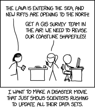
Hey look, GIS people: Randall Munroe made an xkcd comic just for you.
Mapping Tornado Migration

John Nelson’s map of tornado migration in the United States, showing the seasonal variations in tornado occurrence, is a master class in data visualization and design—in deciding on the right way to present geographic information. The map combines three styles—impressionistic choropleth, weighted mean centre movement diagram, and small multiple—to present month-by-month information all at once; in the accompanying text (also here), Nelson discusses some of the alternatives he could have chosen instead. And in a separate post he talks about how he made the map. [Esri]
Previously: Mapping Tornado Tracks.
Dot Density Maps of Belgium

Maarten Lambrechts discusses how to make a dot density population map, in technical detail. He uses QGIS to process data for his home country of Belgium. The map above is one result (he also zoomed in on Brussels).
Coming Soon: Kenneth Field’s Open Online Course on Cartography
Esri will be hosting a free, six-week massive open online course (MOOC) on cartography later this year. Called Cartography., it’s taught by Kenneth Field and coincides with the release of Field’s textbook of the same name.
Each weekly lesson in the Cartography. MOOC focuses on the creation of one exemplary map that draws together key cartographic ideas. Lessons consist of about two hours of content, including video discussions, guided and self-guided exercises using ArcGIS Pro and ArcGIS Online, quizzes, interactions between students and instructors, and supplemental resources. Participants who engage with all the course content will receive a certificate of completion and a discount code to purchase Cartography., the book, should they wish to continue their learning.
 Registration opens on 18 April and continues until 2 May. It is, as I mentioned, free; Esri expects more than 10,000 people to sign up.
Cartography., the book, is currently scheduled to come out in June.
Two More Books for 2017


The year 2017 is almost at an end, but two more map books, published last month, have just come to my attention (via, as usual, the WMS’s indefatigable Bert Johnson). These, then, are very late additions to the Map Books of 2017 page:
Sad Topographies by Damien Rudd (Simon & Schuster), who “journeys across continents in search of the world’s most joyless place names and their fascinating etymologies.” This appears to be an outgrowth of the author’s sadtopographies Instagram account.1
New Lines: Critical GIS and the Trouble of the Map by Matthew W. Wilson (University of Minnesota Press). “Seeking to bridge a foundational divide within the discipline of geography—between cultural and human geographers and practitioners of Geographic Information Systems (GIS)—Wilson suggests that GIS practitioners may operate within a critical vacuum and may not fully contend with their placement within broader networks, the politics of mapping, the rise of the digital humanities, the activist possibilities of appropriating GIS technologies, and more.”
How to Build a Fire Map
Last October Robin Kraft posted an online map of the northern California wildfires showing satellite imagery from before and after the fires (see previous entry); today he’s posted a blog entry explaining how he built it, in great technical detail. The timing is not accidental: “There is another fire raging in Los Angeles right now — if DigitalGlobe and Planet release their data, you can use this guide to make your own map.”
ArcticDEM Release Six Adds Eurasia
 The sixth release of the ArcticDEM initiative adds 32 percent more terrain data, mostly in Russia and Scandinavia. ArcticDEM provides a two-metre-resolution digital elevation model for arctic regions north of the 60th parallel, plus those bits of Alaska, Greenland and the Kamchatka Peninsula south of 60. The final product is due out next year. More at Earth & Space Science News. [GIS and Science]
Tomlinson’s Ph.D. Thesis Now Available
James Cheshire reports that the Ph.D. thesis of the “father of GIS,” Roger Tomlinson, has been digitized. Tomlinson completed his thesis, “Geographical Information Systems, Spatial Data Analysis and Decision Making in Government,” at the University College London’s Department of Geography in 1974. It can be downloaded as a PDF at this link.