
 I only just now found out about the new edition of Canadian Geographic‘s Atlas of Canada—via an item broadcast on CTV yesterday—or I would have included it in this year’s gift guide. It’s apparently the first new edition in a decade. (Incidentally this should not be confused with the Canadian government’s online Atlas of Canada, an entirely distinct beast.)
Author: Jonathan Crowe
Jonathan Crowe blogs about maps at The Map Room. His essays and reviews have been published by AE, Calafia, The New York Review of Science Fiction, the Ottawa Citizen, Strange Horizons and Tor.com. He lives in Shawville, Quebec.
The Patterson Projection
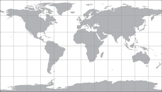
Map projections are inherently interesting, and also a great way to start a fight among a group of cartographers: just ask them their favourite and step back. Everyone has their preferred projection, me included, that fits their own needs and aesthetic. Cartographer Tom Patterson, whose work I’ve featured previously on The Map Room, has added another projection to the mix, the eponymous Patterson Projection, a cylindrical projection which “falls between the popular Miller 1, which excessively exaggerates the size of polar areas, and the Plate Carrée, which compressess the north-south dimension of mid latitudes.” It looks like a compromise projection in cylindrical form. A full article on the design and development of the projection is forthcoming at the link.
Previously: Shaded Relief World Map and Flex Projector; New, Free Physical Map of the United States; Shaded Relief.
Geologic Maps of Vesta

Geologic maps of Vesta, the asteroid visited by the Dawn spacecraft between July 2011 and September 2012, have been produced for a special issue of the planetary science journal Icarus. Above, a global geologic map of Vesta, compiled from 15 individual quad maps and using a Mollweide projection (Vesta itself is decidedly non-spheroid, but still).
Previously: Atlas of Vesta.
Sorol

Another one for those of you who like geofiction as much as I do. The Sorolpedia is an online encyclopedia of the distant and fictional world of Sorol, containing articles about the planet and its inhabitants. The maps are something else: far better than you’d expect from such a project (there’s even a KML file to import it into Google Earth). Its creator has put it on indefinite hiatus since 2010, so we may not see any more updates, but it’s still fascinating stuff.
Gift Guide: 10 Map Books of 2014
Every year, at about this time of year, I assemble a gift guide listing some of the noteworthy books about maps that have been published over the previous year. This list is by no means comprehensive, but if you have a map-obsessed person in your life and you’d like to give that person a map-related gift, this list might give you some ideas.
This year’s list includes several lavishly illustrated histories of maps and globes, interesting reads about map thieves and forgotten places, an a couple of guides to map art and personal mapmaking.
Once again, books bought through these Amazon affiliate links (routed to what my web server thinks is your nearest English-language Amazon store) make me a little money. Thanks for your support.
Moon and Comet Maps


Maps of planets, moons and other objects in our solar system always get me excited, though truth be told they were among the less popular posts on my old Map Room blog. Here are a couple of rather colourful recent examples:
- Above left, a preliminary map of Comet 67P/Churyumov-Gerasimenko, the subject of a visit by the Rosetta mission, that colour-codes several morphologically different regions.
- Above right, a topographical map of the Moon’s surface based on laser altimeter data from the Lunar Reconnaissance Orbiter.
Image credits: ESA/Rosetta/MPS for OSIRIS Team MPS/
Fantasy Maps of U.S. Cities

For another example of using fantasy map design language to create real-world maps, here’s the work of geography professor Stentor Danielson, who draws maps of U.S. cities in the style of fantasy maps and sells them on Etsy. Boston, Cleveland (above), Philadelphia, Pittsburgh and Washington are available. His Tumblr. Via io9.
Previously: A Fantasy Map of Great Britain; A Fantasy Map of Australia; A Fantasy Map of the U.S.
Geologic Map of Mars

As I said during the Q&A part of my fantasy maps presentation at Readercon (see previous entry), maps of other worlds in the solar system are usually images from space probes that have been set to a map projection. The key word is usually. On Monday the U.S. Geological Survey released a geologic map of Mars that “brings together observations and scientific findings from four orbiting spacecraft that have been acquiring data for more than 16 years.” Via io9 and Wired.
Readercon 25
 I had a very good Readercon. I was a nervous wreck leading up to it, because I had to rewrite the fantasy maps presentation from the ground up. (The first draft was too long and too unfocused. Thanks ever so much to my beta testers who pointed out its flaws the Sunday before the convention.)
Fortunately the presentation on Friday night went off without a hitch—the computer connected properly to the projector, I forgot to stammer—and was very well received: one person called it “probably my favorite event of the con,” which is astonishing when you consider that the con in question is freaking Readercon.
(My presentation also seems to have resulted in Wesleyan University Press selling out its on-hand copies of Stefan Ekman’s Here Be Dragons, which was referenced heavily.)
The Thursday night panel on maps in fiction also seems to have gone over well, based on what I’ve been hearing. It’s not always easy to tell if a panel goes well when you’re leading it: even if it doesn’t turn out the way you expected it to, as was the case here, it may still be a success if the audience enjoys it. Which appears to have been the case. If nothing else, I managed to emit something quotable:
"Maps are the antithesis of dragons" @mcwetboy #readercon
— Ella Drake (@Lori_Ella) July 11, 2014
As for the context of that remark, if you weren’t there, I’ll leave that for you to figure out. (I’m working on something along those lines, let me just say.)
For my final panel on Sunday morning, I joined my fellow panellists in a discussion of spoilers. I found myself jumping in and throwing little idea bombs into the discussion, hopefully not too annoyingly or in too derailing a fashion. I saw Scott Edelman recording it on video (the photo above is his) so you may well see the whole thing online at some point.
Meanwhile, I took photos sporadically: here’s the photo album. (Goes without saying that I didn’t bring a camera to my own panels.)
I’d say more, and in more fulsome detail, but I’m off to Detcon 1 in the morning, so this is all you get for now. (This is entirely too little time between conventions.)
Mapping It Out
 In Mapping It Out: An Alternative Atlas of Contemporary Cartographies, out now from Thames & Hudson, editor Hans Ulrich Obrist invited contributors “to create a personal map of their own, in whatever form and showing whatever terrain they choose, whether real-world or imaginary.” Examples of the results can be found on the websites of Design Week, FT Magazine and the Guardian; the New Yorker has posted an excerpt from Tom McCarthy’s introduction.
Finding Longitude
 Major map exhibitions are frequently accompanied by lavishly illustrated books: London: A Life in Maps and the Magnificent Maps exhibitions had their eponymous books (London: A Life in Maps and Magnificent Maps), and the Chicago Festival of Maps was accompanied by Maps: Finding Our Place in the World.
No surprise, then, that “Ships, Clocks and Stars: The Quest for Longitude,” an exhibition opening at the National Maritime Museum in Greenwich next month, also has its accompanying volume: it’s called Finding Longitude: How Clocks and Stars Helped Solve the Longitude Problem, and it comes out later this week. It’ll be interesting to see how this complements Dava Sobel’s Longitude, a short history of the Longitude Prize and Harrison’s chronometers (my review).
OpenGeofiction

I love geofiction—creating imaginary worlds through maps—and OpenGeofiction is something I’ve wanted to see for a long time: a collaborative map of an imaginary world that is built with OpenStreetMap’s editing tools. The world is divided into territories, some of which any member can edit, others that are assigned to individual members (after a waiting period). More info here.
I’ve been playing with it and am already nervous about the amount of time I can see myself losing to this. (Though one wrinkle is having no real-world referents to determine scale: without GPS traces or aerial imagery, figuring out how big a house, or a cloverleaf loop, should be is going to be tricky.)
Previously: Ian Silva’s Koana Islands.
Mapping Gotham
 I was not aware that Batman’s Gotham City has had a consistent map for the last fifteen years or so. Its geography was defined in 1998 by illustrator Eliot R. Brown for the “No Man’s Land” storyline but has been used ever since, including by the Christopher Nolan trilogy of movies. Brown describes how the map came to be on his website; the story has also been picked up by Smithsonian.com. Thanks to Caitlin and Dwight for the tip.
Review: The Map Thief
E. Forbes Smiley III was a well-known and well-connected map dealer, an expert who helped build the Slaughter and Leventhal map collections. Then in 2005 he was caught—on videotape—stealing maps from Yale University’s Beinecke Library. Libraries he had frequented scrambled to check their own holdings and found additional maps missing. Smiley, who cooperated with the authorities, would eventually be sentenced to 3½ years for stealing nearly 100 maps from the British, Boston Public, New York Public, Harvard and Yale libraries, among others. The libraries believed he stole many more.
 With The Map Thief, Michael Blanding presents a book-length exploration of the Forbes Smiley affair, which stunned map collectors and map libraries alike in 2005. Its publication, coming nine years after Smiley’s arrest and four years after his release from prison, is something of an anticlimax, especially for those of us who followed the case so closely as it unfolded (I blogged about it more than 60 times, myself).
Map thieves fascinate us, even if they themselves are not that fascinating (see, for example, the essential blandness of Gilbert Bland, the subject of a previous book about map thefts, Miles Harvey’s Island of Lost Maps), because of what they steal. As stolen goods, antique maps are a curiosity: like art, but more stealable, because there are few copies, not just one.
Four More Map Stories
Four more fantasy stories about maps to tell you about.
To begin with, two short stories by Beth Cato, both published in Daily Science Fiction, both available to read online. In the first, “Cartographer’s Ink” (August 24, 2012), cartographers “peddle in ink, earth and war”: boundaries drawn on maps with magic ink have real-world effects. The second, simply titled “Maps” (February 14, 2013), is a brief, quietly horrific tale of a young girl, Christina, whose left hand, against her will, draws maps that predict the future. Both belong to that group of map stories that deal in the tension between map and territory, between representation and reality.
Next, “Caligo Lane” by Ellen Klages (Subterranean, Winter 2014), which uses the map-as-portal trope: a San Francisco cartographer-witch in a hard-to-find home uses a map to conjure a literal passageway to the place being mapped.
The secret of ori-kami is that a single sheet of paper can be folded in a nearly infinite variety of patterns, each resulting in a different transformation of the available space. Given any two points, it is possible to fold a line that connects them. A map is a menu of possible paths. When Franny folds one of her own making, instead of plain paper, she creates a new alignment of the world, opening improbable passages from one place to another.
Once, when she was young and in a temper, she crumpled one into a ball and threw it across the room, muttering curses. A man in Norway found himself in an unnamed desert, confused and over-dressed. His journey did not end well.
The Japanese army might call this art ori-chizu, “map folding,” but fortunately they are unaware of its power.
Finally, we have “The Inner Inner City” by Robert Charles Wilson, which first appeared in Northern Frights 4, an anthology edited by Don Hutchison (Mosaic Press, 1997); it’s since been reprinted in Wilson’s collection, The Perseids and Other Stories (Tor, 2000). In response to a challenge to invent a religion, Jeremy Singer decides to create “a city religion. An urban occultism. Divination by cartography. Call it paracartography.” There is a tradition of using secret maps to find hidden places; this iteration is quite surreal.
So my religion of the city would have to unite the two domains, the gnostic and the urban. Paracartography implied the making of maps, city maps, a map of this city, but not an ordinary map; a map of the city’s secret terrains, the city as perceived by a divine madman, streets rendered as ecstasies or purgatories; a map legible only at night, in the dark.
Singer loses himself in overnight walks, in more ways than one.
What I rediscovered that autumn was my ability to get lost. Toronto is a forgiving city, essentially a gridwork of streets as formal and uninspiring as its banks. Walk in any direction long enough, you’ll find a landmark or a familiar bus route. As a rule. But the invention of paracartography exercised such trancelike power that I was liable to walk without any sense of time or direction and find myself, hours later, in a wholly new neighborhood, as if my feet had followed a map of their own.
Which was precisely what I wanted. Automatic pathfinding, like automatic writing. How better to begin a paracartographic survey?
Previously: Four Map Stories.