
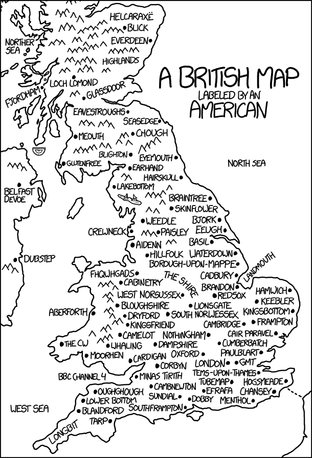
Today’s xkcd is a British map labelled by an American. It’s another one of those where the longer you stare at it, the more it hurts. Randall’s messing with us again.
Today’s xkcd is a British map labelled by an American. It’s another one of those where the longer you stare at it, the more it hurts. Randall’s messing with us again.

Tomorrow is Election Day in the United States. The liberal political blog Daily Kos has produced the above map of poll closing times; I presume it’s accurate.
Update: The New York Times also has maps of poll closing times.

NASA Earth Observatory: “Days of intense rainfall in August 2016 led to widespread flooding in southern Louisiana, as rivers swelled high above their banks and many crested at record-high levels. […] The animation above shows satellite-based measurements of the rainfall as it accumulated over the southern United States. Specifically, it shows rainfall totals every three hours over the span of 72 hours from August 12-14, 2016. These rainfall totals are regional, remotely sensed estimates, and local amounts can be significantly higher when measured from the ground.”

The European Space Agency has released this false-colour composite image of Ireland based on 16 radar scans by the Sentinel-1A satellite in May 2015. The colours show change over the 12 days of coverage: “The blues across the entire image represent strong changes in bodies of water or agricultural activities such as ploughing. […] Vegetated fields and forests appear in green. The reds and oranges represent unchanging features such as bare soil or possibly rocks that border the forests, as is clear on the left side of the image, along the tips of the island.” [ESA]

Jason-3 is the latest earth observation satellite tasked with measuring global sea surface height; its data will be used in weather and climate research (e.g., El Niño, climate change). Launched on January 17, it’s now in its six-month checkout phase and has produced its first complete map, which corresponds well with the map produced by the still-operational Jason-2 satellite, so that’s a good sign. [via]

“Simplified City Map,” a cartoon by John Atkinson. [via]
A copy of one of the oldest maps in Britain, now exploring the newest frontier here in space #mappamundi pic.twitter.com/ghSp3PmV2f
— Tim Peake (@astro_timpeake) February 11, 2016
A copy of the Hereford Mappa Mundi, brought to the International Space Station by British astronaut Tim Peake, turned up on Twitter yesterday. BBC News has the details. [via]

In response to The End of Maps in Seven Charts, Duncan Jackson writes to point out the above xkcd comic from 23 November 2012, which says something quite similar about maps that really just show population density.

NPR graphics editor Alyson Hurt discovered that this month’s blizzard was showing up in Google Maps as traffic delays, and whipped up a little script that took regular screencaps of Google Maps’s traffic layer. She then created an animated GIF from the screencaps. The end result (above) dramatically shows the storm sweeping across the mid-Atlantic states.
Andy Woodruff then took Hurt’s script and created an animation of an ordinary day of Boston traffic. For a “quick, crude” script it certainly seems to have potential. [via]
[sciba leftsrc=”https://www.maproomblog.com/xq/wp-content/uploads/2016/01/lake-poopo-2013.jpg” leftlabel=”12 April 2013″ rightsrc=”https://www.maproomblog.com/xq/wp-content/uploads/2016/01/lake-poopo-2016.jpg” rightlabel=”15 January 2016″ mode=”horizontal” width=””]
Lake Poopó has become the Aral Sea of the Andes. Thanks to drought, water diversion and mining activity, the lake—long, wide, shallow, saline and the second-largest in Bolivia—has basically dried up, as this comparison of 2013 and 2016 Landsat 8 images demonstrates. CBC News, The Independent.
[sciba leftsrc=”https://www.maproomblog.com/xq/wp-content/uploads/2016/01/new-year-flooding-1.jpg” leftlabel=”8 Dec 2015″ rightsrc=”https://www.maproomblog.com/xq/wp-content/uploads/2016/01/new-year-flooding-2.jpg” rightlabel=”1 Jan 2016″ mode=”horizontal” width=””]
These two Landsat images illustrate the extent of flooding along the Wabash and Illinois Rivers at the end of last year, as 6-10 inches of rain fell over the midwestern United States. The image from 8 December 2015, above left, shows normal water levels; the image from 1 January 2016, above right, shows the rivers in flood. Use the slider to compare the two views. Original image. [via]

The New Horizons spacecraft’s rendezvous with Pluto is next week, folks, but we’re already getting better views of our favourite dwarf planet than we’ve ever had before. NASA has assembled images taken between June 27 and July 3 into the above map, which despite its relatively low resolution shows some intriguing surface features: the so-called “whale” and “donut.” (Of course, low resolution is relative: this is already much better than the Hubble-based maps of Pluto released in 2005 and 2010.)

A Redditor called Sarithus has created a map of Clichéa, “a map based on fantasy tropes that also pokes a little fun at unoriginal map makers.” Like others of its kind, it hearkens back, probably undeliberately, to early modern maps of Cockaigne and Schlaraffenland and other satirical maps. Cartographer’s Guild thread, Reddit thread.
Previously: The Only Fantasy World Map You’ll Ever Need.

The Only Fantasy World Map You’ll Ever Need by Jake Manley isn’t the first map of its kind that I’ve seen (see also the map in Diana Wynne Jones’s Tough Guide to Fantasyland); still, it’s clear that fantasy maps are a proven vehicle to satirize and critique the genre. (And be satirized and critiqued.) [John Scalzi]