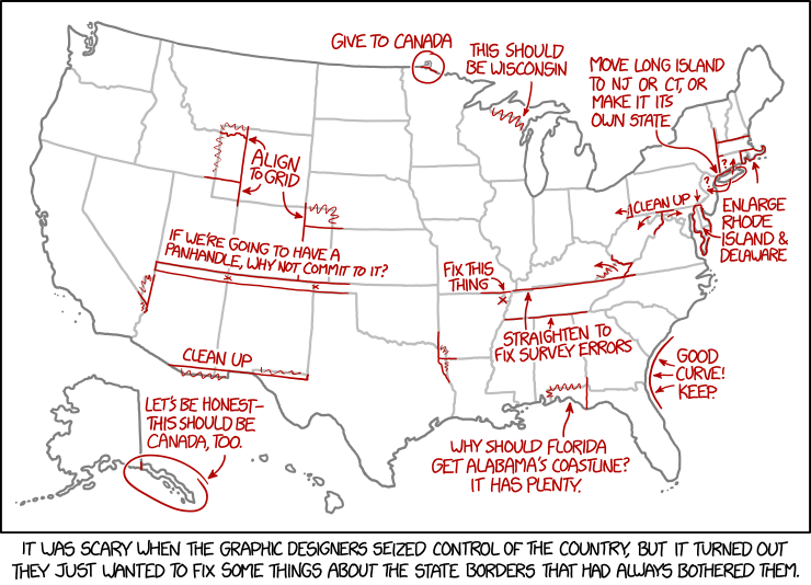
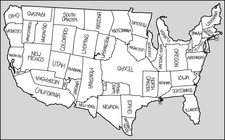
Today’s xkcd. Apparently, the graphic-designer dictatorship will, in their zeal to fix the state borders, overlook Point Roberts.

Today’s xkcd. Apparently, the graphic-designer dictatorship will, in their zeal to fix the state borders, overlook Point Roberts.

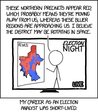
I’m surprised it took as look as it did for physics and cartography to collide—relativity and choropleth maps—in an xkcd cartoon.

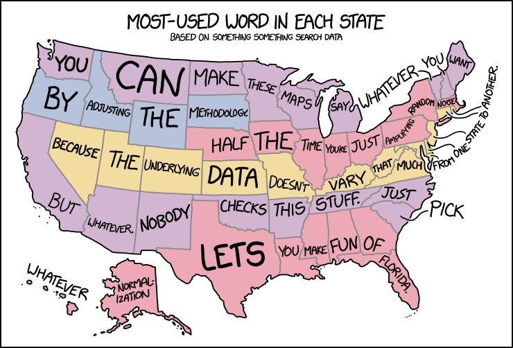
In yesterday’s xkcd cartoon, Randall makes explicit what I think a lot of us have been thinking about those maps assigning a word or a search term to each state or country or whatnot.

Randall Munroe is a bad man who is back with another bad map projection to make our eyes bleed. (If he does this often enough he’ll have enough for a book. Heaven forfend.) This one is, like his other maps, fiendishly subtle: it stretches and compresses countries to fit where their time zones ought to be, longitudinally speaking.

Every so often Randall Monroe puts up a map-related xkcd cartoon, and each time I dutifully post about it. This morning’s is called “Bad Map Projection: Liquid Resize.” Or: when Photoshop algorithms attack.

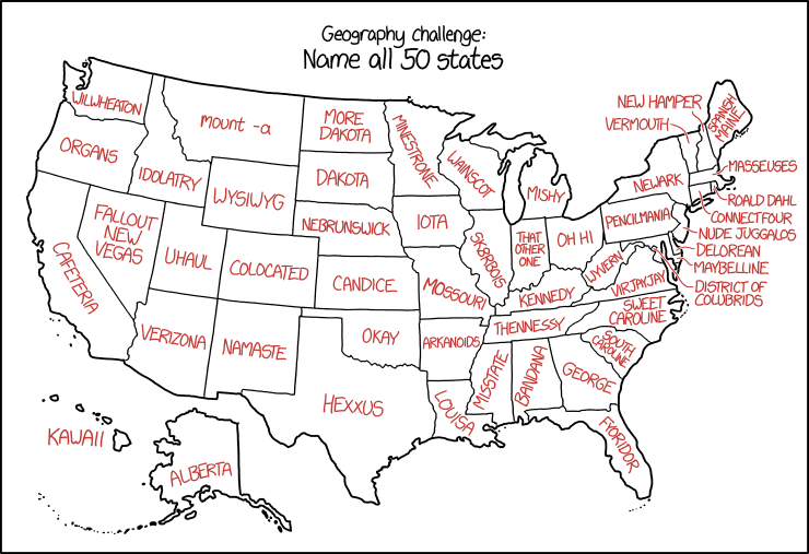
Randall is messing with us again in today’s xkcd, which assigns malapropisms and synophones to U.S. state names. The results are about what you’d expect.
Previously: xkcd’s United States Map.

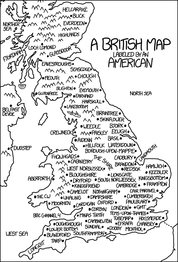
Today’s xkcd is a British map labelled by an American. It’s another one of those where the longer you stare at it, the more it hurts. Randall’s messing with us again.

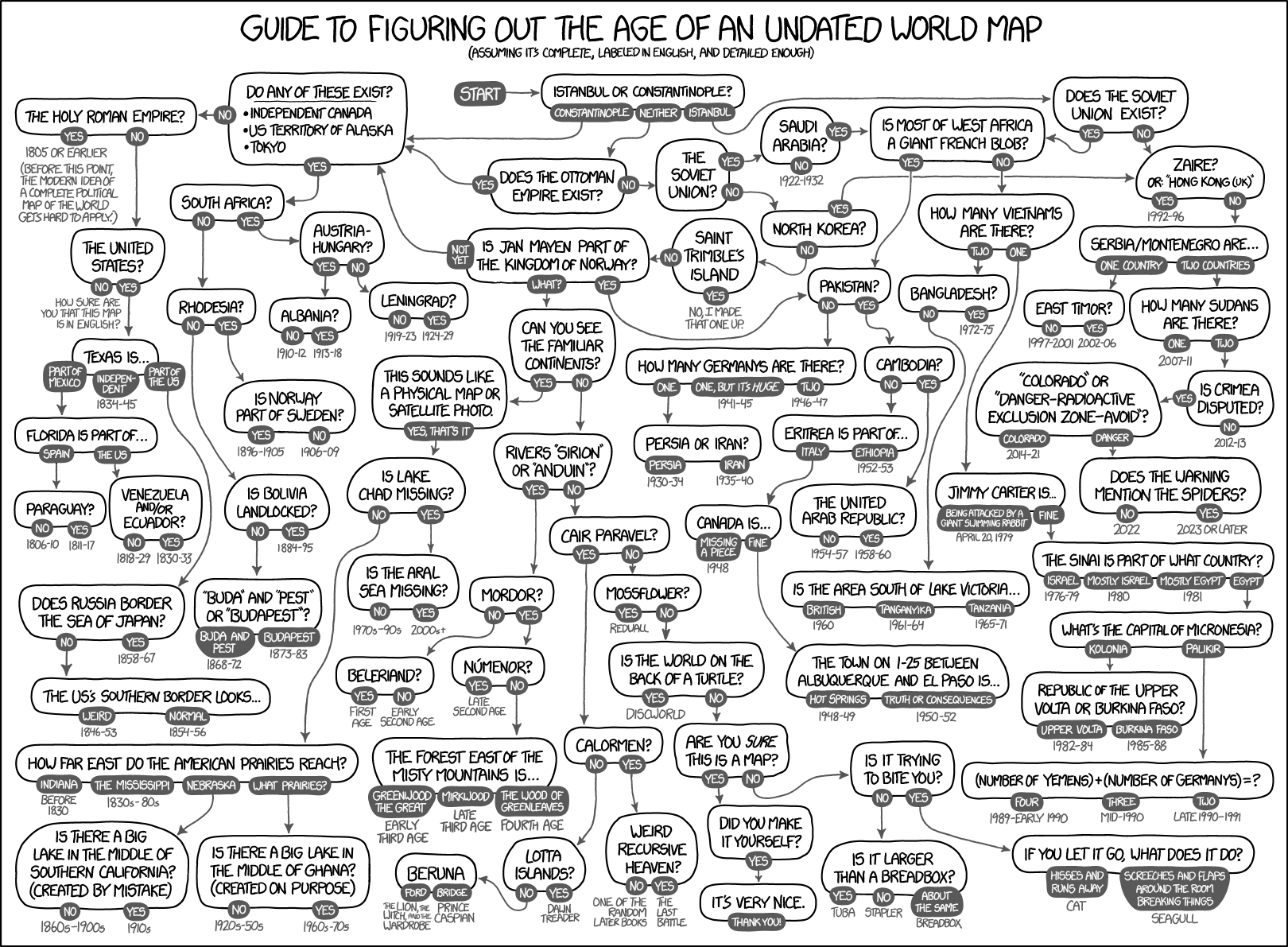
Today’s xkcd is a flowchart for figuring out the age of an undated world map. Look carefully.
Today’s xkcd is a map of the United Sta—wait … what has Randall done? My eyes … they’re bleeding.

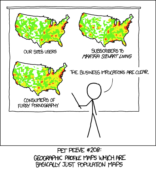
In response to The End of Maps in Seven Charts, Duncan Jackson writes to point out the above xkcd comic from 23 November 2012, which says something quite similar about maps that really just show population density.