Neil Freeman’s Random States of America creates election maps from an alternate reality. They apply real-world election results to randomly generated state boundaries, which can yield radically different results than what actually happened.
Like The United Swears of America, The Great American Word Mapper explores regional variation in English language use in the United States based on geocoded Twitter data, this time through a search interface that allows side-by-side comparisons. As before, forensic linguist Jack Grieve is involved, along with fellow linguist Andrea Nini. [Kottke]
While the map shows the historical probability that a snow depth of at least one inch will be observed on December 25, the actual conditions in any year may vary widely from these because the weather patterns present will determine the snow on the ground or snowfall on Christmas day. These probabilities are useful as a guide only to show where snow on the ground is more likely.
While the subject may seem whimsical, it’s based on 1981-2010 Climate Normals data; this paper details into the methodology involved. (It also answers a question that climatologists and meterologists get a lot.)
Computed communities subject to interpretive analysis. From Nelson and Rae 2016.
Tract-to-tract commutes of 160 km or less. From Nelson and Rae 2016.
A commuter flow-based regionalization of the United States. From Nelson and Rae 2016.
In a paper published in PLOS One, Garrett Dash Nelson and Alasdair Rae explore whether megaregions—i.e., a region centred on a major metropolitan area—can be determined algorithmically, using commuter flow data. In the end they conclude that “any division of space into unit areas will have to take into account a ‘common sense’ interpretation of the validity and cohesion of the regions resulting from an algorithmic approach. For this reason, the visual heuristic method coupled with the algorithmic method offers a good combination of human interpretation and statistical precision.” In the process, they’ve generated a series of maps that are fascinating on several levels, including a final map of megaregions that combines algorithmic results with visual heuristics (i.e., human judgment). [Atlas Obscura]
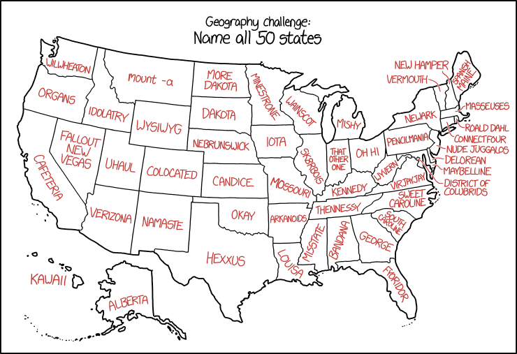
Randall Munroe, “U.S. State Names,” 2 December 2016. xkcd.
Randall is messing with us again in today’s xkcd, which assigns malapropisms and synophones to U.S. state names. The results are about what you’d expect.
Last year Neil Freeman produced a map of ineligible voters in the United States. “There are three main groups of people who aren’t eligible to vote: children, non-citizens, and disenfranchised felons. The Census does a survey of voting age and citizenship, this map uses 2013 estimates.” [Max Galka]
Mapping U.S. election results by county and state is a bit different than mapping results by electoral or congressional district, because counties and states don’t have (roughly) equal populations. Choropleth maps are often used to show the margin of victory, but to show the raw vote total, some election cartographers are going 3D.
The New York Times has a first-rate graphics department, and they’ve come up with some stunning ways to depict the 2016 U.S. presidential election results. They updated their maps of so-called “landslide counties” (see previous entry), which was straightforward enough. Their feature on how Trump reshaped the election map, with arrows showing the county-by-county swing (red and to the right for Trump, blue and to the left for Clinton), was unexpectedly good. But their maps of the Two Americas (above), imagining Trump’s America and Clinton’s America as separate countries, with bodies of water replacing the areas won by their opponents—Trump’s America is nibbled at the edges by coastlines and pockmarked by lakes; Clinton’s is an archipelago—is quite simply a work of art. Incredible, incredible work.
The Economist’s county-by-county election map is a standout because of its quick-acting slider: you can scroll quite quickly through 64 years of presidential elections. Their analysis also focuses on the urban/rural divide (there’s also a graph). [Benjamin Hennig]
I’ve delayed posting maps of the 2016 U.S. presidential election results because—well, because like many of you I’m still recovering. But here we go. We’ll start with Benjamin Hennig’s cartogram of the results which, as cartograms tend to do, correct for the urban concentrations that made up Hillary Clinton’s vote, and demonstrate the rural nature of Donald Trump’s support. See it at Geographical magazine and Hennig’s website.
Are you used to seeing a big map behind the news anchors during election night coverage? As the Los Angeles Times reports, that’s something that began only in 1976, when NBC News commissioned a 14-foot-high plastic map that lit up (red for Democrats, blue for Republicans—the colors hadn’t been standardized yet) depending on who won the state. [Map Dragons]
While we wait for the results, think back, raise a glass, and remember fondly the meme that came and went so quickly a month or so ago: What if only … voted? Based on FiveThirtyEight maps showing the gender gap in voting intentions (What if only women voted? What if only men voted?) that quickly went viral, similar maps showing gap by race and educationwere followed by other maps that were considerably … sillier—here’s a selection. As Boing Boing’s Rob Beschizza said on 14 October: “The whole thing went from funny to saturation point to old in record time, and is already over.” Thing is, now that it’s Election Day I’m seeing them again. It ain’t over till it’s over. And sometimes not even then.
As we approach the first election results of the evening, here are a few maps of the electorate that is doing the voting tonight.
Swing Counties
The Washington Post
The Washington Postmaps the swing counties that could decide the 2016 U.S. presidential election.
Landslide Counties
The New York Times
The New York Timesmaps the increasing number of so-called landslide counties—counties where a candidate won by 20 or more percentage points. “The proportion of voters living in landslide counties has steadily increased since 1992, a trend that reflects the growing tendency of like-minded people to live near one another, according to Bill Bishop, a co-author of ‘The Big Sort,’ a 2008 book that identified this phenomenon.”
Bad Hombres, China and Trump Supporters
For all of Donald Trump’s rhetoric about illegal Mexican immigration and competition from China, his supporters don’t seem to be much affected by either. That’s the conclusion of a study by Raul Hinojosa Ojeda of UCLA’s Institute for Research on Labor and Employment. “[A]n examination of the geographical concentration of support for Donald Trump in the presidential primaries indicates a negative correlation between the number of Trump supporters and the population size of Mexican immigrants, as well as a negative correlation between Trump support and import competition from Mexico or China. […] In fact, only 2% of U.S. counties in the U.S. actually fit the Trump narrative of very high Trump support combined with very high levels of immigration or trade.” [CityLab]
The Mysterious Blue Curve
Geographical magazine explores what they call the “mysterious blue curve” —a narrow swath of Democratic support across the centre of the Deep South. I’ll save you a click: it’s where the African-American voters are concentrated. Geographical, though, goes a bit further back—to the fricking late Cretaceous—to explain why the soil in that area was so amenable to growing cotton, an activity that brought so many slaves to the area in the first place.
Felony Convictions and Voting Rights
Cards on the table: I live in a country where prisoners have the right to vote even while in prison, so the American practice—in 48 of 50 states—of not allowing ex-convicts to vote even after release is both alien and upsetting to me. The New York Times maps the impact of that practice, both in terms of how many people in each state can’t vote due to felony convictions, and in terms of how many African-American adults can’t vote—1 in 13!—because of same. When, as the Times says, “[a] black person is more likely to be convicted of a felony than a white person who committed the same crime,” this has the smell of systemic, targeted disenfranchisement to me.


