Apparently the globe outside the Novosibirsk planetarium has some interesting cartographic features. Not entirely sure what Great Britain and Iceland are doing off the coast of the Americas, or where Florida and Egypt have gone off to . . . [Map Fail/Maptitude]
Mapping Berlin’s Election Results
The Berliner Morgenpost has an interactive map showing the results of the Berlin state elections held on 18 September 2016. (Berlin is a state in its own right.) The choropleth map is shaded to show the margin of plurality; more information is given when you hover over or click on a particular district. The biggest gains were made by the right-wing Alternative für Deutschland and liberal Freie Demokratische Partei; the Pirate Party, which won 15 seats in 2011, was wiped out. [Maps Mania]
Fantasy Maps: Macaroni and Malazan
This post describing how to make a fantasy map using macaroni has been making the rounds of Tumblr for a while—it was first posted in January 2014—but it just got picked up by Tor.com recently, so let’s talk about it. The point of the post is how quick and easy it is to make a good looking fantasy map:
LOOK AT THIS WONDERFUL PIECE OF SHIT IT TOOK ME LITERALLY TEN MINUTES TO MAKE TOPS AND NOW YOU JUST NEED TO FIGURE OUT WHERE TO PUT ALL YOUR DWARF-FUCKING ELVES AND LIZARD-PEOPLE WITH BOOBS
(All caps in the original. Yes, it’s like that throughout. Sorry about that.)
But it seems to me that its quick-and-easy appeal is also an indictment of the fantasy map making process—just like the Uncharted Atlas bot (previously), which demonstrates that fantasy map terrain can be algorithmically generated. They do not, in other words, require much in the way of human imagination.
Meanwhile, on the Atlas of Ice and Fire blog, Adam Whitehead has a look at the maps of the Malazan world. Originally co-created by Steven Erikson and Ian Cameron Esslemont as the basis of a role-playing campaign, the Malazan world is the setting for multi-volume fantasy series by both authors.
Atlas Obscura
Atlas Obscura, the website, has been aggregating an online database of unusual and interesting places around the world for the past several years. Atlas Obscura, the company, has been expanding at a rapid pace these past few years, hiring former Slate editor David Plotz as their CEO in 2014. One result of said expansion has now come to fruition in the form of Atlas Obscura, the book, out this week from Workman Publishing. Written by co-founders Joshua Foer and Dylan Thuras and associate editor Ella Morton, Atlas Obscura is basically a curated subset of the online Atlas Obscura experience.
Like the Atlas of Cursed Places (reviewed here), Atlas Obscura is not an atlas per se. There are maps, but they exist to locate the subjects of the essays that make up this book. Those subjects—those weird and wonderful places—also appear on the website, but the essays are different; in the sample I compared, the book’s version is considerably briefer and more dense. This is to be expected: when you have fewer than 500 pages to work with, you have to make some zero-sum editorial decisions. Fewer, more fulsome pieces, or more pieces of shorter length. Atlas Obscura has opted for the latter, with pieces that are frustratingly, tantalizingly brief, each followed by a little information on how to get there (or, in some cases, whether you can get there). Even then only a fraction of the places that appear online appear between the book’s covers.
But browsing a website is not the same experience as reading a book. No one would try to go through the entire Atlas Obscura database; the book allows for a big-picture look at the sort of thing found there. A curated subset, as I said above. A taster’s menu. The book also rewards serendipity and pleasant surprises: whether you’re reading from beginning to end (as I did for this review), looking for specific continents, regions or countries, or flipping through pages at random, you’re bound to encounter an entry you hadn’t expected to come across. If there’s value in a hard-copy (or electronic: Kindle, iBooks) version of something freely available online in expanded form, it’s here. And let me be clear: that’s not nothing.
I received an electronic advance review copy from the publisher via NetGalley.
Buy Atlas Obscura via Amazon or iBooks.
Related: Map Books of 2016.
Library of Congress Magazine’s Map Issue
Library of Congress Magazine’s September-October 2016 issue (direct PDF link) is almost entirely dedicated to maps, with several feature articles on the Library’s map holdings, profiles of Library cartographers, and other map-related items. [WMS]
A Czech Atlas Publisher Is Caught Between Israel and Palestine
A Czech publisher has managed to get itself entangled in the dispute over how to map Israel and Palestine, with a school atlas that showed Jerusalem as the capital of Israel (which Palestinians dispute). The Palestinian ambassador protested; the Czech education ministry relented—which enraged the Israelis, until the Czech education ministry reversed itself again. This is one of those situations where a neutral map is impossible: each option pisses off the other side. As Google found out about Crimea, it isn’t always enough to show the “right” map to the right people.
Previously: Russia Accuses Google Maps of ‘Topographical Cretinism’ Over Crimea; Google, Palestine, and the Unbiased Map; Empty Maps and Virgin Territory.
Quail Lane Press’s Letterpress Maps
Quail Lane Press is a husband-and-wife Oregon studio that makes, among other things, very nice looking letterpress prints of hand-drawn maps. Etsy store. [Mike Hall]
Street View Protects Cow Privacy
Google’s Street View blurs people’s faces for privacy reasons. Licence plates, too. But a tweet by the Guardian’s David Shariatmadari reveals that Google’s algorithm sometimes extends privacy rights to cows.
https://twitter.com/D_Shariatmadari/status/775488250223947776
See the BBC’s coverage. Some context from Slate.
High-Resolution Elevation Data Released for Alaska

A new digital elevation model of Alaska was released earlier this month. The result of a presidential directive to improve elevation maps of Alaska as a tool “to help to help communities understand and manage” the risks of climate change, the ArcticDEM project is a collaboration between the National Geospatial-Intelligence Agency (NGA), the National Science Foundation (NSF) and the University of Minnesota, among others. The unclassified data gives two-metre (or better) resolution across the state. Lower-resolution DEMs for the entire Arctic will follow next year.
Digital elevation data for Alaska had previously been poor; the National Geographic article leads with the point that Mars has better topographic maps than Alaska does. Most digital elevation data is collected by airplane—an impractical method in the far north; the ArcticDEM is based on stereo imagery from DigitalGlobe satellites. (As a comparison, the Shuttle Radar Topography Mission’s DEM resolution is 30 metres for the U.S., 90 metres elsewhere.)
ArcticDEM data is available on the ArcticDEM Explorer page and on the NGA’s Arctic Support 2016 page.
After the cut, a comparison of digital elevation models pre- and post-ArcticDEM, using Anchorage, Alaska.
Continue reading “High-Resolution Elevation Data Released for Alaska”
Treasures from the Map Room
A new book, Treasures from the Map Room, “explores the stories behind seventy-five extraordinary maps” held at the Bodleian Library, including the Gough Map, the Selden Map, and maps by J. R. R. Tolkien and C. S. Lewis. Edited by Debbie Hall, it’s out now in the U.K. and next month in North America. Buy at Amazon. [Tony Campbell]
Related: Map Books of 2016.
Gaia’s First Sky Map
Yesterday the European Space Agency released a sky map based on the first 14 months of data collected by the Gaia spacecraft, an astrometric observatory whose mission is to create a precise catalogue of astronomical objects’ position and relative motion. Several versions are available: annotated, unannotated, annotated with titles (above), unannotated with titles. The maps contain artifacts (curves and stripes) from Gaia’s scanning procedures, but they’ll improve as more data is added over the course of Gaia’s five-year mission.
Mapping Star Trek
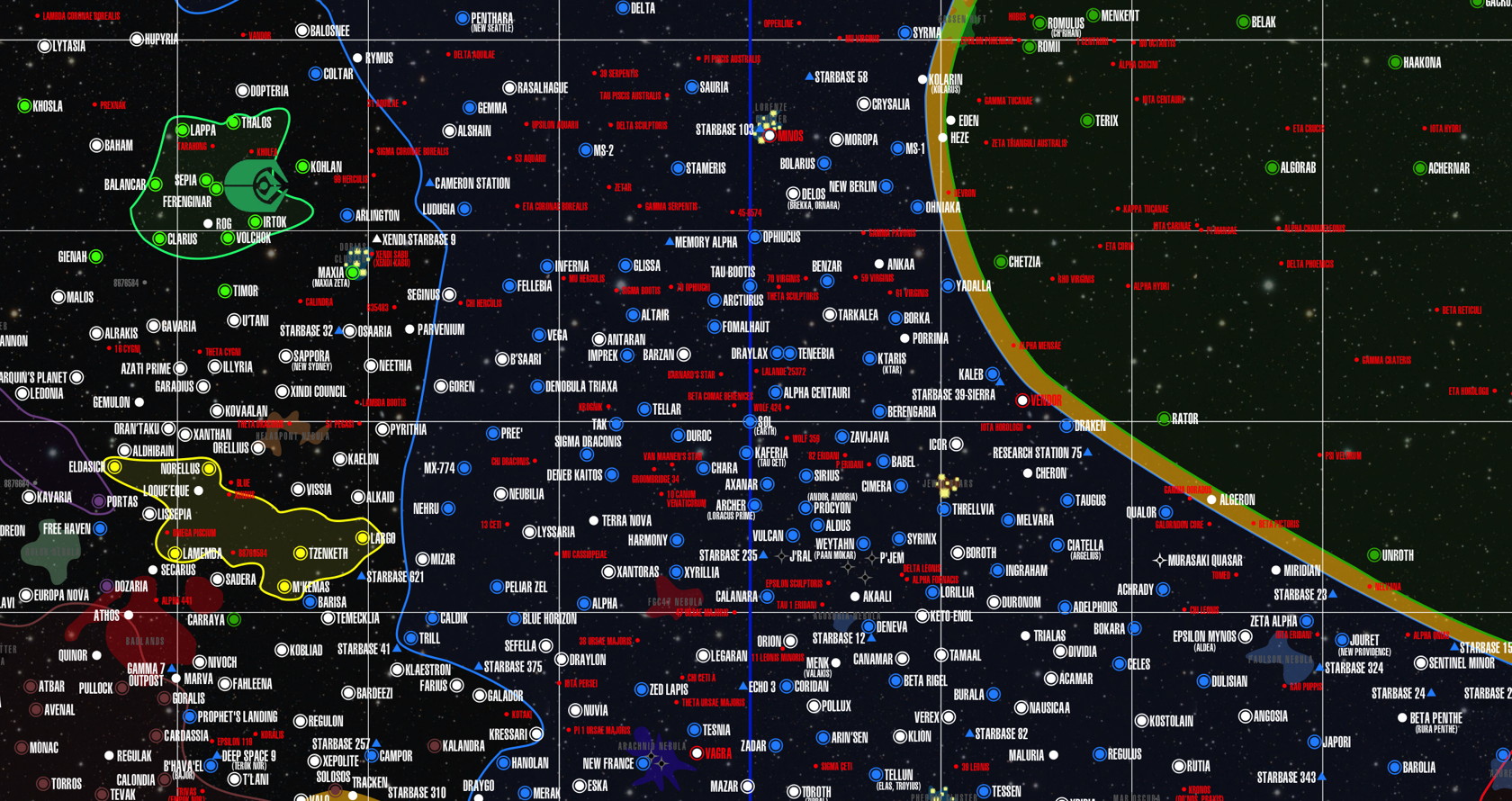
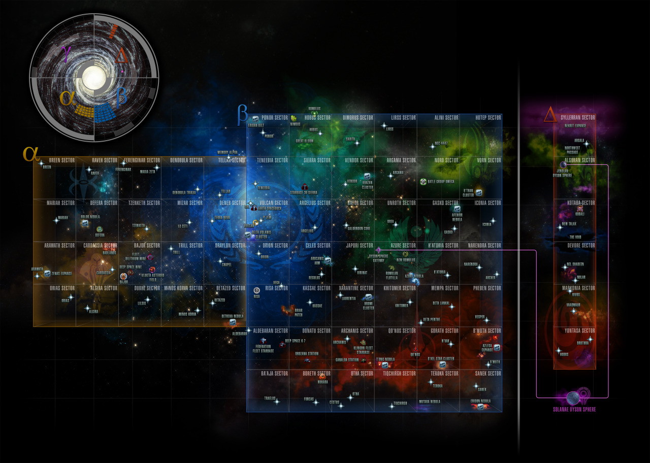
This month marks Star Trek’s 50th anniversary, so I thought it might be worth it to put together a little post about maps in Star Trek. This proved to be more fraught a subject than I expected. There are a lot of maps of the Star Trek universe out there by divers hands, some more official than others, and they don’t always agree on all points, as Sufficient Velocity forum member WhiteDragon25 griped in 2014:
Despite so many planets, stars, systems, and other locations that were mentioned and referenced to throughout the entire franchise’s run, we’ve never got an official and fully accurate map of the Trek universe. […] Hell, for all of the Star Wars EU’s faults, at least it managed to generate a universally accepted map! Star Trek on the other hand, despite being just as popular as Star Wars, cannot even figure out the sizes and positions of the Feds, the Romulans, and the Klingons in relation to one another!
WhiteDragon25 might be overstating things a bit: most of the maps have the Star Trek major powers in the same relative position (other empires like the Tholians are another matter). But the point remains. While original series canon assigned aliens to known nearby stars, and the shows occasionally used real locations (e.g. Wolf 359), episode writers did not start with a map and generally did not take spatial relationships into consideration, which no doubt has made the belated mapping process a bit more challenging.

In print form, the earliest map I’m aware of is Star Trek Maps (1980), which according to Memory Alpha was a pair of double-sided map posters accompanied by a fairly mathy booklet; of course, the Star Trek universe was a lot smaller then. Star Trek: Star Charts came out in 2002 and seems to be considered the most canonical of the maps in existence; it’s out of print now, though. Star Trek: Stellar Cartography (2013), a collection of ten 24″×36″ folded maps. (Note that I haven’t seen any of these maps.)

Online, Star Trek Dimension’s Cartography section has maps from the series as well as Christian Rühl’s Galactic Atlas. StarTrekMap.com, a fan site that appears to be based on Star Trek: Star Charts, uses an in-universe interface that functions well (scroll wheel zooming!) but is awfully small on large screens. Neither has been updated in years. The Star Trek Online game also has, as you might expect, a map.
Mapping Same-Sex Marriage in America

The number of same-sex marriages in the United States is not directly tracked. But a new Treasury Department research paper has been able to come up with a count of same-sex marriages by looking at jointly filed tax returns; the New York Times story is accompanied by a nice interactive map of such marriages by zip code. [MAPS-L]
British Library Exhibition on 20th Century Maps Opening in November
The British Library’s upcoming exhibition, Maps and the 20th Century: Drawing the Line, runs from 4 November 2016 to 1 March 2017. Tickets are now on sale.
Two World Wars. The moon landings. The digital revolution. This exhibition of extraordinary maps looks at the important role they played during the 20th century. It sheds new light on familiar events and spans conflicts, creativity, the ocean floor and even outer space.
It includes exhibits ranging from the first map of the Hundred Acre Wood to secret spy maps, via the New York Subway. And, as technology advances further than we ever imagined possible, it questions what it really means to have your every move mapped.
The Evening Standard and TimeOut London look at one item going on display: Harry Beck’s original sketch of what would become the iconic Tube map.
New Edition of Times Concise Atlas Now Out
The 13th edition of the The Times Concise Atlas of the World came out last week. The HarperCollins listing sets out the updates and changes from the previous edition (including changing “Czech Republic” to “Czechia,” argh). The Concise is the second-largest of the Times world atlases and slots between the Comprehensive and the Universal in terms of physical size, page count, number of maps and place names. Here’s a handy chart showing the differences between the various Times atlases. [Collins Maps]
Related: Map Books of 2016.