
Map art will be featured on the walls of a new hotel in Dubai: the upcoming Address Boulevard Hotel will display art by Matthew Picton (previously) and Ewan David Eason. [WMS]
Category: Art
xkcd’s British Map
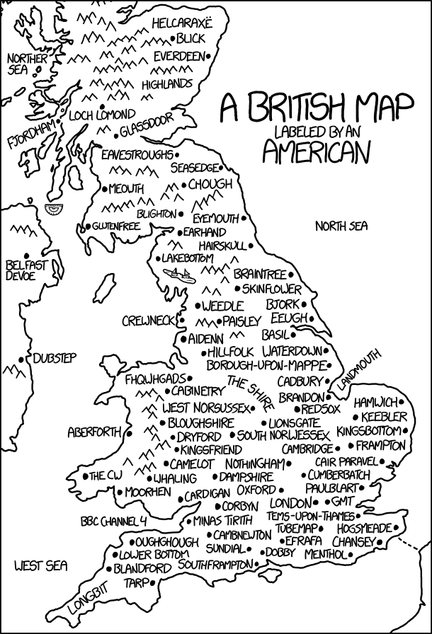
Today’s xkcd is a British map labelled by an American. It’s another one of those where the longer you stare at it, the more it hurts. Randall’s messing with us again.
This Map Needs a Magnifying Glass
The Bangkok Post interviews artist Karoon Keamviriyasatean (aka Zillv).
You Are Here: NYC
 Today is the publication date for Katharine Harmon’s latest book of map art: You Are Here: NYC: Mapping the Soul of the City (Princeton Architectural Press). This is Harmon’s third map art book and features some two hundred maps of New York City, “charting every inch and facet of the five boroughs, depicting New Yorks of past and present, and a city that never was.” Fast Company Co.Design’s Meg Miller has a piece on the book. [via]
Previously: A Forthcoming Map Art Book About New York City.
Texas Monthly on Smith Map Studio

Texas Monthly has a piece about Christopher Alan Smith, who for the past decade has been creating original maps, mostly of Texas and Texas-related subjects. It’s been his full-time gig since 2008. Smith uses a mixture of pen-and-ink and acrylic paints:
I tend to follow the style of postage stamps and currency. I use a pen-and-ink stipple technique, which is a series of dots that create the illusion of halftones. Cross-hatching is another method, using lines instead of dots. I’ve also started using engraved wood to give the maps a layered, 3-D look. For example, on my Thirteen Colonies map, I illustrated the coastline on two layers of hardboard.
[WMS]
River Basins in Rainbow Colours

The latest map to go viral is Robert Szucs’s dramatic and colourful map of the U.S. river basins. It’s even more spectacular in high resolution. Made with QGIS, the map separates river basin by colour and assigns stream thickness by Strahler number. I do have a couple of quibbles. The map doesn’t distinguish between the Hudson Bay and Atlantic watersheds: the Great Lakes and Red River basins are coloured the same way. And speaking of the Great Lakes, I have no idea why they look like ferns here. The map is available for sale on Etsy, along with similar maps of other countries, continents and regions. Daily Mail coverage.
Road Trees
The Road Trees project has produced animated isochrone maps showing road networks erupting fractally from a single departure point.
An isochrone in a map shows with the same color all points from which it takes the same time to arrive to a specific location.
We chose 10 locations around the world and for each of them constructed the isochrones on top of the road network of the corresponding country. Consequently, we plot these isochrones using a dynamic color palette representing the diffusion from the location of interest to any other point of the road network.
Unexpectedly, we found that the isochrones follow beautiful fractal patterns, very similar to networks shaped in the Nature by rivers, veins, or lightnings.
Gregor Turk’s Conflux

Gregor Turk’s Conflux is on display at Spalding Nix Fine Art in Atlanta, Georgia until October 28. Conflux “features wall-mounted box-like maps of global choke points, strategic locations where passage by land or sea is constricted. Coastlines are depicted as alternating positive and negative cut-outs, framed in a grid and wrapped with repurposed rubber (bicycle inner tubes). Shadows and negative space come into play with the stark structures.” Turk’s past art includes ceramics and public art installations inspired by topographic and city maps; see also his 49th Parallel Project. [The Map as Art]
Matthew Picton Exhibition in Portland, Oregon

An exhibition of Matthew Picton’s art is taking place at the Elizabeth Leach Gallery in Portland, Oregon. The Fall runs until 29 October.
Matthew Picton’s wall-mounted sculptures constructed from paper and vellum provide aerial views of urban environments. Unlike street maps, Picton’s representations are at once cartographic, topographical and cultural, incorporating period-specific texts and popular culture ephemera. In The Fall, Picton aims to illuminate periods of struggle and transition in societies and cultures that underwent seismic upheavals through the lens of literary and cinematic imagery. These works place elements of film posters and stills within the cartographic landscape of the city in which they are set, exploring the inversions of power and authority and the moral upending of society and civilization.
Parnasium’s Fantasy Maps of Real-World Places

I’ve written before about maps of the real world done in the style of fantasy maps; they’re a key piece of evidence for my argument that fantasy maps have a distinct (and limited) style. Enough of these fantasy maps of reality are being done that it’s clearly a thing now. The latest examples I’ve encountered come from an Etsy store called Parnasium. Run by a Polish designer named Karol S., it sells poster-sized maps of Europe, the United States, the British Isles, France, Italy, Japan and Poland (so far) in the style of fantasy maps. (The fact he’s using Uncial script suggests he’s primarily inspired by the Lord of the Rings movies; Uncial is fairly rare in book maps.) [Maptitude]
Karen Margolis: Maps and Holes

Karen Margolis burns holes in old maps to make art:
Maps offer the implicit promise of direction. Symbolizing more than just destinations or the exterior world, and composed of vascular systems and arteries, maps act as proxies for our physical selves. They grow old, become obsolete and worthless. Working with outdated, worn out maps, I enhance their colors and trace over roadways to augment their intrinsic structure and utility. I then proceed to obliterate cities and other geographic data by burning holes into the maps with a soldering iron and excising discs from the maps. Producing dislocations, the holes subvert ability to communicate coherent information, but as maps are layered on top of each other, passages emerge into new territories and interrupted routes find new connections. Possibilities open up for new areas to be generated from what was lost. I reassemble amputated map discs into mandala inspired compositions.
A Map of Canada’s Roads and Highways

This striking high-resolution map of Canada’s roads and highways, produced by EarthArtAustralia, is a work of GIS: it’s assembled from Canadian GIS road data, with roads coloured and weighted by importance (freeways are bright yellow, back roads are blue). This map is also inarguably a work of art: I could easily have one on my wall. It’s certainly being sold as such, with high-resolution digital downloads and prints available. (EarthArtAustralia has a number of downloadable and frameable maps based on road and waterway data: they’ve been coming at a furious clip lately.)
Quail Lane Press’s Letterpress Maps

Quail Lane Press is a husband-and-wife Oregon studio that makes, among other things, very nice looking letterpress prints of hand-drawn maps. Etsy store. [Mike Hall]
Architectural Maps of London

London-based publisher Blue Crow Media has begun issuing a series of cartographic guides to urban architecture. They sent me samples of their first two maps, the Art Deco London Map and the Brutalist London Map. (A bilingual Constructivist Moscow Map came out this week, and a Brutalist Washington Map is coming in October.)
Each is a folded paper map of London, 42 × 60 cm in size, that highlights more than 50 examples of Art Deco or Brutalist architecture, respectively, found in that city. On the front side is the map itself, where the architectural examples, highlighted in red, pop out against an extremely spare base layer that has no text except for parks and Tube stations; streets are unlabelled. The end result is dramatic and clear—the grey-on-black Art Deco map is particularly striking—but presupposes a familiarity with the landscape (or a smartphone); these maps really can’t be used on their own to find things. They’d look awfully good on a wall, though. These are simple, well-designed maps that make a virtue of simplicity. They cost £8 each (or two for £14.50).
Interchange Choreography
Interchange Choreography is a collection of maps of complicated highway interchanges by Chicago-based designer Nicholas Rougeux. “Applying colors to roads and using connecting roads to blend those colors adds structure and breathes new life in to areas that are often avoided for their complexity. The results resemble everything from dancers to otherworldly creatures.”
New Jersey’s interchanges look particularly complicated:


Prints are also available. More at Slate and Fast Company. [Leventhal Map Center]