
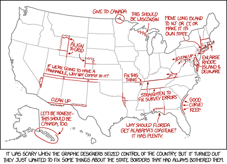
Today’s xkcd. Apparently, the graphic-designer dictatorship will, in their zeal to fix the state borders, overlook Point Roberts.
Today’s xkcd. Apparently, the graphic-designer dictatorship will, in their zeal to fix the state borders, overlook Point Roberts.
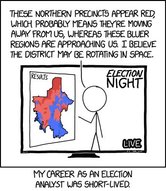
I’m surprised it took as look as it did for physics and cartography to collide—relativity and choropleth maps—in an xkcd cartoon.
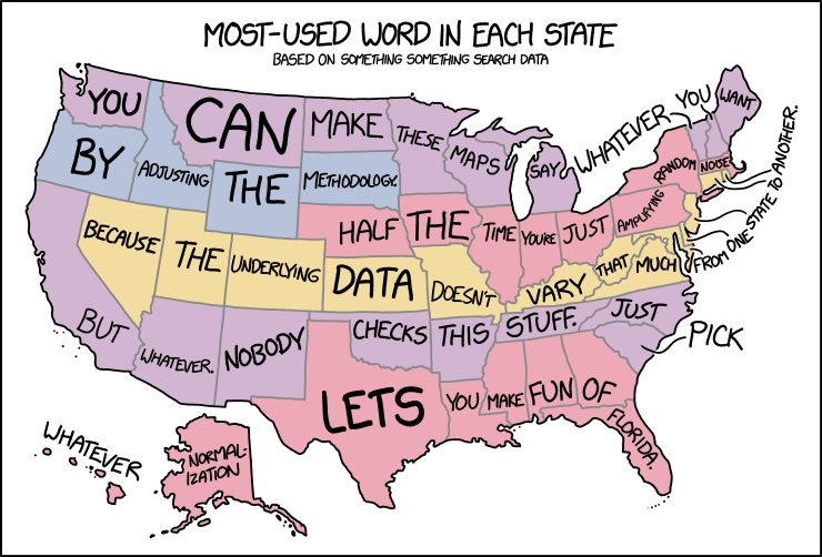
In yesterday’s xkcd cartoon, Randall makes explicit what I think a lot of us have been thinking about those maps assigning a word or a search term to each state or country or whatnot.

Randall Munroe is a bad man who is back with another bad map projection to make our eyes bleed. (If he does this often enough he’ll have enough for a book. Heaven forfend.) This one is, like his other maps, fiendishly subtle: it stretches and compresses countries to fit where their time zones ought to be, longitudinally speaking.

Every so often Randall Monroe puts up a map-related xkcd cartoon, and each time I dutifully post about it. This morning’s is called “Bad Map Projection: Liquid Resize.” Or: when Photoshop algorithms attack.
Randall is messing with us again in today’s xkcd, which assigns malapropisms and synophones to U.S. state names. The results are about what you’d expect.
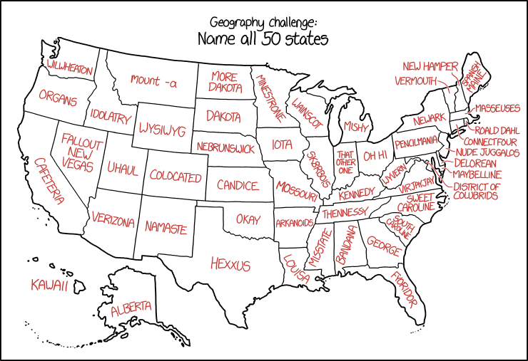
Previously: xkcd’s United States Map.
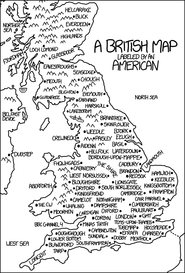
Today’s xkcd is a British map labelled by an American. It’s another one of those where the longer you stare at it, the more it hurts. Randall’s messing with us again.

“Simplified City Map,” a cartoon by John Atkinson. [via]

In response to The End of Maps in Seven Charts, Duncan Jackson writes to point out the above xkcd comic from 23 November 2012, which says something quite similar about maps that really just show population density.
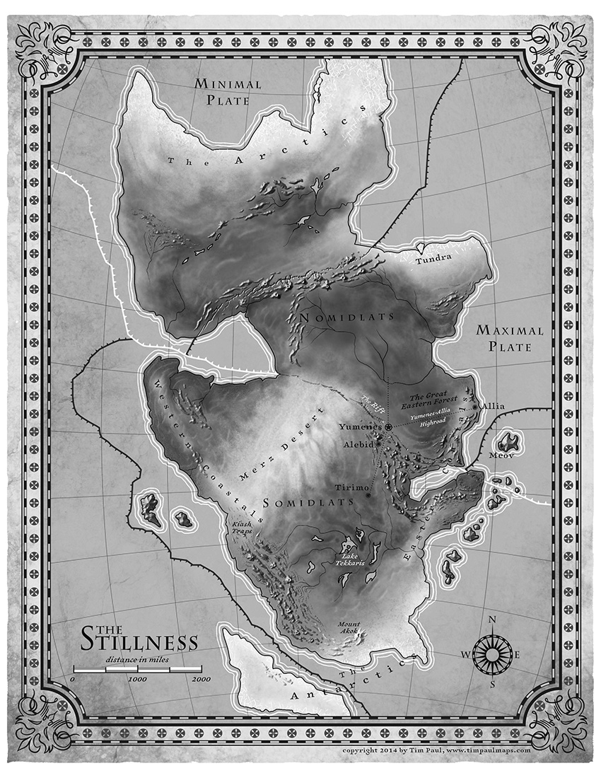 N. K. Jemisin talks about the map that accompanies her new fantasy novel, The Fifth Season. Uncharacteristically for a fantasy map, but appropriately for the novel, it indicates tectonic plate boundaries. Also uncharacteristic is its use of shaded relief to indicate mountains. The map was executed by Tim Paul, whose portfolio is here.
Tor.com is giving away 10 copies of a fold-out poster map that accompanies the boxed set of Brandon Sanderson’s Mistborn trilogy. (Entry deadline is October 9 at noon EDT.)
Jake Hayes is collecting maps from children’s fiction on Pinterest.
At The Funambulist last January, Léopold Lambert discussed the use of cartography in François Schuiten and Benoit Peeters’s 2004 graphic novel The Invisible Frontier (Vol. 1, Vol. 2).
As Fabrice Leroy exposes in “The Representation of Politics and the Politics of Representation in Schuiten and Peeters’s La Frontière Invisible,” (History and Politics in French-Language Comics, Jackson: The University of Mississippi Press, 2008, 117-136), two cartographic paradigms oppose each other throughout Schuiten and Peeters’ novel. The first one is carried by an old man, Monsieur Paul, who is committed to make maps that reflects on the historic conditions of a place, both at an individual empirical level and at a collective (inter)national one. This interpretation of the map is particularly illustrated in the first part of the story with the delicate care of each body interacting empirically with the model/terrain. The second one is also embodied by a character, Ismail Djunov, who undertook to automatize the process of map-making through monumental machines aiming at an objective cartography.
Something else for me to track down. The Invisible Frontier seems to be out of print.
 I was not aware that Batman’s Gotham City has had a consistent map for the last fifteen years or so. Its geography was defined in 1998 by illustrator Eliot R. Brown for the “No Man’s Land” storyline but has been used ever since, including by the Christopher Nolan trilogy of movies. Brown describes how the map came to be on his website; the story has also been picked up by Smithsonian.com. Thanks to Caitlin and Dwight for the tip.