
 I’ve belatedly heard the news that Robert G. Bartholomew died last April in Edinburgh at the age of 90. Robert and his older brothers John and Peter, who died in 2008 and 1987, respectively, were the last of six generations of Bartholomews working for the eponymous family mapmaking firm, John Bartholomew and Son, that was, among other things, responsible for the Times series of atlases before being subsumed into the HarperCollins publishing empire. Robert served as production manager, John as director and Peter as chairman. See the NLS’s Bartholomew Archive and the family’s website for more on the firm’s and the family’s history. [WMS]
Author: Jonathan Crowe
Jonathan Crowe blogs about maps at The Map Room. His essays and reviews have been published by AE, Calafia, The New York Review of Science Fiction, the Ottawa Citizen, Strange Horizons and Tor.com. He lives in Shawville, Quebec.
Ecological Atlas of the Bering, Chukchi, and Beaufort Seas

Audobon Alaska’s Ecological Atlas of the Bering, Chukchi, and Beaufort Seas maps the environment, biota and wildlife in the three seas surrounding the Bering Strait, as well as the human activity that puts them at risk. The cartography is by Daniel Huffman and not by coincidence excellent. It’s available for download as PDF files, either chapter-by-chapter or a whopping 125-megabyte single download; a print copy costs $125 with shipping and handling. [NACIS]
Atlas for the End of the World

The Atlas for the End of the World collects a series of world maps that measure our planet’s environmental well-being. More specifically, they examine the amount of protected area in our planet’s biological hotspots, especially relative to the UN Convention on Biological Diversity’s 2020 conservation targets. Created by landscape architects, the accompanying text (by project lead Richard J. Weller) tends toward the abstruse and verbose, but the maps themselves are quite interesting. (I note that they make extensive use of the Goode homolosine projection, which is refreshing.) [Geo Lounge]
The Avignon Chart
 Though I haven’t seen it, the most recent issue of Maps and History reports on the discovery of a fragment of an early portolan chart in the departmental archives of the Vaucluse. The so-called Avignon Chart (Carte d’Avignon)1 dates to around 1300, making it one of the earlier portolan charts known to exist. If you can read French, the Brussels Map Circle’s website has a lengthy article about the chart by Jacques Mille and Paul Fermon that discusses, among other things, the chart’s provenance and how its approximate age was determined. (I don’t know whether this is the same article that appears in Maps and History.) [Tony Campbell]
Ottawa Transit Maps, 1929-2015
![]()
Carelton University’s library has an online collection of Ottawa transit maps from OC Transpo and its predecessor agencies, dating as far back as 1929 (above). The originals scanned as PDFs, with SHP and KML files if the vectorized transit routes are what you’re really after. [Transit Maps]
During The Map Room’s hiatus (June 2011 to January 2016), any map blogging I did went on my personal blog. I wrote a total of 201 map-related blog posts during that period. At the moment I’m starting to remove older material on my personal website, so those posts have now gone dark over there. I’d like to keep them around, so I’ve started the process of importing those map posts over here. I did 2011 earlier today, and I learned that each post is going to need a lot of cleaning up, so it’ll be a slow process.
The Fantasy Maps section that once resided on my personal site is now more or less over here, too—though it’s as bare-bones and incomplete here as it was over there.
California Wildfires: Mapping Sonoma County
 Sonoma County’s wildfire information page points to a number of useful maps: fire perimeter boundary maps, current evacuation areas, road closures, rapid evaluation safety assessment (RESA) maps. The City of Santa Rosa’s emergency information page also has maps specific to that city; Heavy also has a roundup. See also Cal Fire’s structural status information map. [The Mercury News]
Previously: Mapping the Northern California Wildfires.
Google Maps Abandons Experimental Calorie Counter
![]() An experimental feature in the iPhone version of Google Maps that measured the calories burned (and equivalent in mini-cupcakes) when walking a route instead has been pulled due to complaints, TechCrunch reports: the feature couldn’t be disabled, the calorie counts were vague and unhelpful, and it could be actively harmful to users with eating disorders. More at Buzzfeed, Slate and The Verge.
An experimental feature in the iPhone version of Google Maps that measured the calories burned (and equivalent in mini-cupcakes) when walking a route instead has been pulled due to complaints, TechCrunch reports: the feature couldn’t be disabled, the calorie counts were vague and unhelpful, and it could be actively harmful to users with eating disorders. More at Buzzfeed, Slate and The Verge.
Mapping the Northern California Wildfires

Maps and satellite imagery of the wildfires in Northern California include the San Francisco Chronicle’s interactive map; Robin Kraft’s interactive map showing satellite imagery from before and after the fire; this New York Times page mapping building damage in Santa Rosa; the Washington Post’s coverage of the devastation; and NASA Earth Observatory’s images of the smoke plumes here and here.
Ancient Maps and the Ancient Psyche

Maps are artifacts of the era in which they were created: they reflect not only what people knew about the world, but how they saw it. That’s the thrust of Amelia Soth’s article for JSTOR Daily about The Book of Curiosities of the Sciences, and Marvels for the Eyes, a Fatimid-era cosmography compiled in Egypt in the 11th century; the Bodleian Library’s example is a late 12th/early 13th-century copy.
There is a philosophy underlying the geography. It pins abstract concepts to points in space, placing civilization and order at the center and wilderness and chaos at the edges. The medieval Arab world inherited the Greek conception of geography—in particular, that of Ptolemy, who separated the world into seven climates. The concentric arcs marked on the map represent these climates. The world is mapped as a circle with a center and a periphery; the regions grow hotter to the south and colder to the north, buffeted by different kinds of winds on the eastern and western sides, while the land at the heart of the map enjoys a harmonious balance of elemental forces. The people living at the center benefit from the temperate weather and grow up beautiful and healthy.
Moons and Planets added to Google Maps

The Moon and Mars were relatively early additions to Google Earth; that application may have been migrated to the web, but the planets and moons keep coming. Yesterday Google announced the addition of a dozen other worlds in our solar system; the space layer of Google Maps now includes planets Mercury, Venus and Mars; dwarf planets Ceres and Pluto;2 Jupiter’s moons Io, Europa and Ganymede; and Saturn’s moons Dione, Enceladus, Iapetus, Mimas, Rhea and Titan. Large moons Callisto and Triton aren’t included, and Iapetus is projected onto a sphere rather than appearing as the bizarre space walnut it is.
The Planetary Society’s Emily Lakdawalla noticed a thing, though:
Anybody know who I should talk to at @Google to let them know that several of the icy moon maps have names & image offset by 180 degrees?
— Lady Lakdawalla of Baltis Vallis (@elakdawalla) October 16, 2017
Emily reports that this bug affects several moons of Jupiter and Saturn; Google is apparently already on it and may have fixed it by the time you read this.
The Humanitarian OpenStreetMap Team and Puerto Rico
Both Atlas Obscura and CityLab look at efforts by the Humanitarian OpenStreetMap Team to update and improve the quality of maps in Puerto Rico in the wake of Hurricane Maria.
Previously: Volunteers Mapping Post-Hurricane Puerto Rico.
Australian Braille Globe Being Digitized
A rare Braille globe held by the Queensland State Library is being digitized so as to create a 3D-printed replica. The globe, invented by Richard Frank Tunley in the 1950s, is one of the last copies still in existence and is in poor physical shape—problematic for something designed to be touched. That’s where the replica comes in. It’s funded by the library foundation’s crowdfunding initiative, which will also help fund the original globe’s restoration. ABC News, Sydney Morning Herald. Media release. [ANZMapS]
‘They Just Wanted to Fix Some Things About the State Borders’
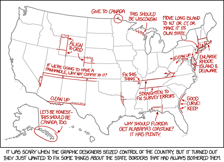
Today’s xkcd. Apparently, the graphic-designer dictatorship will, in their zeal to fix the state borders, overlook Point Roberts.
Street View at the Top of the World

At 82° north latitude, Quttinirpaaq National Park is on the northernmost tip of Canada’s northernmost island, Ellesmere Island. It takes days to fly there and requires you to hire a charter plane. Fewer than 50 people visit every year. And along with the remote northern communities of Grise Fiord and Resolute Bay, it’s just been added to Google Street View: Parks Canada staff backpacked across the park with the iconic Street View camera. More from CBC News and Google.